Creating a Dashboard and Configuring the “Graphical Statistics” Widget
General widget description
The Graphical Statistics widget allows users to visually represent and analyze data, improving decision-making efficiency and enhancing understanding of current business process states.
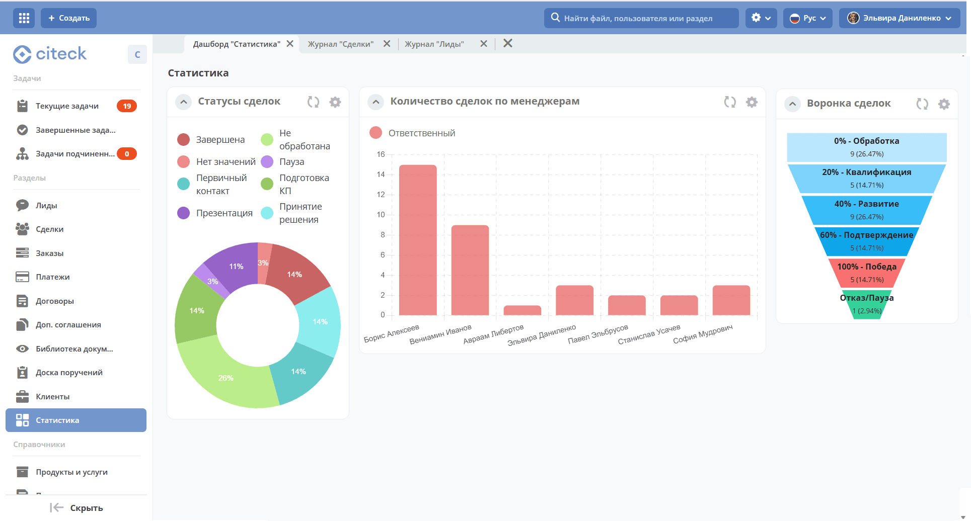
The widget supports the following chart types:
line;
bar;
pie;
funnel.
Users can select data sources for charts, including specific attributes and columns related to cases and reference lists of the ECOS platform. Charts are configurable — you can customize axes, scaling, and other display parameters.
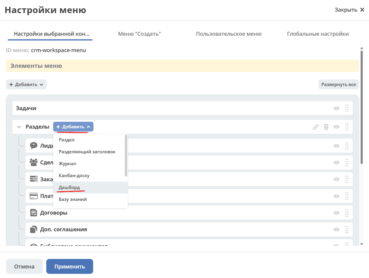
Adding a dashboard
Note
The functionality is available for users who are workspace managers.
Widgets can be added to a separate dashboard. To do this, go to menu settings:

Add a Dashboard section:
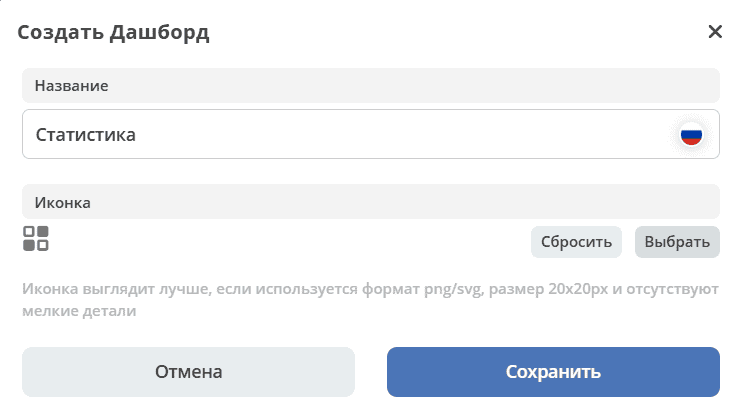
Specify the name, select an icon, and save:
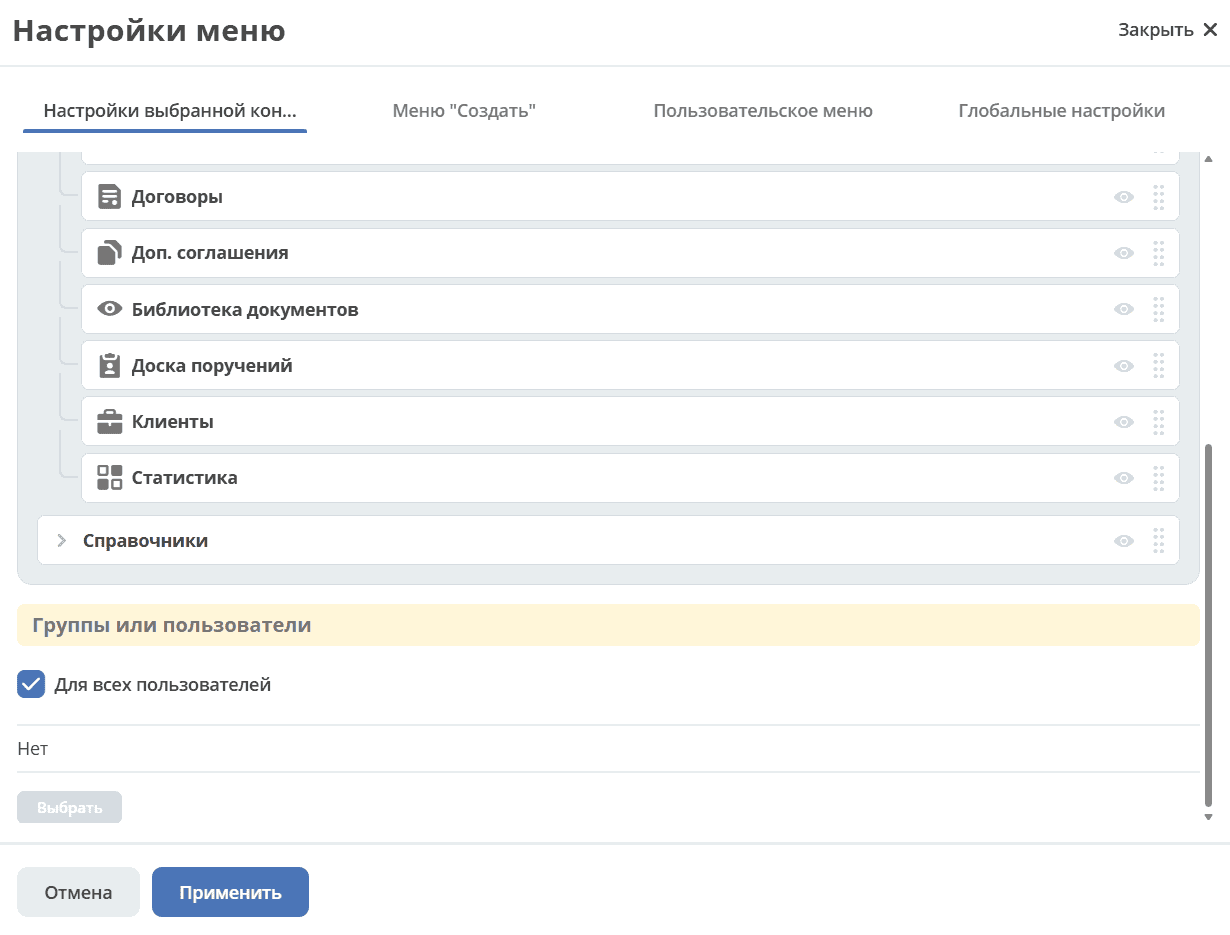
Click «Apply» to save the settings:
Go from the menu to the created dashboard and click «Configure»:
Dashboard configuration
Specify the number and content of tabs (1).
Select the layout and number of columns for each tab (2).
Fill the columns with widgets — drag the «Graphical Statistics» widget to the required column (3).
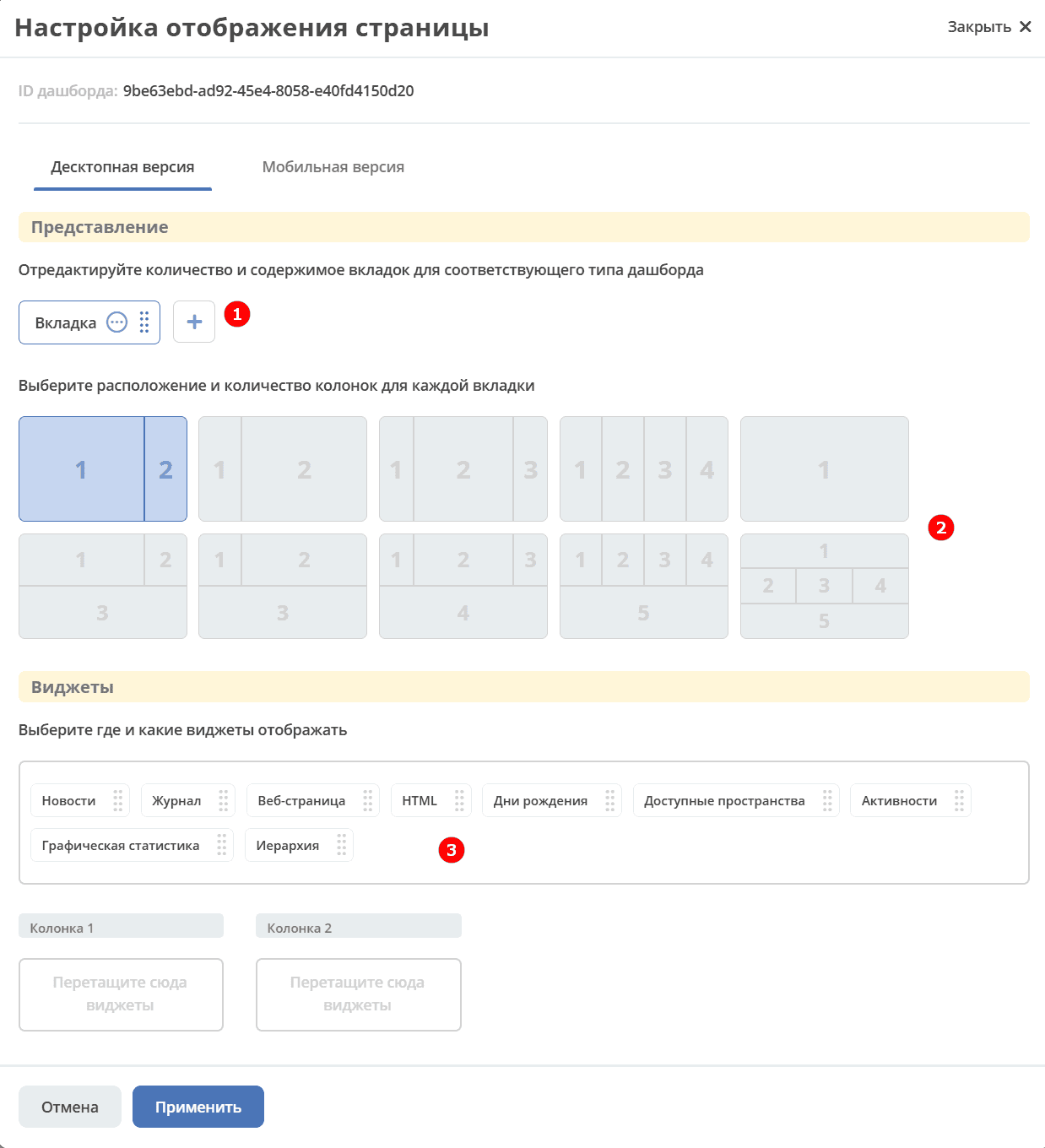
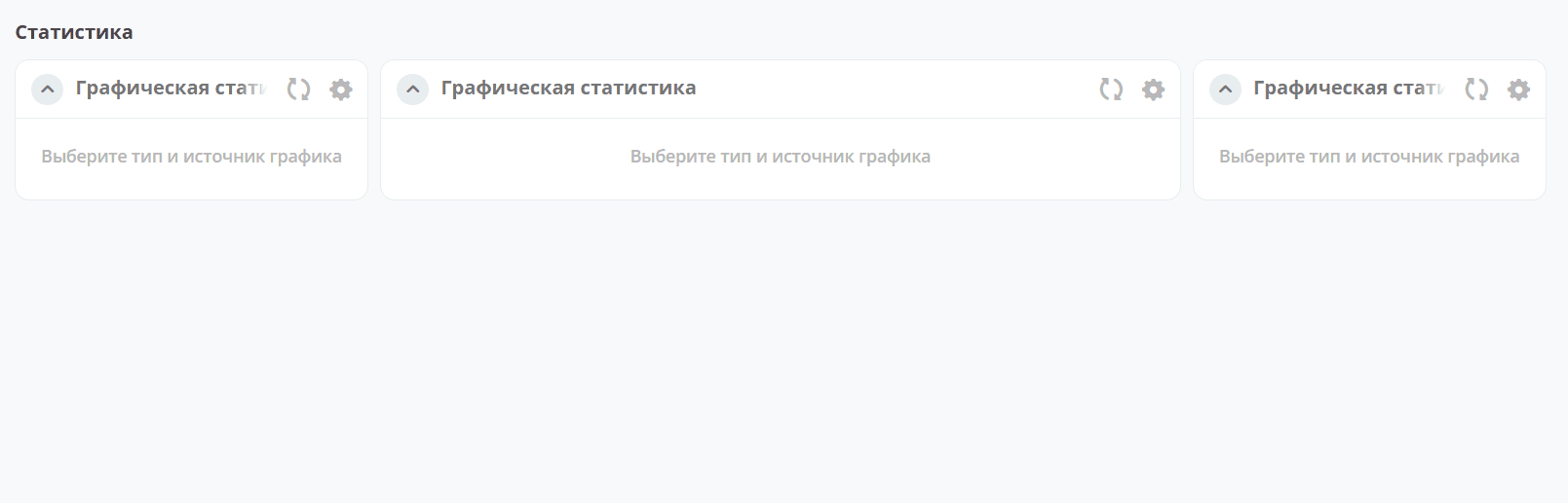
Click «Apply» — a dashboard will open where you can configure each widget:
Configuring the “Graphical Statistics” widget
To open the settings, click the widget edit button:

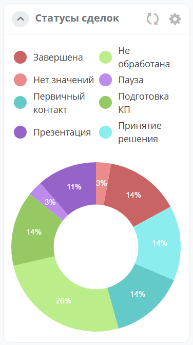
Let’s configure a pie chart to show the percentage ratio of request statuses.
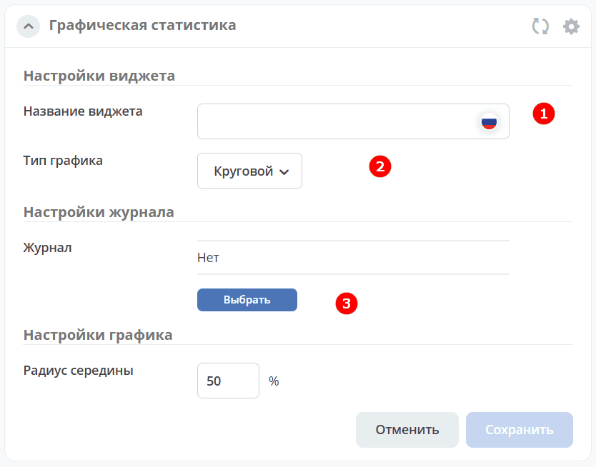
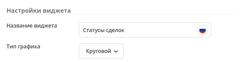
Step 1. Chart Name and Type
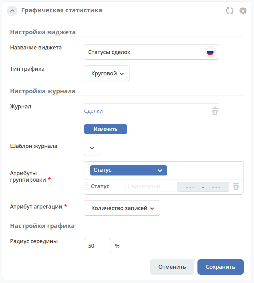
Specify the widget name (1), select the «Pie» type (2):
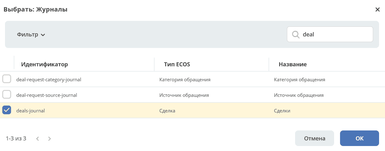
Step 2. Data Source
Next, select the journal (3) based on whose data the chart should be built:
Note
The selected journal must have columns pre-configured for grouping. This action is available to administrators. See details in about the widget.
Step 3. Grouping and Aggregation
After selecting a journal, the grouping and aggregation settings become available:
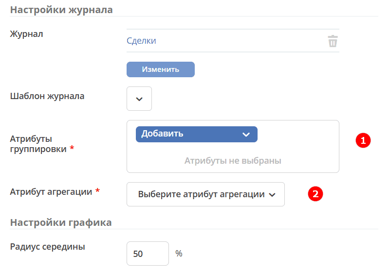
Grouping — an operation of combining data into groups so that elements in each group share a common attribute.
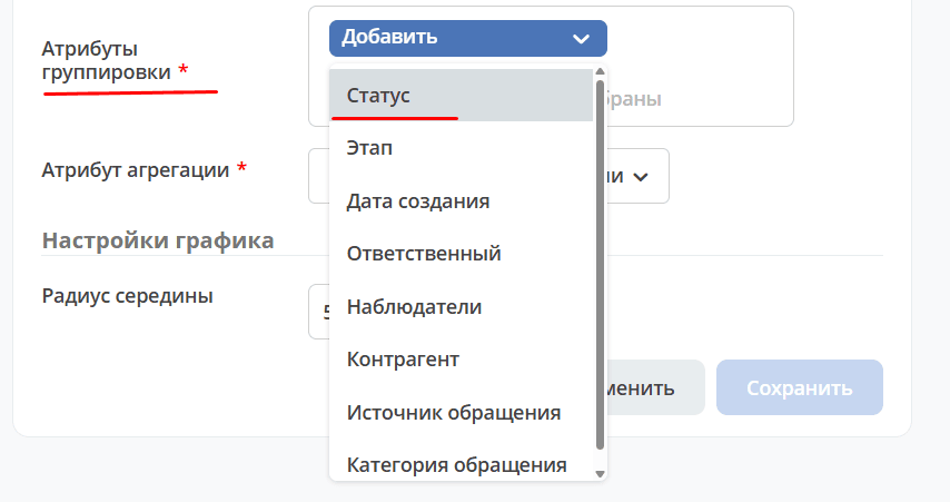
Select an attribute for grouping:
Note
The list shows attributes that have grouping enabled in their settings.
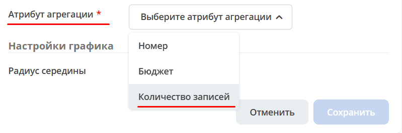
Aggregation — an attribute for which summary data should be returned.
Select an attribute for aggregation from the list:
Step 4. Additional Parameters
The main chart settings are completed. You can change the radius of the central circle as a percentage of the main radius or leave the default value of 50%:
Click «Save»:
See also
For other chart types and advanced settings, see Widget «Graphical Statistics».