Widget “Graphic Statistics”
Note
Available in the enterprise version only.
Key charts
The widget allows users to visually represent and analyze data, improving decision-making efficiency and understanding of the current state of business processes.
The Chart.js library was used in development.
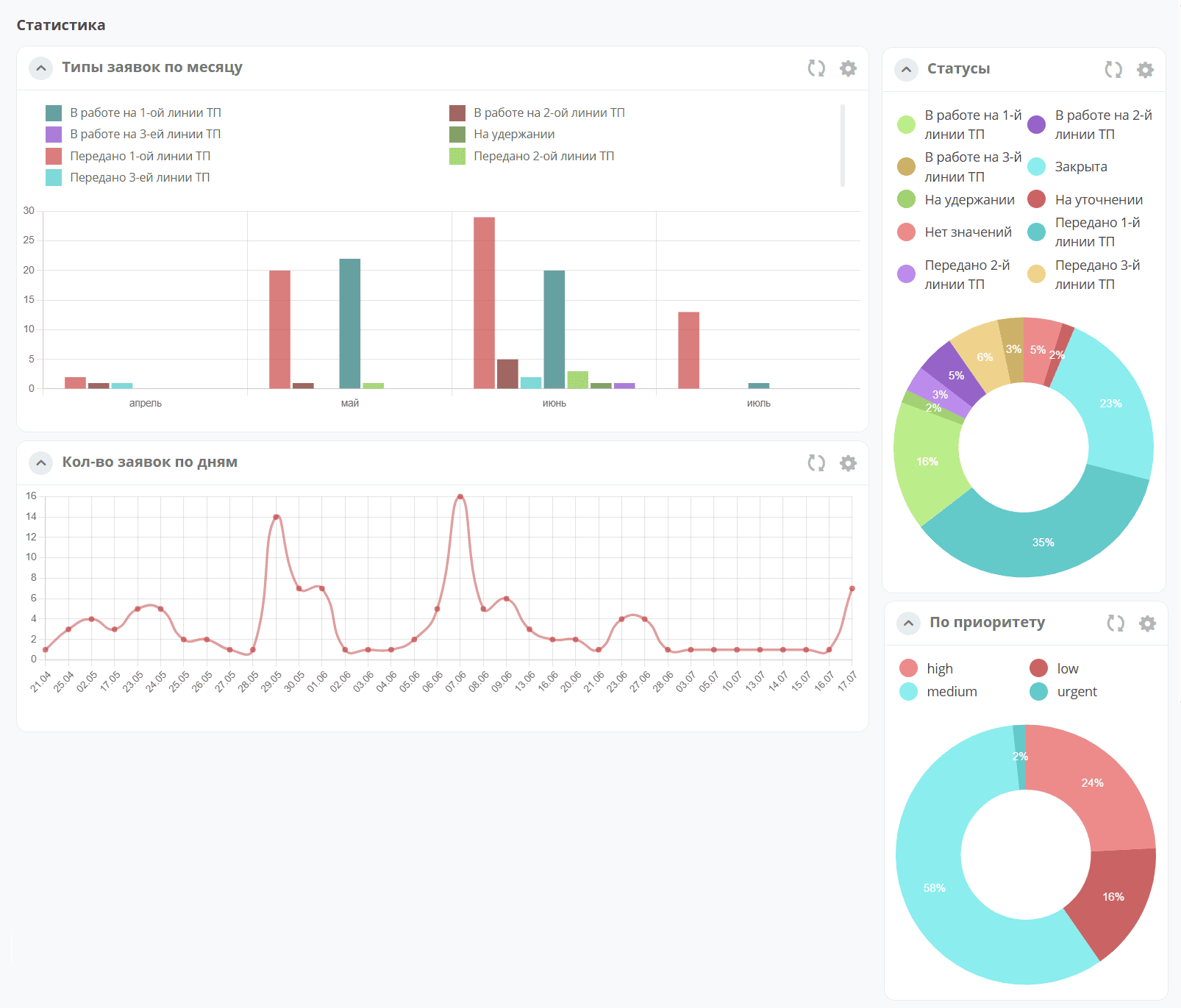
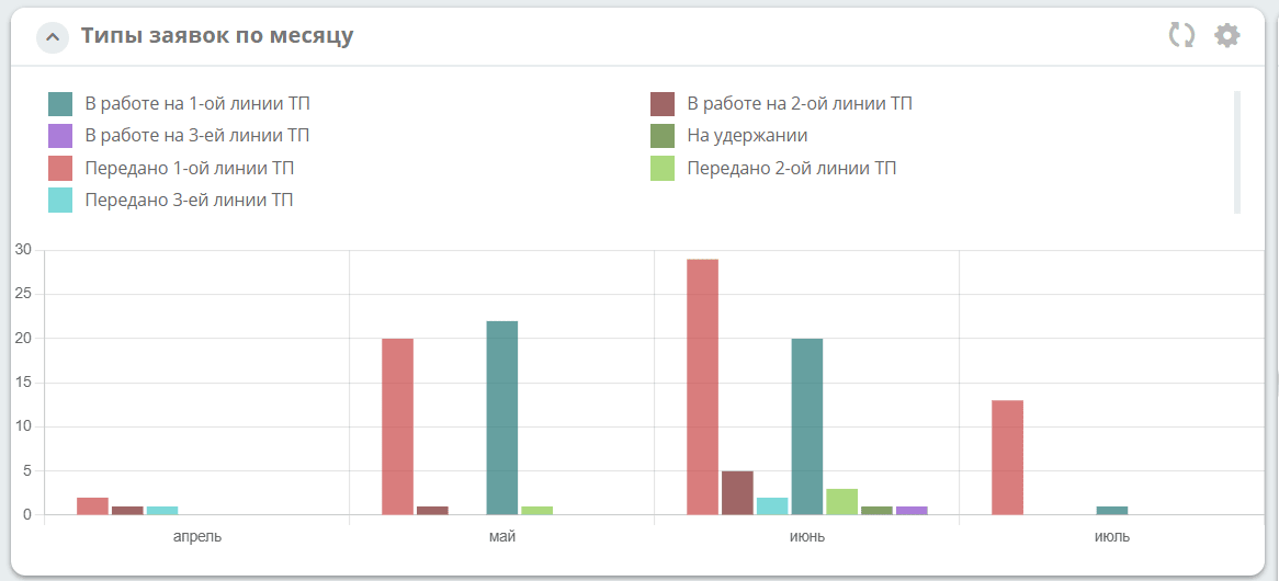
The widget supports various chart types: line, bar, pie, and funnel. Users can select a data source for the chart, including specific attributes and columns linked to cases and reference books in the Citeck platform.
Charts are configurable — users can adjust axes, scaling, and more.
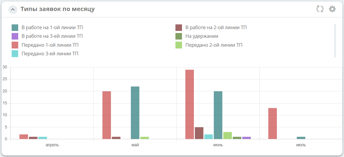
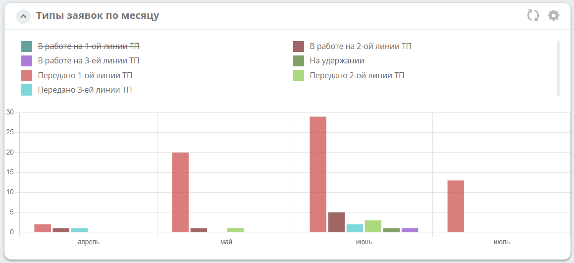
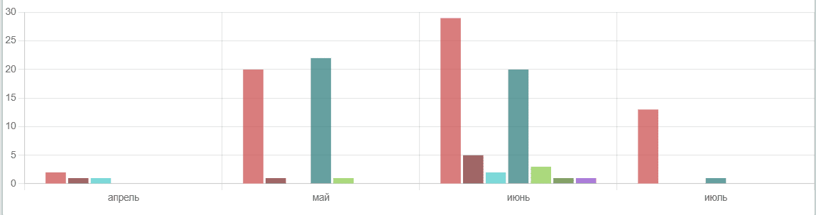
For bar, line, and pie chart types, clicking a legend item removes its data from the chart view:
General configuration
For all chart types:
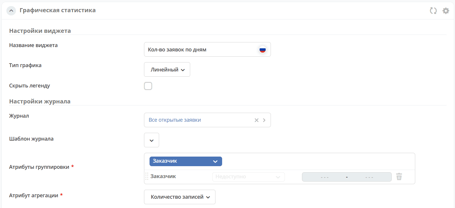
Widget name |
Enter the view name. |
Chart type |
Select a type from the list:
- Столбчатый
- Круговой
- Линейный
- Воронка
|
Journal settings |
|
Journal |
Select the journal whose data will be used to build the chart.
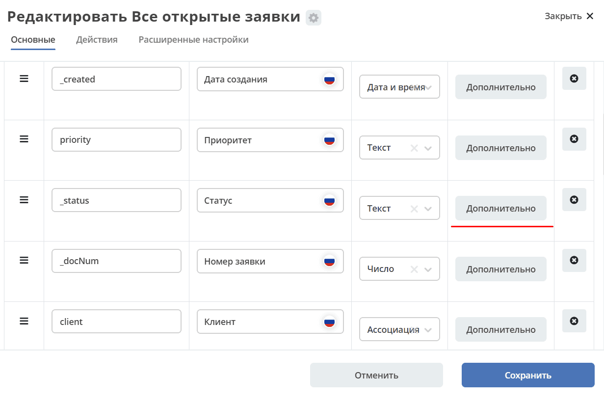
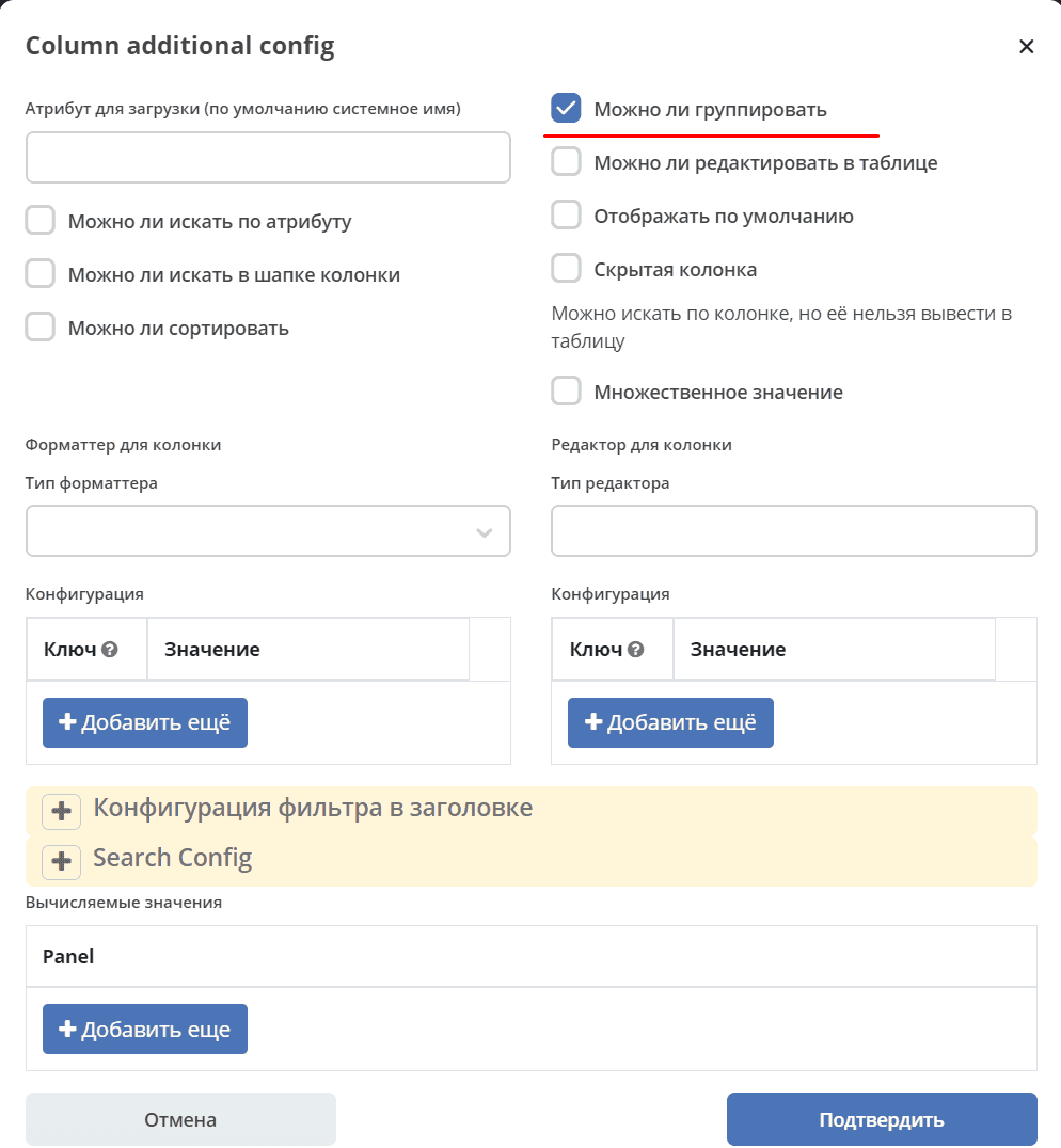
The selected journal must have grouping columns configured in advance. This action is available to administrators.
To enable grouping, go to the required column in the journal and click More:
Check the Can be grouped checkbox:
|
Journal template |
Select a journal template. |
Grouping attributes |
Grouping is the operation of combining data into groups so that all elements in each group share a common attribute.
Click “Add” and select the attributes by which to group the data from the list.
The list shows only attributes for which grouping is enabled in settings.
|
Aggregation attribute |
Select an attribute from the list to use for returning aggregated data. |
Bar
A bar chart is a diagram represented by rectangular areas (bars) whose heights or lengths are proportional to the values they represent.
Configuration:

Minimum vertical value |
The minimum value displayed on the vertical axis. |
Maximum vertical value |
The maximum value displayed on the vertical axis. |
Aspect ratio x/y |
Decimal. Axis scaling — the ratio of one X unit to one Y unit. Default is 2. |
Using the Aspect ratio x/y parameter and adjusting proportions, the chart height can be balanced. Examples of different aspect ratio values:
2: |
|
4: |
Line
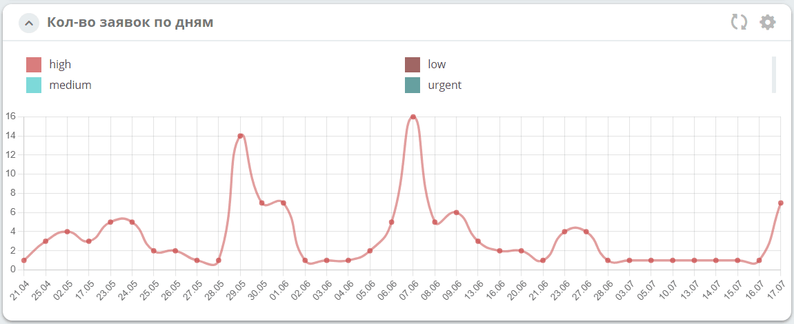
A line chart displays data as points connected by a line. It is used to show how metrics change over time or to compare two data sets.
Configuration:
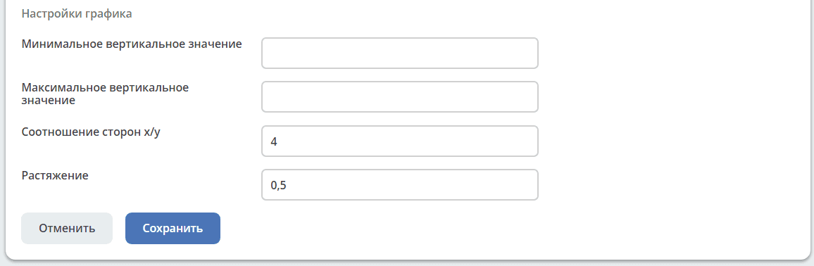
Minimum vertical value |
The minimum value displayed on the vertical axis. |
Maximum vertical value |
The maximum value displayed on the vertical axis. |
Aspect ratio x/y |
Decimal. Axis scaling — the ratio of one X unit to one Y unit. Default is 2. |
Tension |
The smoothness level of the chart line. Default is 0. |
Pie
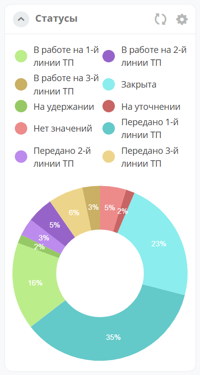
A pie chart represents data as a circle divided into sectors. Each sector is a data category that makes up a share of the total.
Configuration:
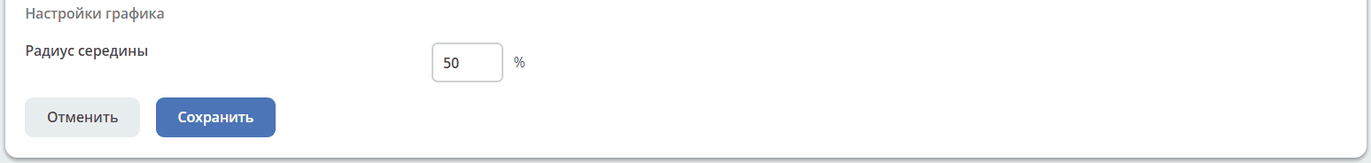
Inner radius |
The radius of the inner circle as a percentage of the outer radius. Default is 50%. |
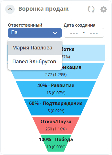
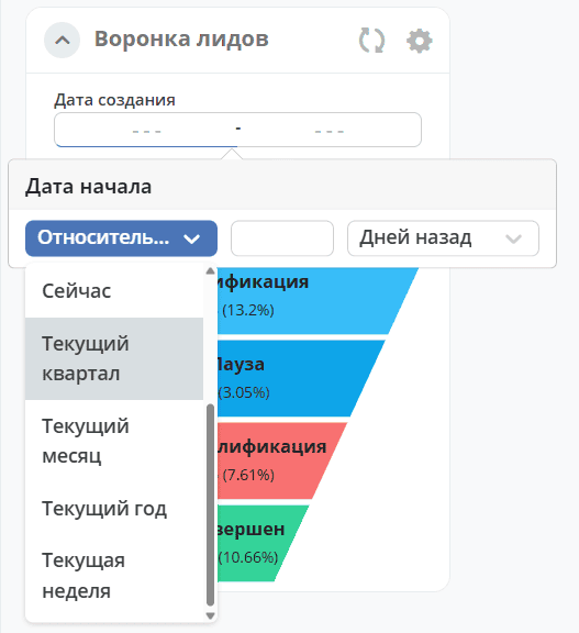
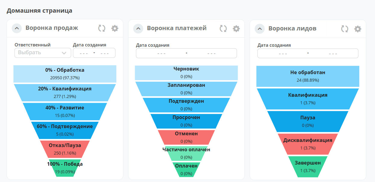
Funnel
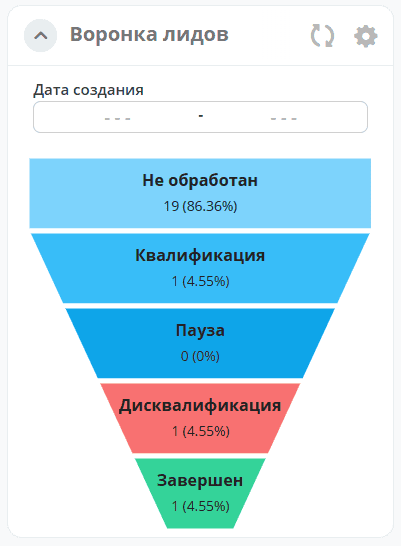
A funnel is used to visualize sequential process stages where the number of elements decreases at each step. Each level shows the element count and its percentage of the total.
Clicking any level of the chart opens a journal with a list of elements belonging to that grouping category.
Configuration:
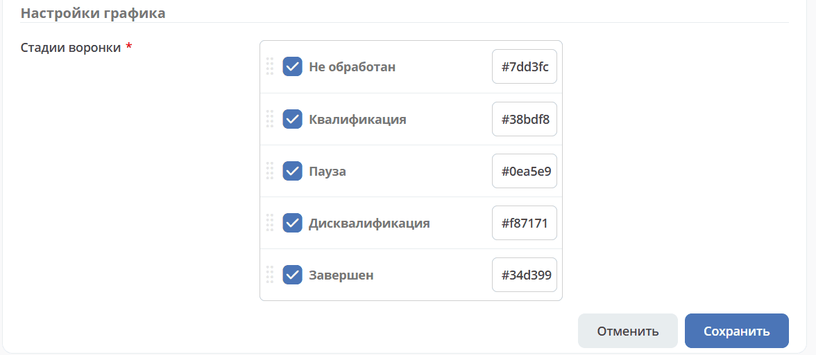
Funnel stages |
Select the stages and display colors for the funnel. |
The following options are available for the funnel:
Selecting an assignee with a search function:
|
Selecting a date range:
|