Form Builder
General Description
Form Builder is a visual designer for creating and configuring forms in the Citeck platform. It allows defining the composition and layout of fields, setting validation rules, managing component visibility and availability, and adding custom form behavior logic — all without writing code.
Using the builder, you can:
choose from a ready-made set of components (text fields, lists, dates, attachments, etc.) and place them on the form by drag-and-drop;
configure the properties of each component — displayed label, binding to an attribute of the data type, mandatory status, read-only mode;
set display conditions and field change logic depending on user actions;
validate field filling using built-in validation rules or custom scripts.
Adding a Form Component
Each new form starts with automatically added buttons and a text field, which can be deleted or edited as needed.
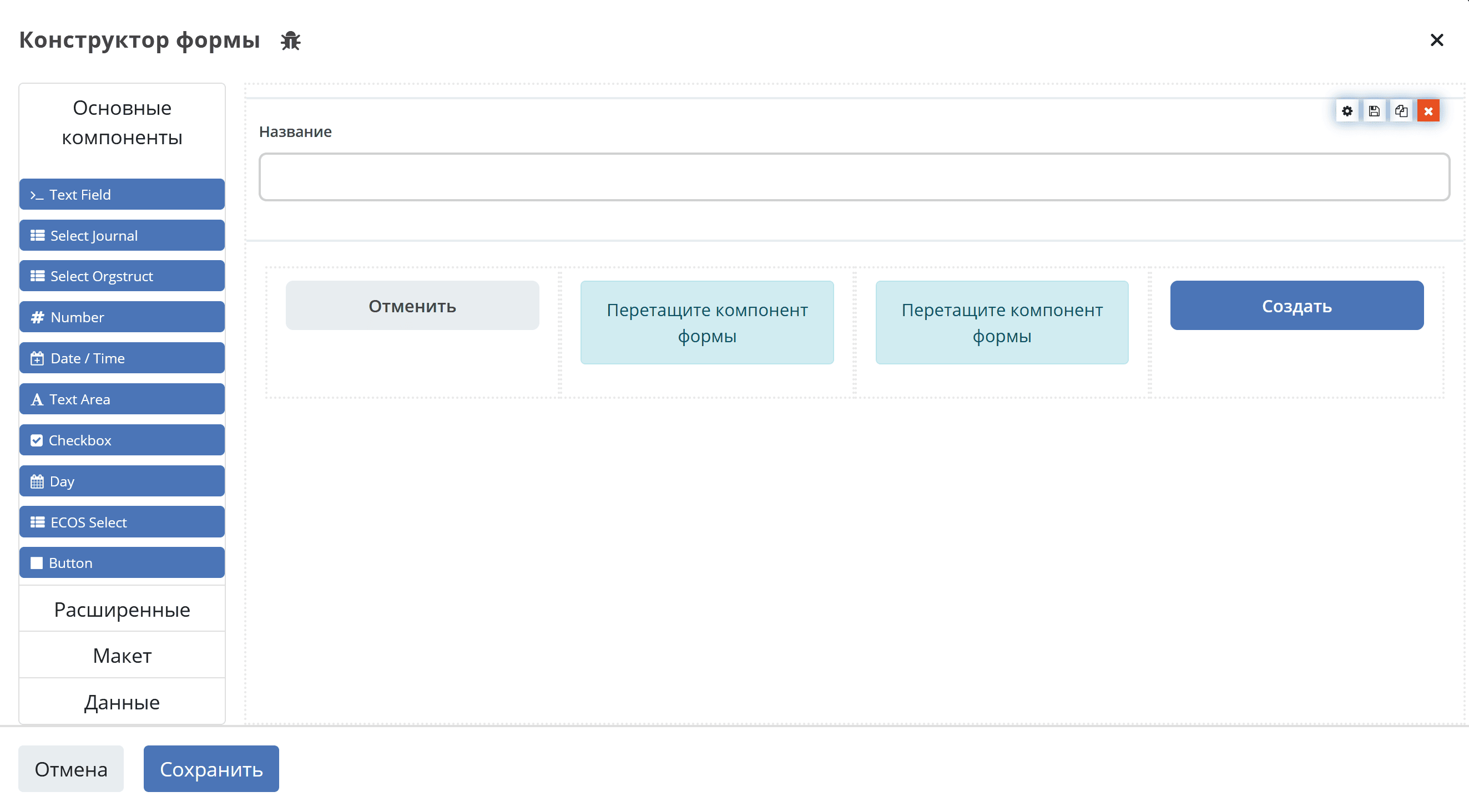
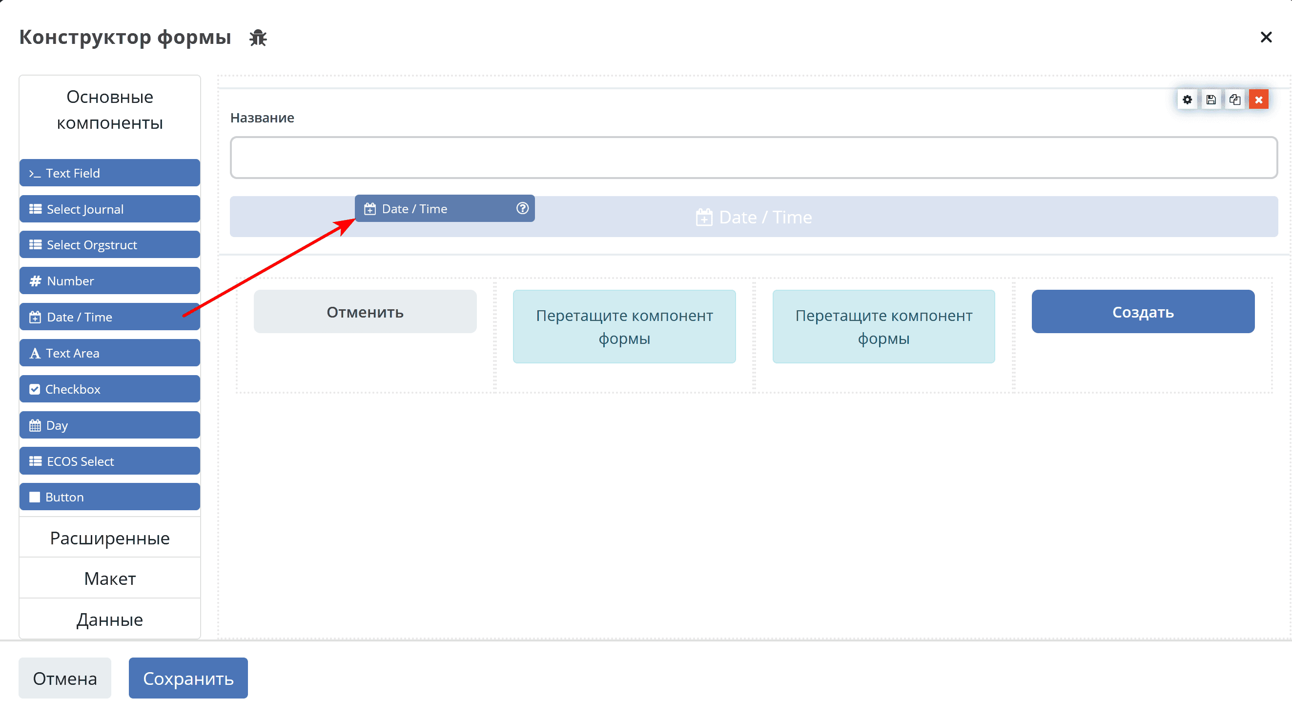
To add a component to the form, drag the component from the left column to the desired location in the form:
Editing a Form Component
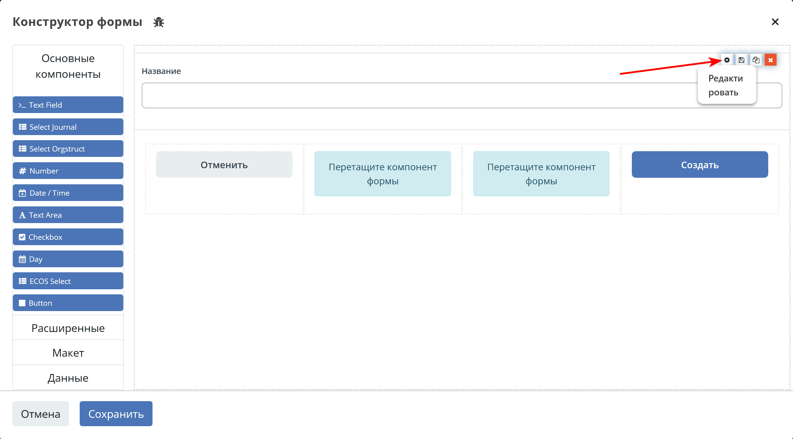
To change a form component, hover the mouse pointer over the component and click the gear icon - the settings form for the component will open.
General Component Settings
Below is a list of general settings that are present in most components.
Configuring Components
Main tabs used for configuration:
Basic. Contains the basic, most frequently used settings.
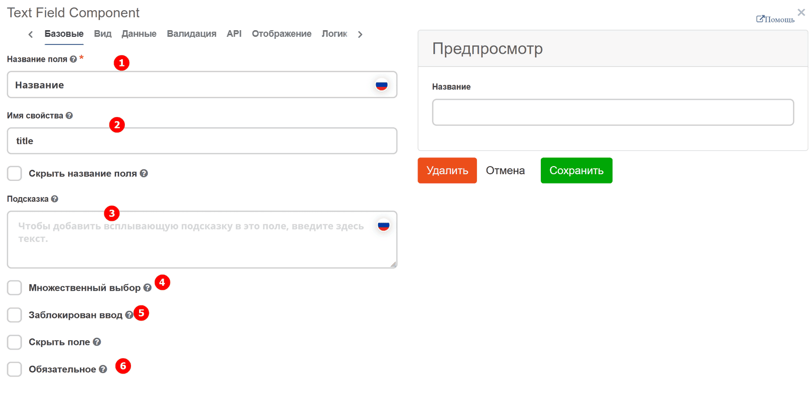
No. |
Name |
Description |
|---|---|---|
1 |
Field Label |
the name of the component as it will appear on the form. |
2 |
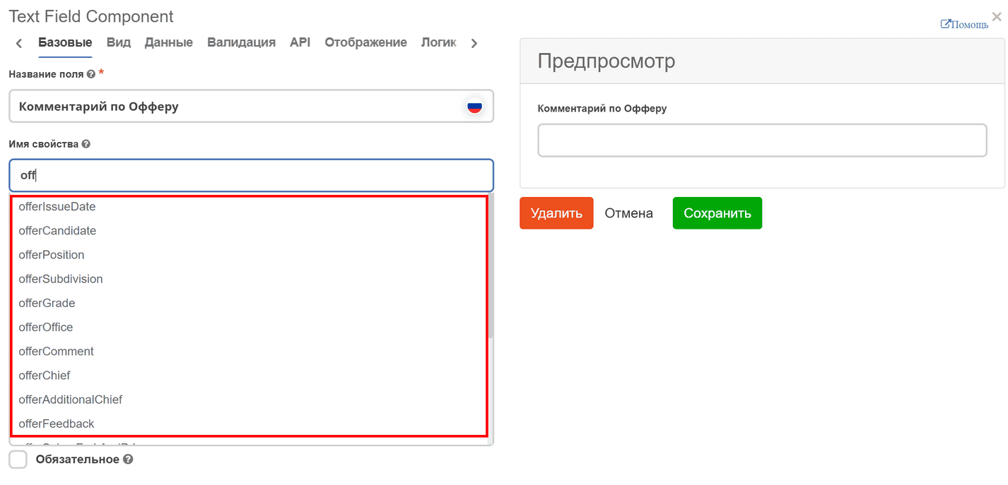
Property Name |
the property name from the data type
When entering a property name, a dropdown list of attributes from the data type for which the form is being created appears (if there is a partial name match). This helps to understand which names are already taken to avoid errors when creating or editing the form.
|
3 |
Tooltip |
a hint that appears when hovering the cursor over the question mark near the field, if necessary. |
4 |
Multiple Selection |
enables multiple selection (needed for selection from a list, journal, or organizational structure). |
5 |
Input Disabled |
disables the ability to enter data into the component. |
6 |
Required |
mandatory field filling. |
Display. Contains display settings. For basic configuration, the following are needed:
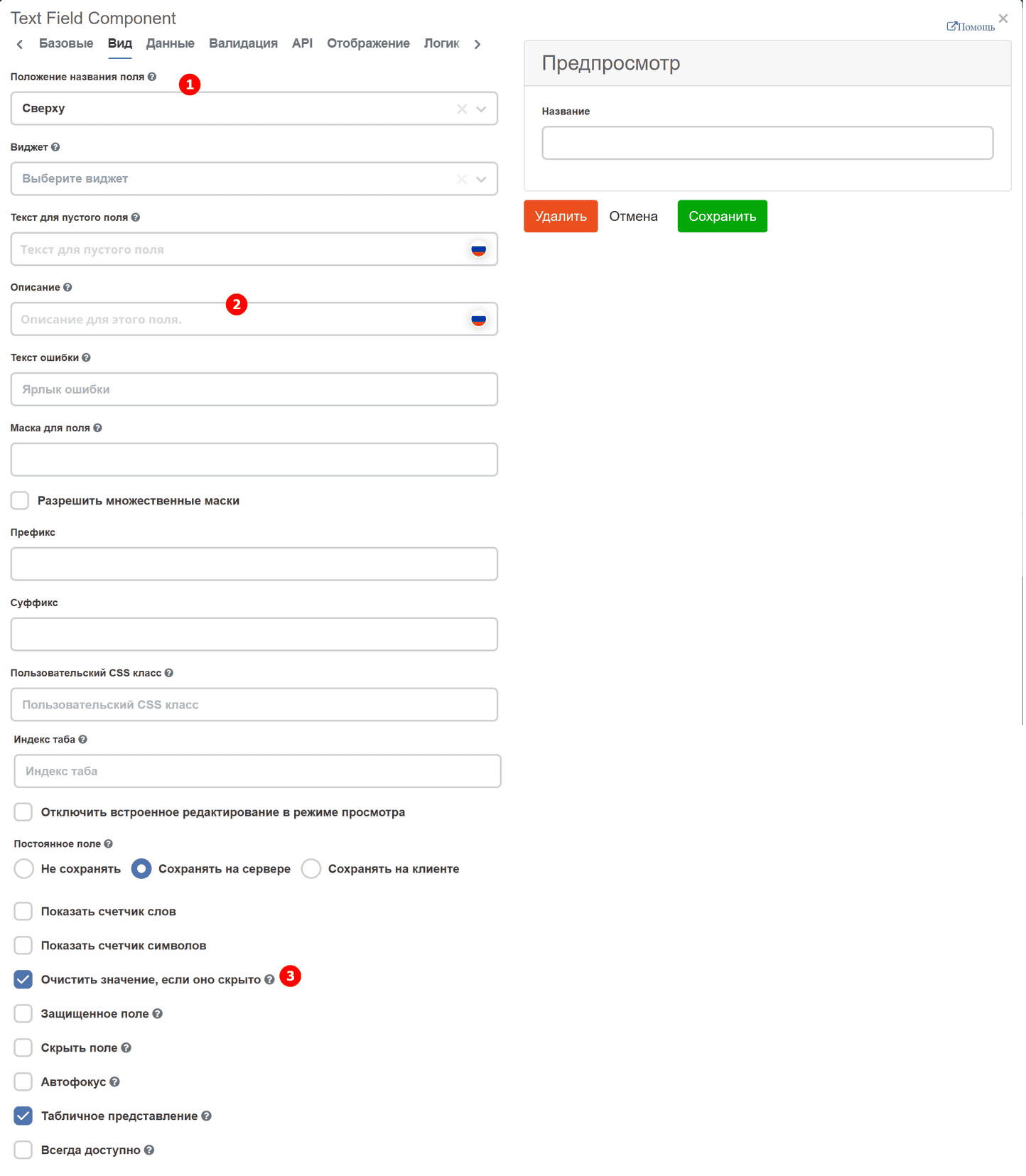
No. |
Name |
Description |
|---|---|---|
1 |
Placeholder Text |
a hint that is displayed before starting to fill the field. Used mainly for text fields. |
2 |
Description |
a hint that is always displayed on the form, unlike the placeholder, if necessary. |
3 |
Clear Value When Hidden |
responsible for clearing data in the component when it is hidden. |
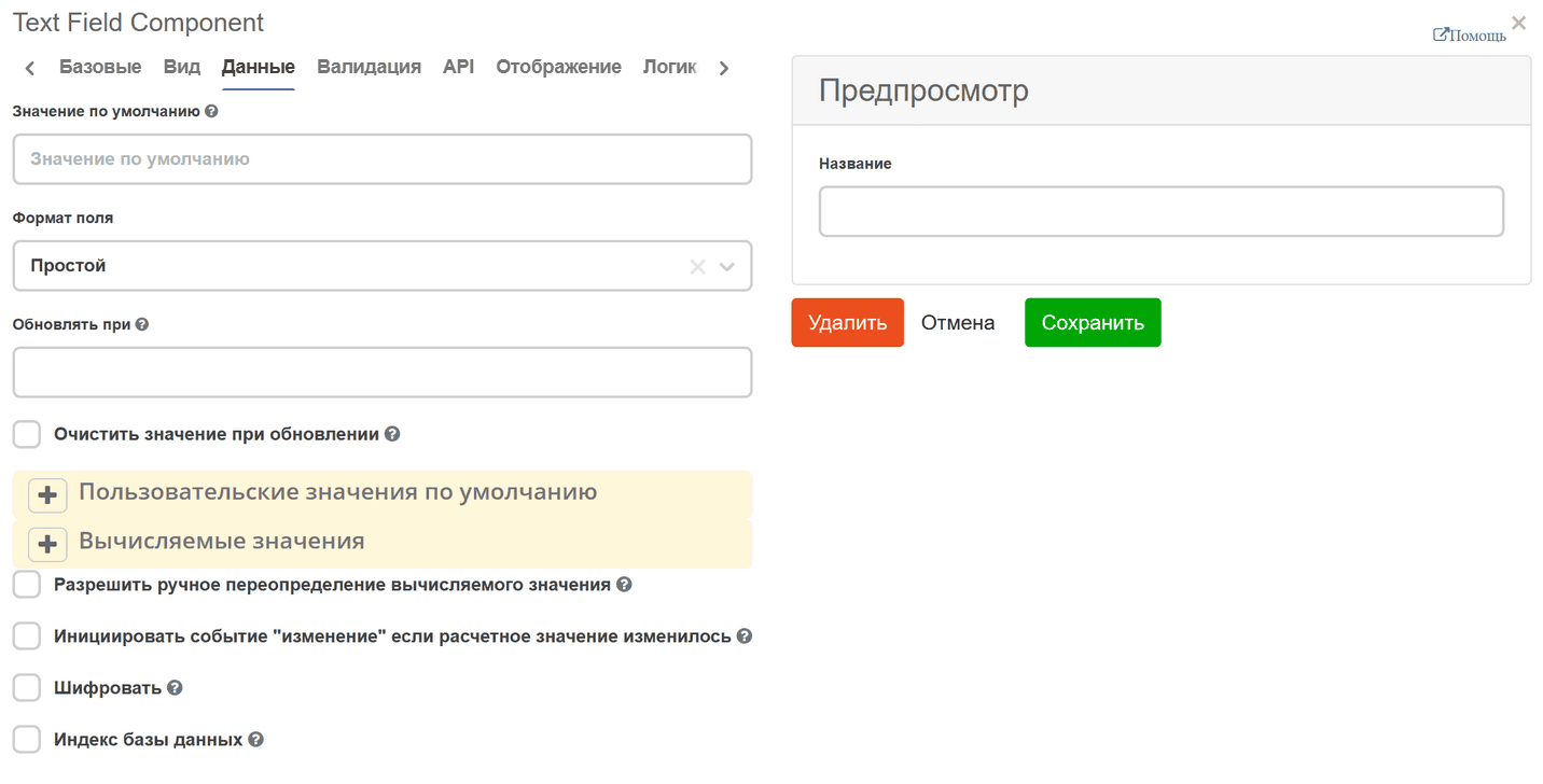
Data. Responsible for automatically populating the field with data. In lists, there is an option to populate the list with static data or data obtained from an asynchronous request.
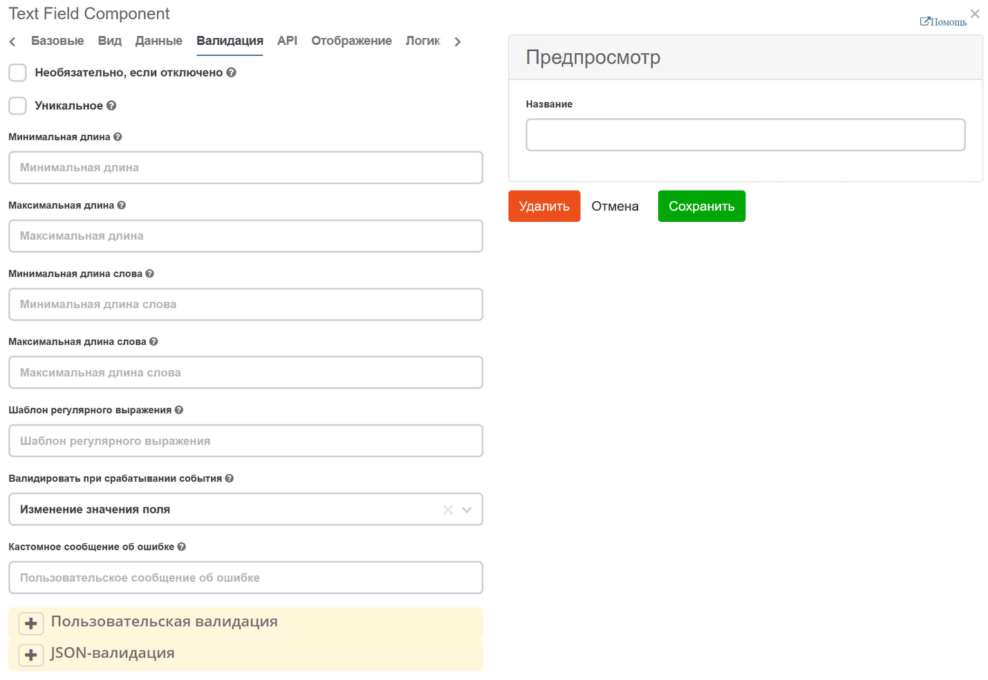
Validation. Responsible for checking the correctness of field filling. Supports both simple checks (checking the length of the entered string or accepting a specific value) and complex ones.
API. Contains the key and attribute for correct data saving. The following fields must be filled in:
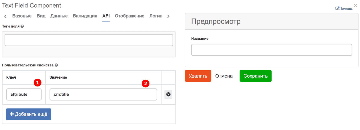
In the Key field, enter the string ‘attribute’, and in the Value field, enter the data as in the title %prefix%_%localName%. For example: initiator
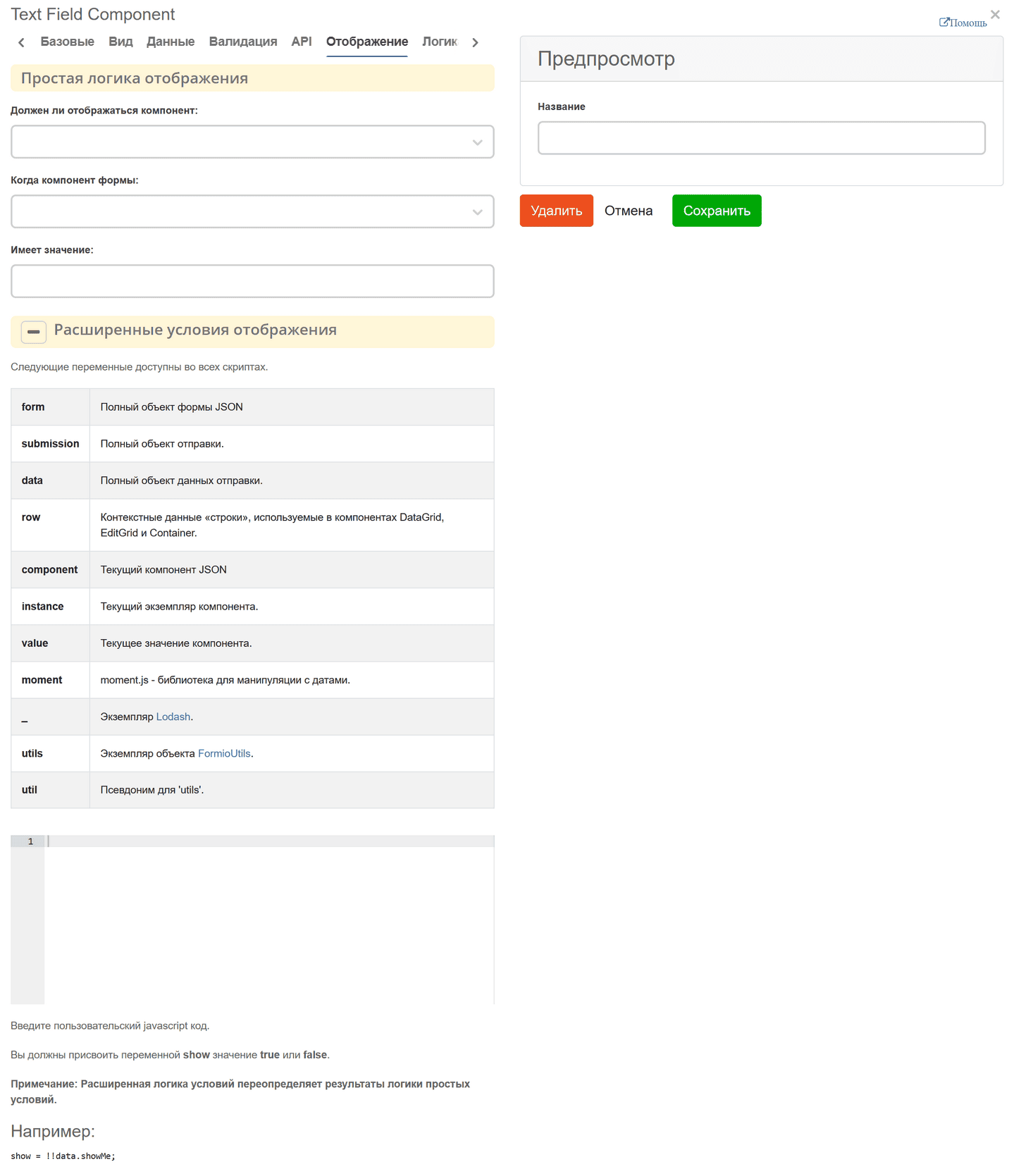
Display. Responsible for configuring the display of the component. Supports both simple logic, such as matching a field value and displaying upon match, and complex logic.
Logic. Custom logic. Adding dynamic behavior to forms:
Show/hide fields.
Changing values, mandatory status, availability of fields.
Performing custom actions via JavaScript.
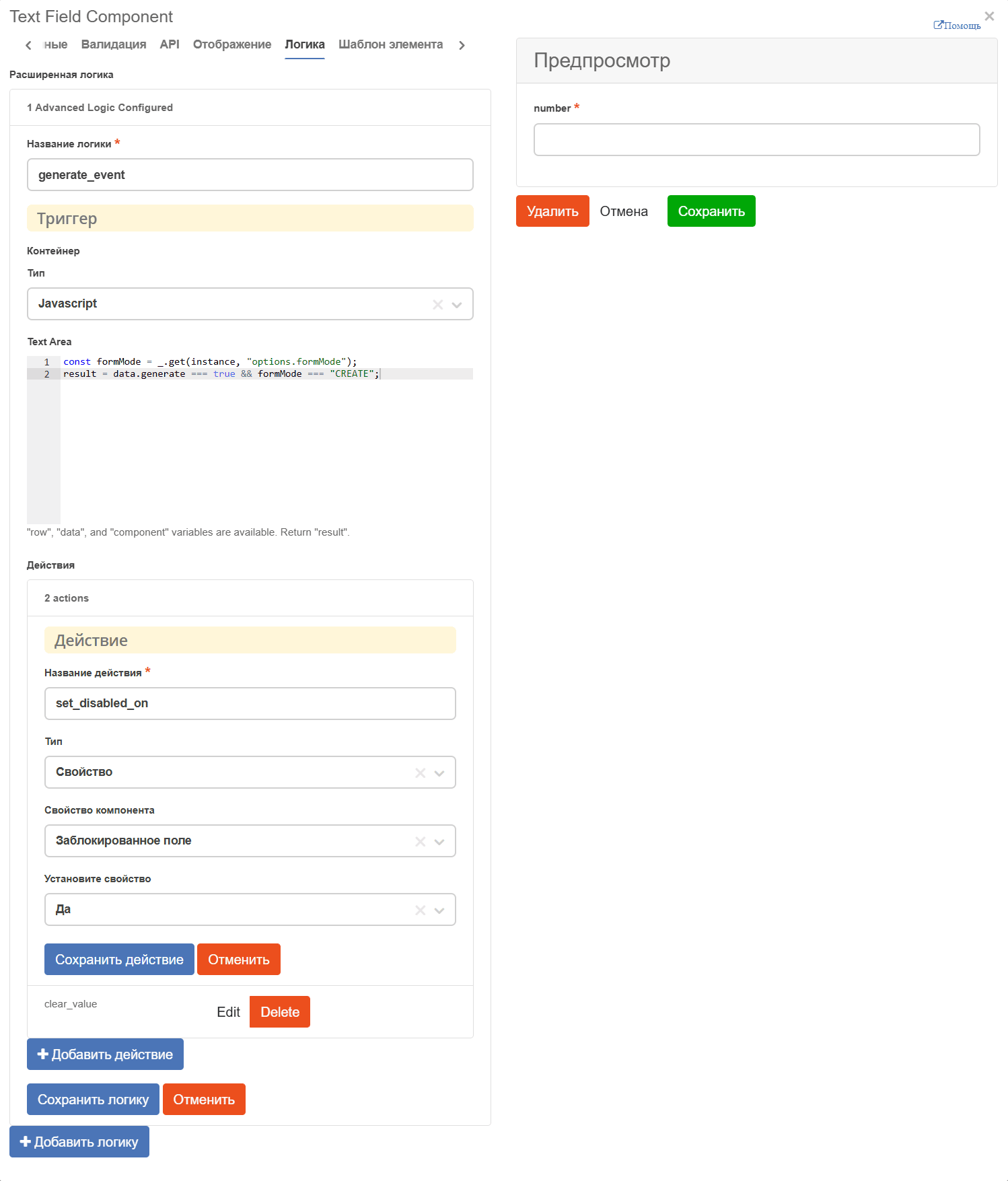
The trigger type defines the structure and firing conditions. The trigger configuration depends on the selected type:
Simple. Uses a standard interface and configuration methods similar to the “Display” tab. See Simple Conditions Documentation
JavaScript. Allows writing custom conditions in JavaScript. The interface and settings match Advanced Display Conditions. See Advanced Conditions Documentation
JSON Logic. An alternative to JavaScript for writing logical conditions using JSON structures. See JSON Logic Documentation
Event. Designed for creating custom events in the form.
The following actions are available that can be performed when the condition is activated:
Property. Changing field settings (visibility, mandatory status, label text, etc.).
Value. Dynamic data update using JavaScript (variables row, data, component, result are available).
Validation. Configuring form data validation rules depending on conditions.
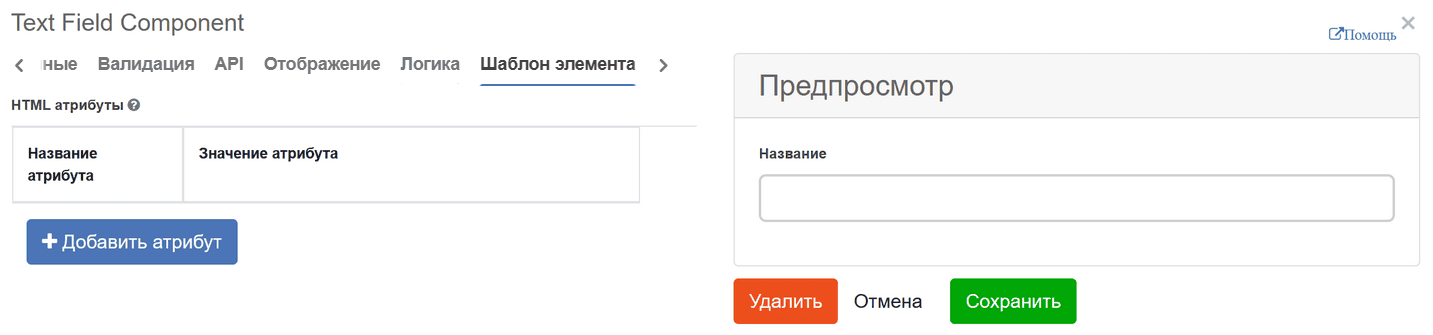
Element Template. Responsible for additional attributes that can be added to the form.
Layout settings. You can change the arrangement of components on the form using HTML attributes. For example, top, bottom, left, and right padding. The values must be entered in a valid CSS format (e.g., 10px) to display correctly. The components will be arranged accordingly depending on which padding fields you configure.