Component Examples. How to
This section contains practical examples of configuring form components in the Citeck platform, as well as typical scenarios («How to») — scripts and configurations for solving common tasks: managing field visibility, auto-filling, event handling, and more.
Columns
The Columns component allows convenient arrangement of form components.
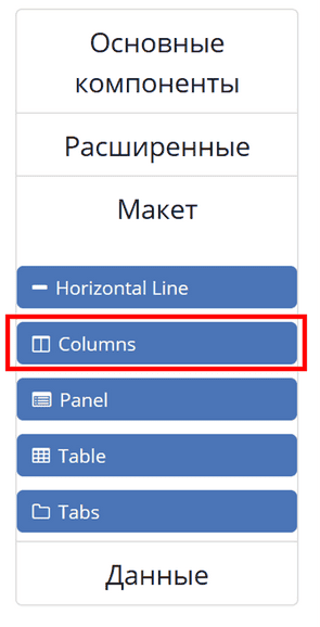
Column Properties - the main configuration parameter, allows defining how the component will be divided into columns. The component is based on Bootstrap Grid.
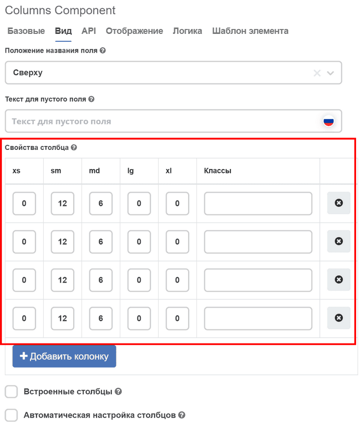
On the «Display» tab in the Column Properties section, specify the number of columns and their size.
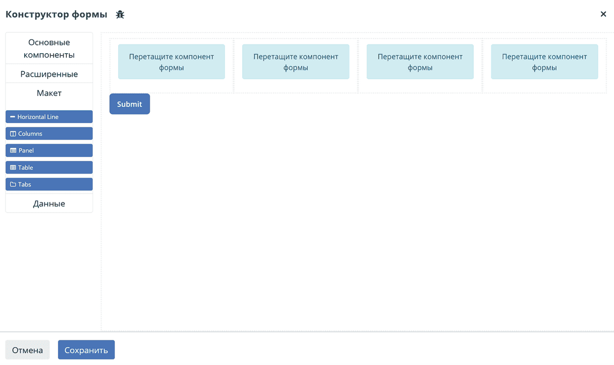
Then click “Save”. Result:
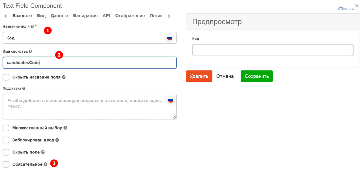
Text field
Text field - text component.
On the «Basic» tab, fill in:
Field Label - the name of the component as it will appear on the form (1).
Property Name - the property name in the data type (2).
Field requirement is set with a separate checkbox. (3)
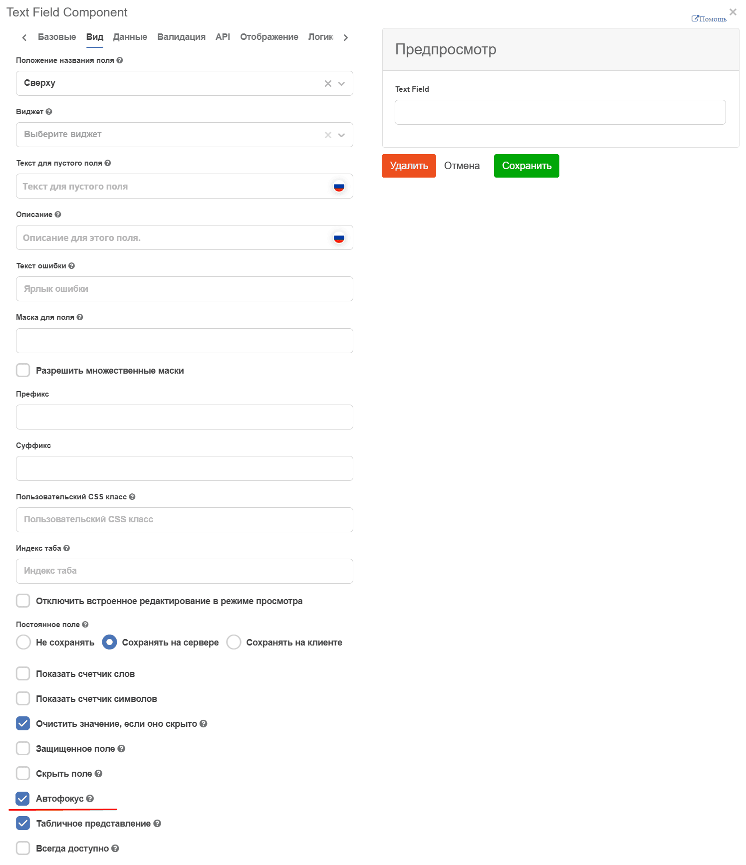
Autofocus - automatically places the input cursor without the need to click on it with the mouse:
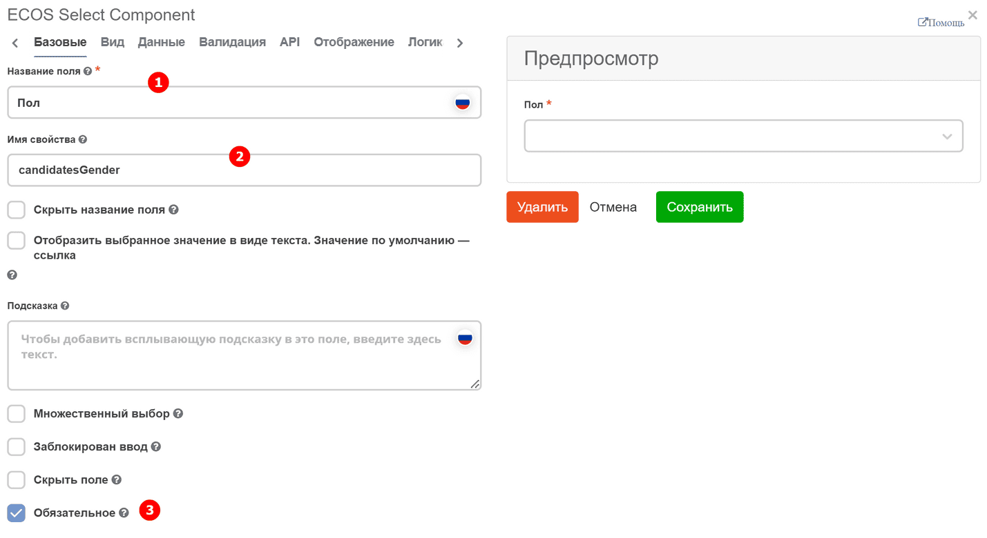
ECOS Select Component
ECOS Select Component - form component for selecting a value from a list.
On the «Basic» tab, fill in:
Field Label - the name of the component as it will appear on the form (1).
Property Name - the property name in the data type (2).
Field requirement is set with a separate checkbox. (3)
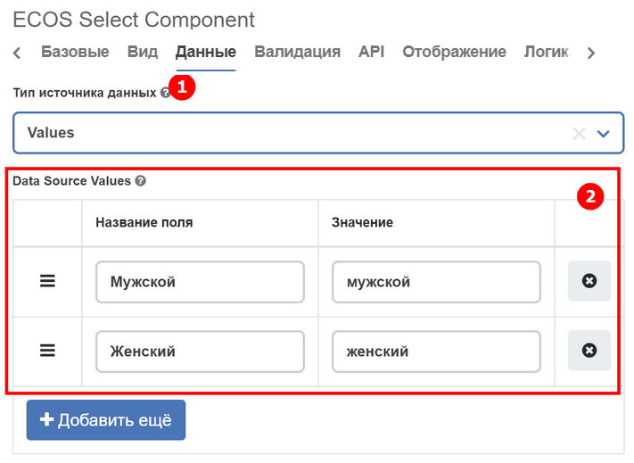
On the «Data» tab in “Data Source Type” select Values (1).
Data Source Values is filled with values that should be available for selection in the list (2):
Field Label - display name,
Value - the contained value.
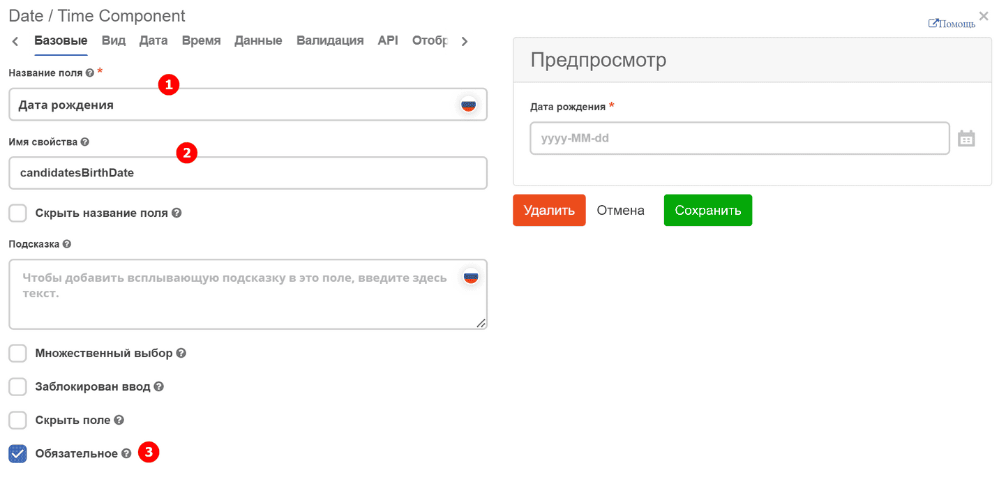
Date / Time Component
Date / Time Component - date/time component.
On the «Basic» tab, fill in:
Field Label - the name of the component as it will appear on the form (1).
Property Name - the property name in the data type (2).
Field requirement is set with a separate checkbox. (3)
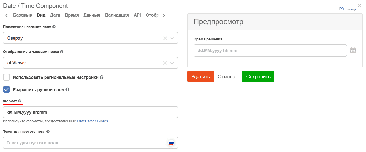
On the «Display» tab, specify the date format (5) and the possibility of manual input (4).
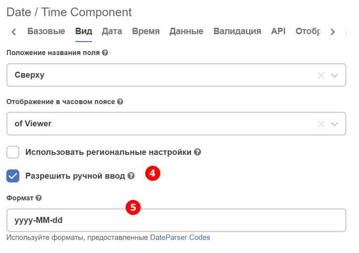
To change the date/time format, go to the tab - «Display» tab - Format:
Default value — current date
To set the current date as the default value, use the customDefaultValue property on the «Data» tab. The property accepts a JavaScript expression whose result is assigned to the value variable.
Note
The static property defaultValue does not support dynamic values (for example, "now" does not work). For dynamic values, always use customDefaultValue.
Configuration example:
{
  "key": "startDate",
  "type": "datetime",
  "input": true,
  "format": "yyyy-MM-dd",
  "enableTime": false,
  "customDefaultValue": "value = new Date();",
  "defaultValue": ""
}
In the Custom Default Value field in the form builder, enter:
value = new Date();
When the creation form is opened, the field will be automatically populated with the current date.
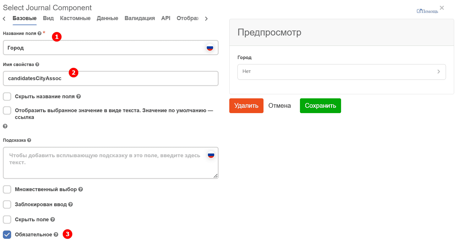
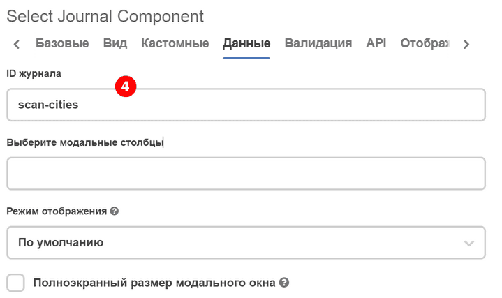
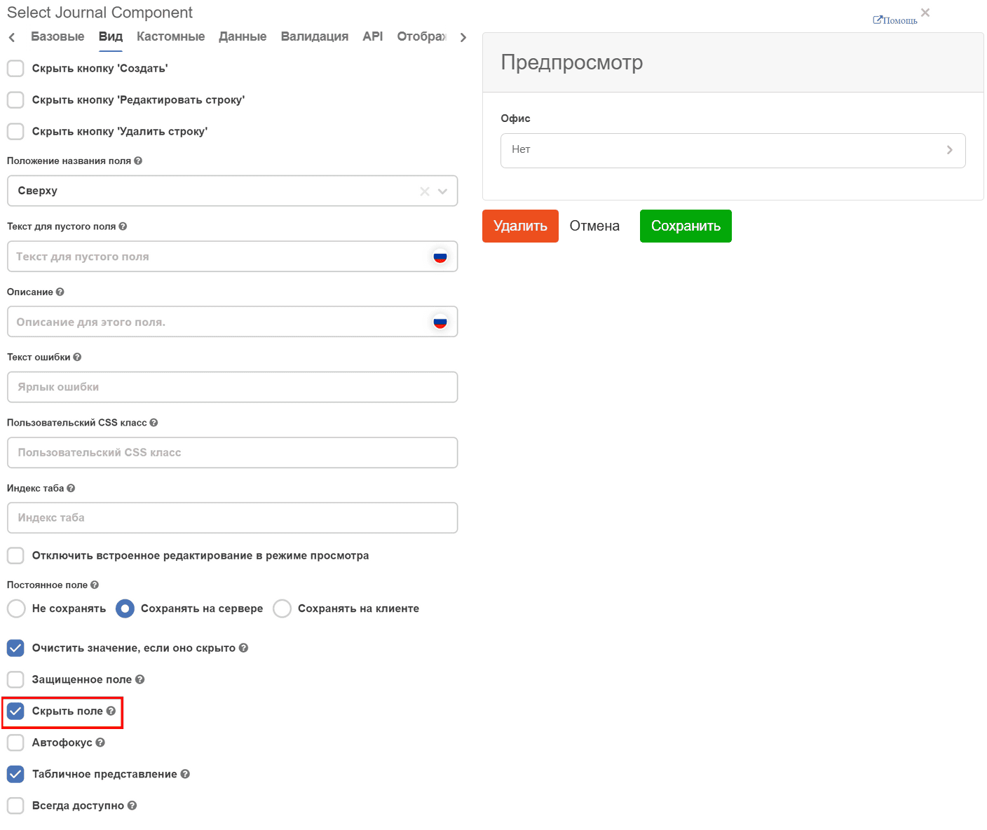
Select Journal Component
Select Journal Component - component for selecting a value from a journal.
On the «Basic» tab, fill in:
Field Label - the name of the component as it will appear on the form (1).
Property Name - the property name in the data type (2).
Field requirement is set with a separate checkbox. (3)
On the «Data» tab, fill in Journal ID - the identifier of the journal that will be used in the component. (4)
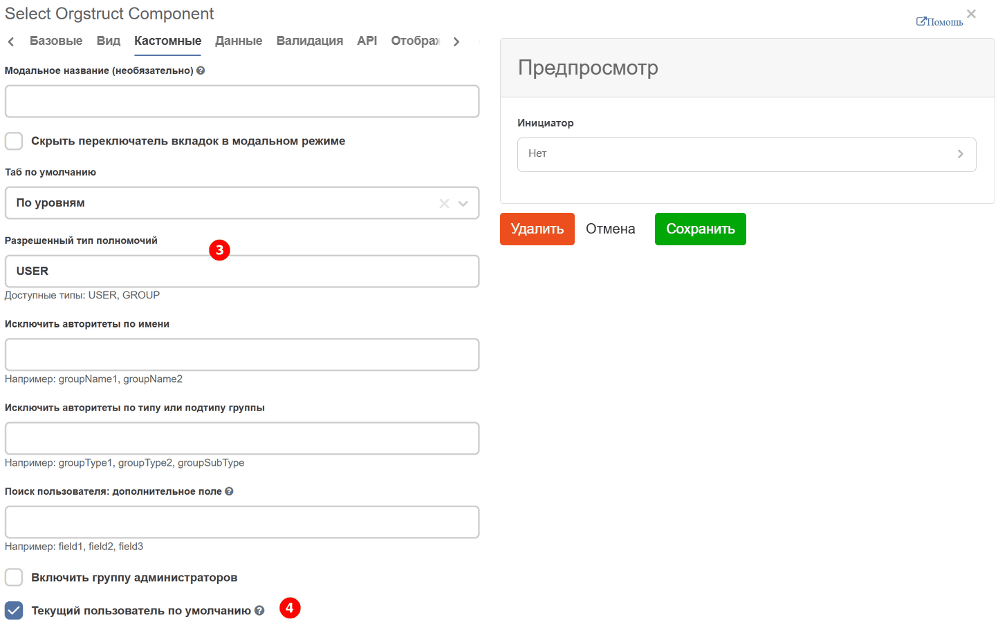
Select Orgstruct Component
Select Orgstruct Component - component for selection from the organizational structure.
On the «Basic» tab, fill in:
Field Label - the name of the component as it will appear on the form (1).
Property Name - the property name in the data type (2).

On the «Custom» tab - you can specify:
allowed «Allowed Authority Type» (3)
Current User by Default - a setting that allows substituting the user who opened the form for creation into the component (4).
Current user by default
To automatically substitute the current user when creating a record, use the currentUserByDefault property. The setting only works in form creation mode (formMode = CREATE).
Configuration example:
{
  "key": "responsible",
  "type": "selectOrgstruct",
  "input": true,
  "allowedAuthorityType": "USER",
  "currentUserByDefault": true,
  "defaultValue": ""
}
Note
The
currentUserByDefaultproperty is a built-in setting of theselectOrgstructcomponent. For other component types, usecustomDefaultValue(see Custom Default Value).
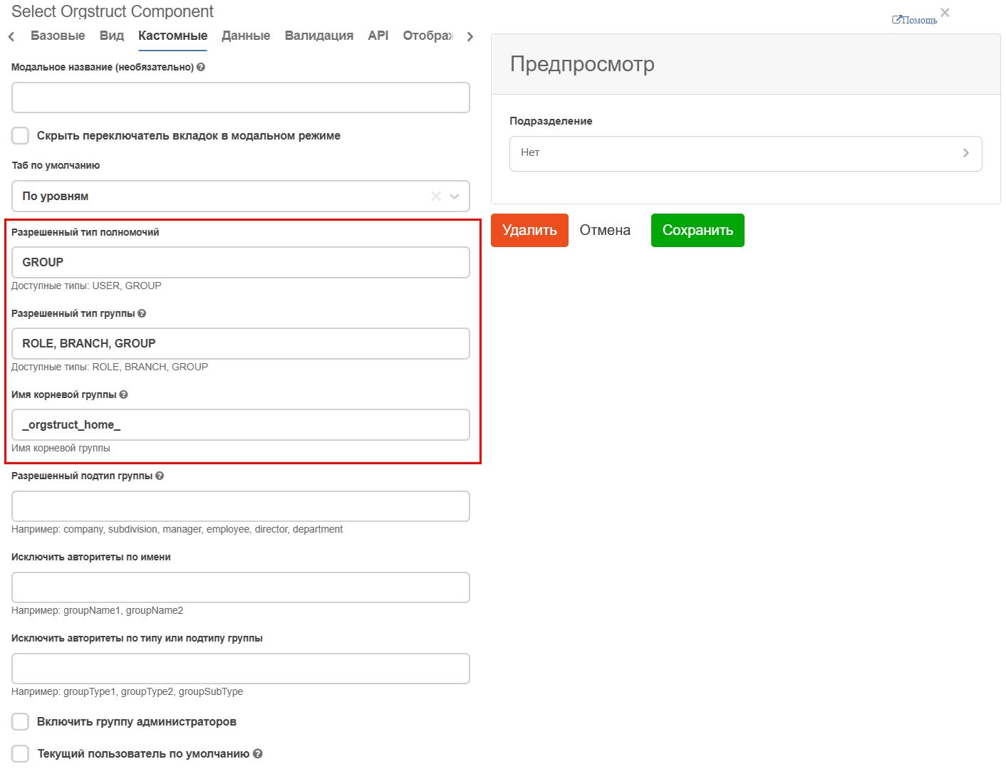
For selecting a department:
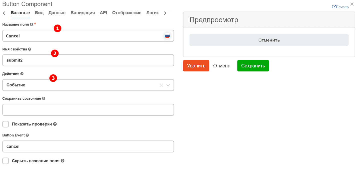
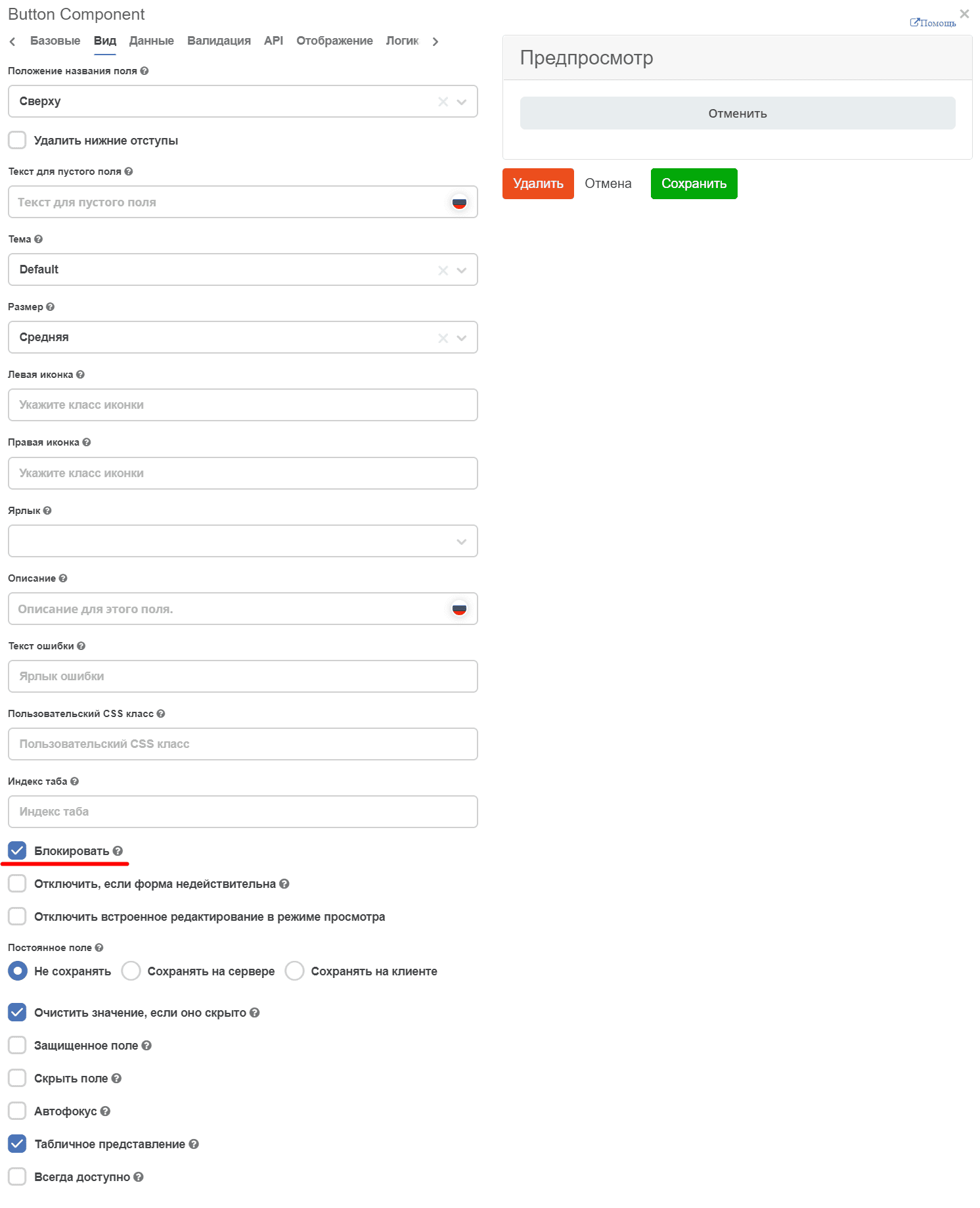
Button Component
On the «Basic» tab, fill in:
Field Label - the name of the button as it will appear on the form (1).
Property Name - the button property name (2).
Actions - specify the button action (3)
To display the button across the full width of the cell, on the “Display” tab, check the “Block” checkbox:
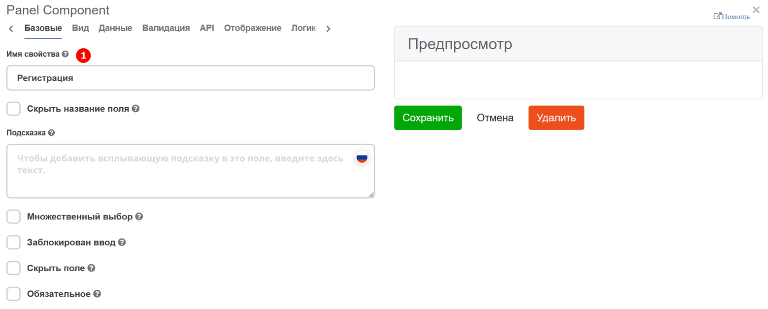
Panel
Panel - a component - a header that contains semantically related components.
Fill in «Property Name» - the component name.
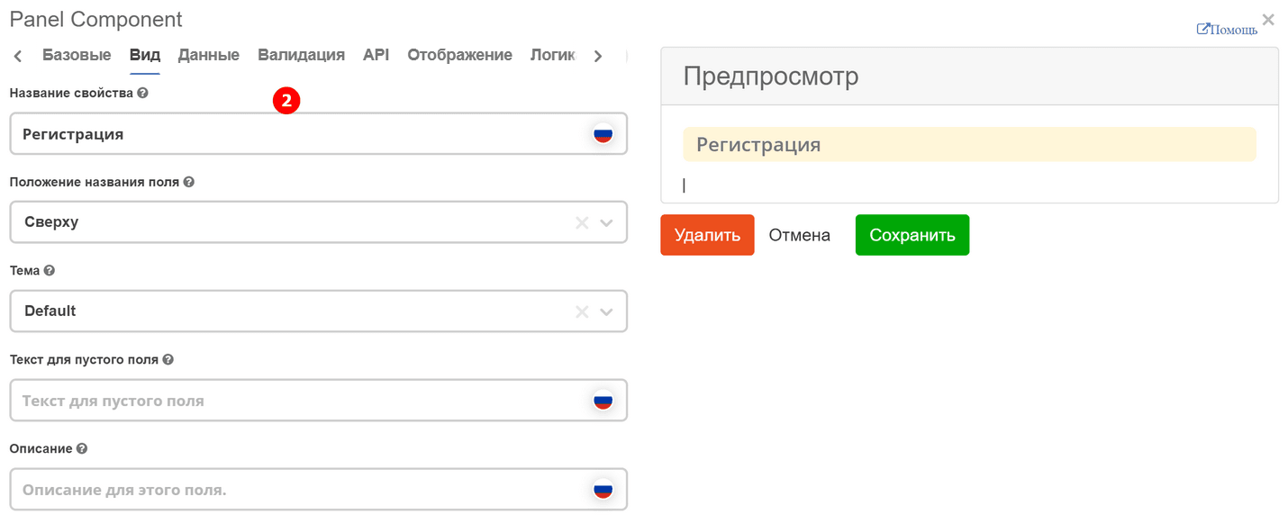
And on the “Display” tab, fill in “Property Label” (2):
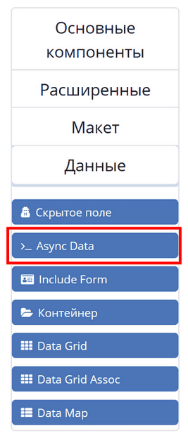
Async Data Component
Async Data Component - asynchronous component.
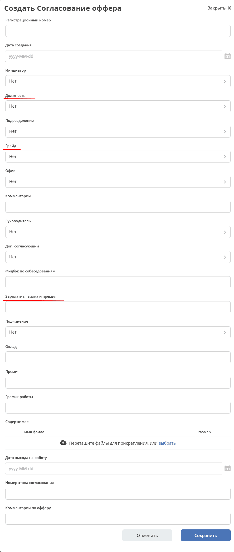
The Grade reference (data type hr-grades-type) contains information about the position (offerposition), salary range (gradesSalary) and bonus (gradesPrize).
When selecting a Position, the corresponding Grade and Salary Range and Bonus fields will be automatically filled:
On the «Async Data» tab, fill in:
Field Label - the name of the component as it will appear on the form (1).
Data Type - data type (2).
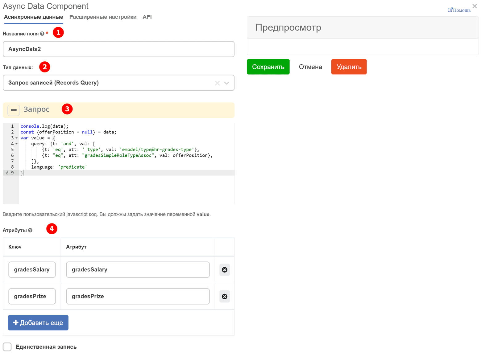
Script explanations (3):
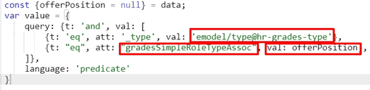
emodel/type@hr-grades-type - the type from which data needs to be obtained.
gradesSimpleRoleTypeAssoc - the type property being compared, from which we get data.
offerPosition - the property we use to compare with the type property from which we get data.
In «Attributes», specify the attributes that need to be obtained (4).
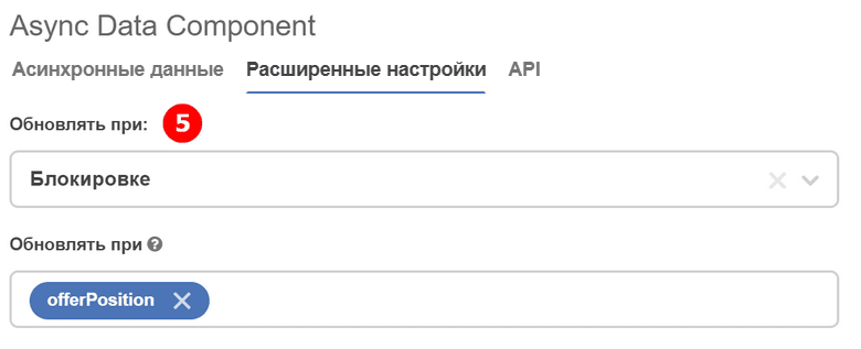
On the «Advanced Settings» tab, fill in:
Update On - parameter where the form element to track is specified (5).
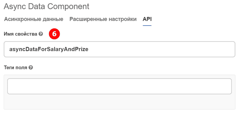
On the «API» tab, fill in:
Property Name - the component property name (6).
For the form component to respond to the async component, make the following settings on the «Data» tab in the Grade component:
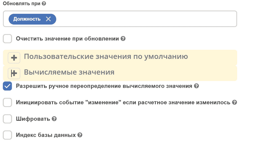
In Update On, specify the component whose changes will trigger the component that needs to get data from the async component.
In Calculated Values:
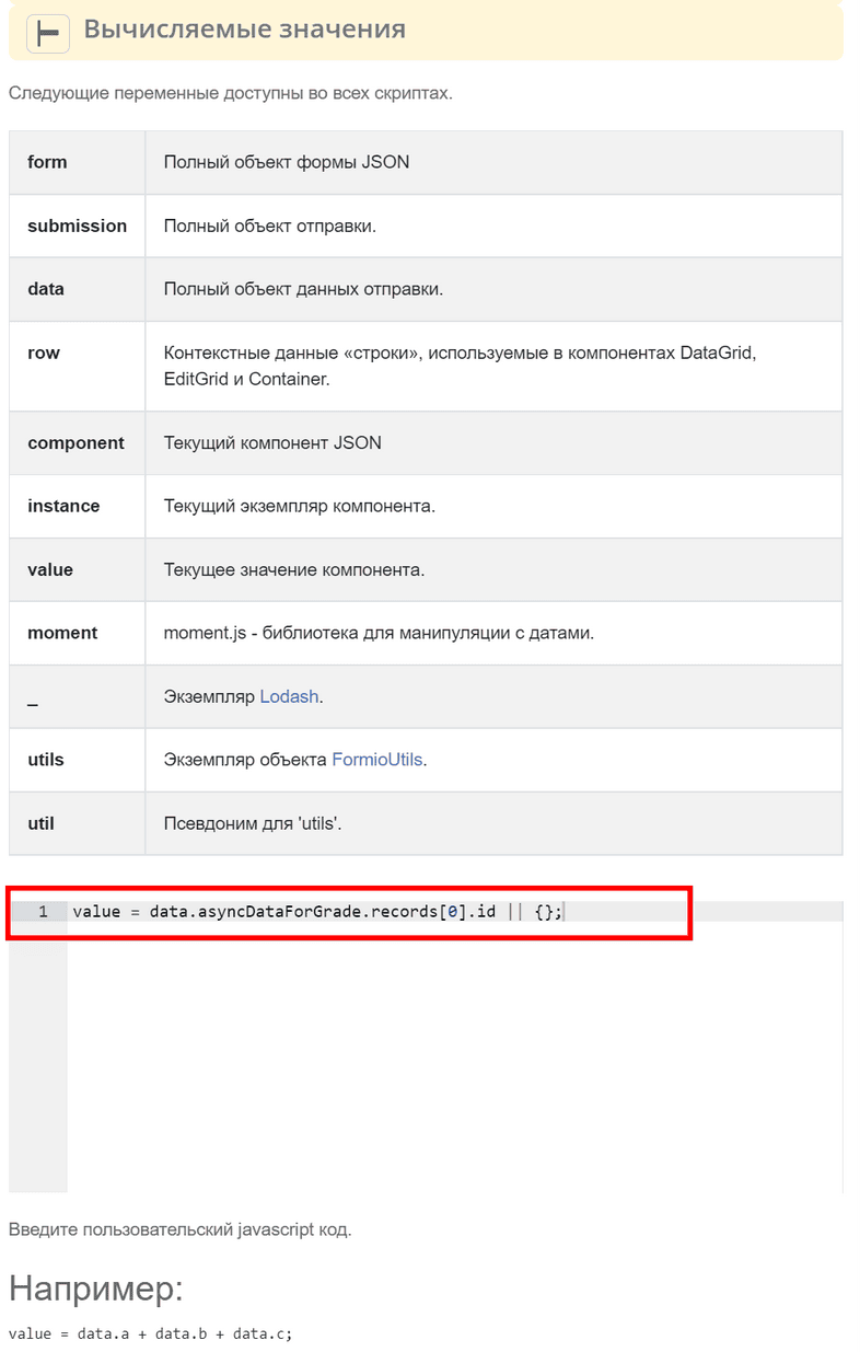
Now when selecting a Position, the «Grade» form component will automatically be set with a value depending on the «Position» component value.
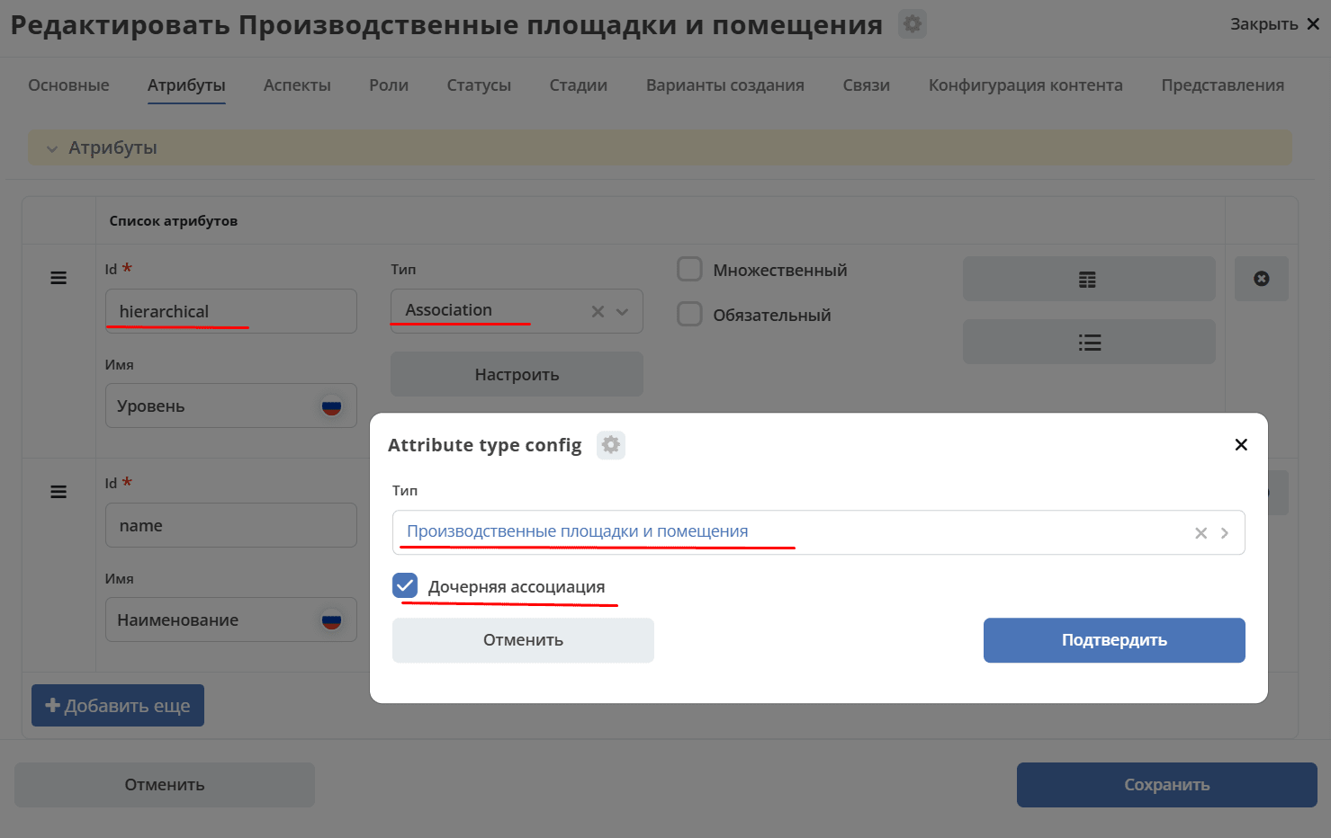
Select Hierarchical Component
The Select Hierarchical component allows selecting elements from a hierarchically organized reference. To configure it, you need to first prepare a data type with a self-referential association.
Step 1. Prepare the data type
In the data type, add an attribute — an association referencing itself. If needed, enable multiplicity.
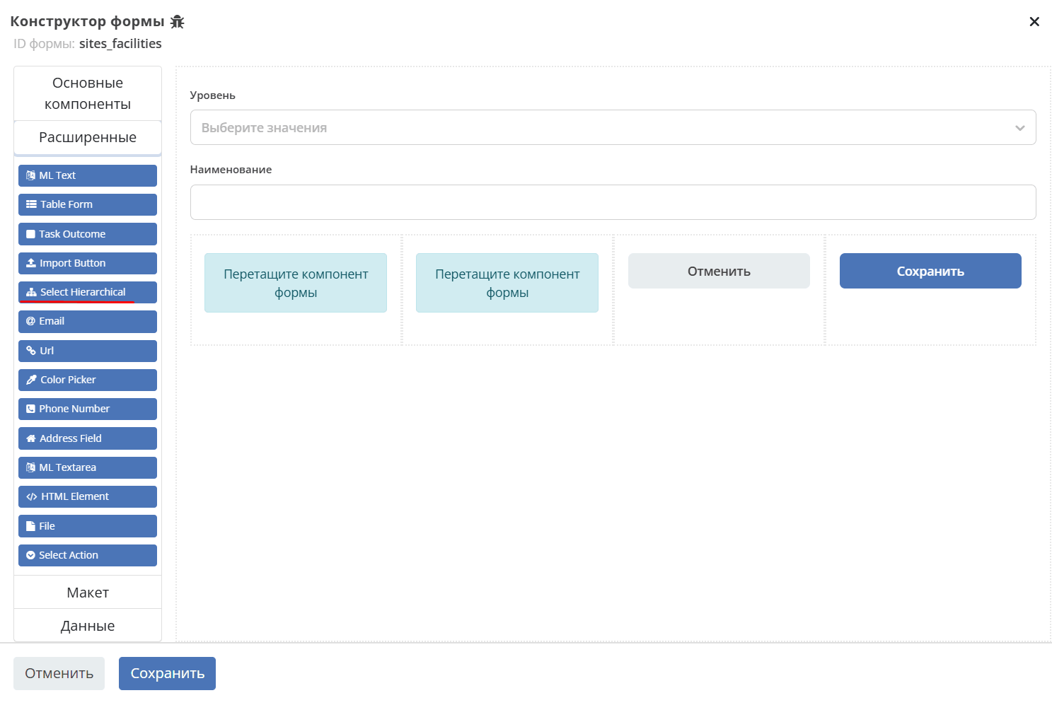
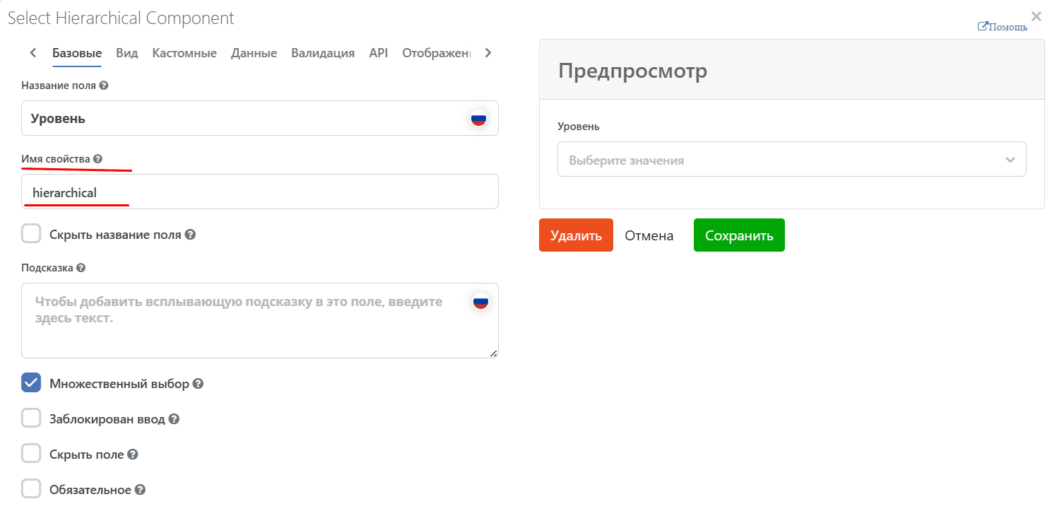
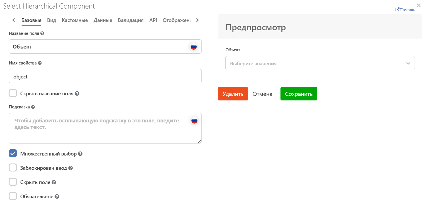
Step 2. Add the component to the form
Add the Select Hierarchical component to the form, specifying the attribute name from the data type in the Property Name field:
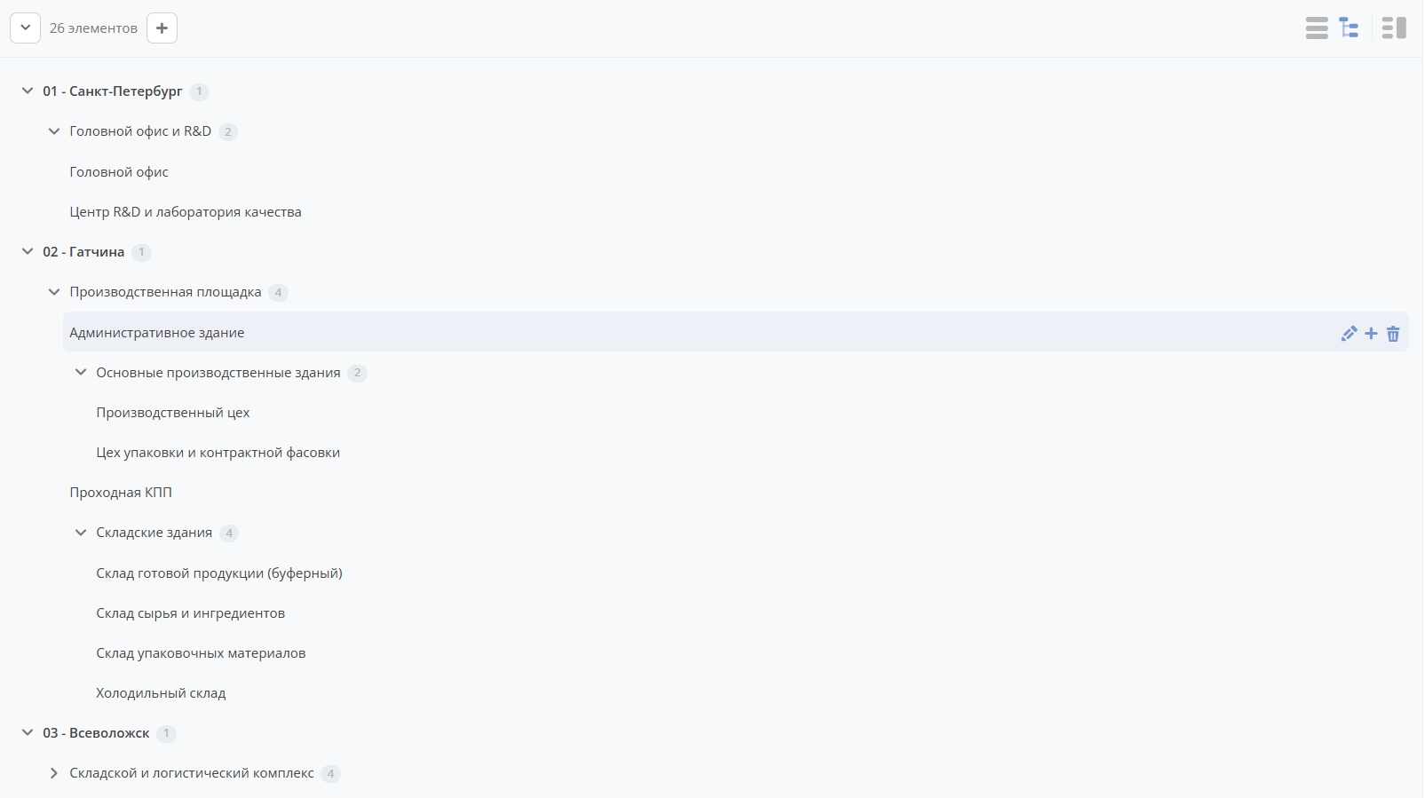
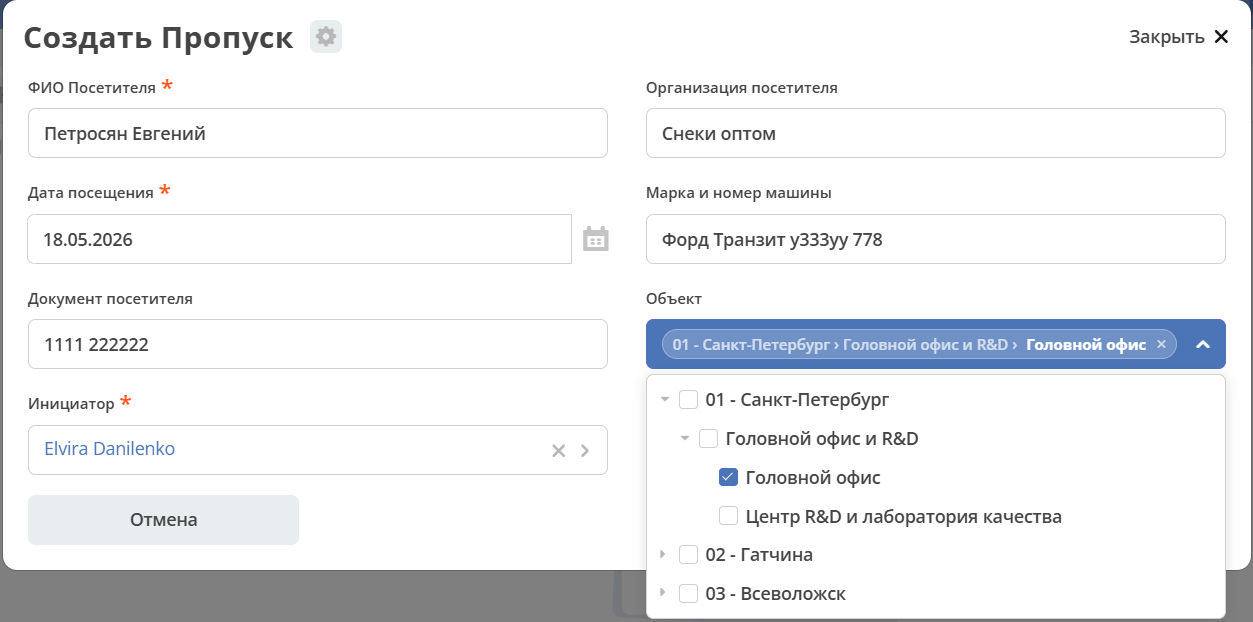
Result:
For more details see
A data type can be used in another data type via an association.
To do this, add an association attribute in another data type pointing to the data type with hierarchy.
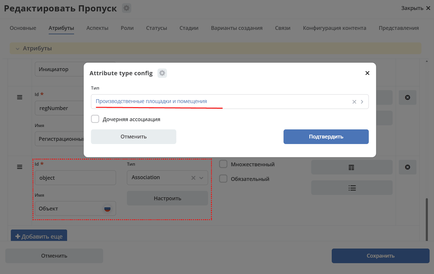
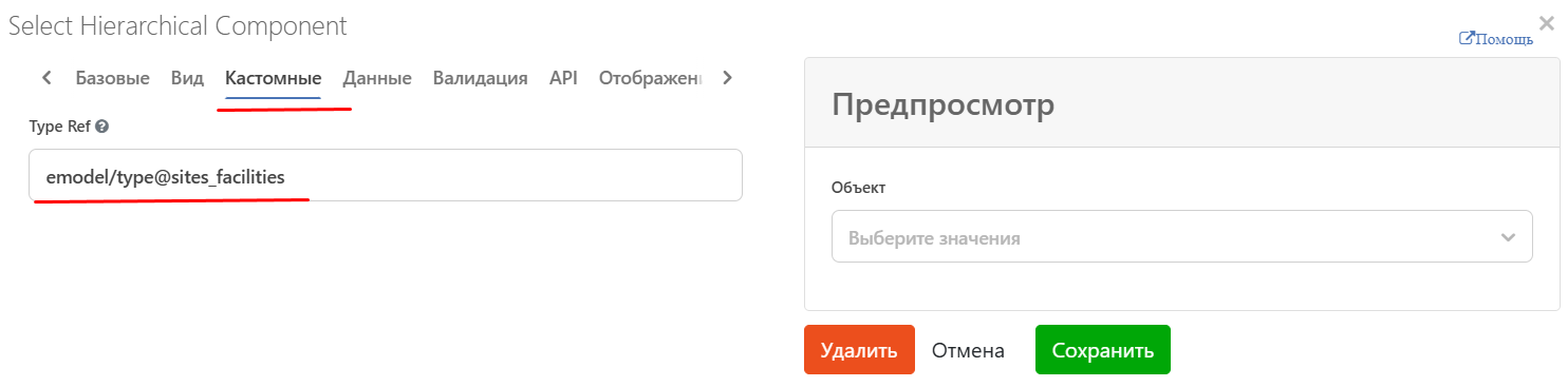
On the form, use the Select Hierarchical component, specifying the association attribute name in the Property Name field. On the Custom tab, specify the hierarchical data type prepared in step 1.
Result:
How to
Make a component non-editable
«Display» tab - Hide Field - makes the component non-editable.
Hide a field on the form if it is empty
Useful, for example, on kanban board:
Script text:
show = !_.isEmpty(value)
Status
On the document form, status can be displayed as follows:
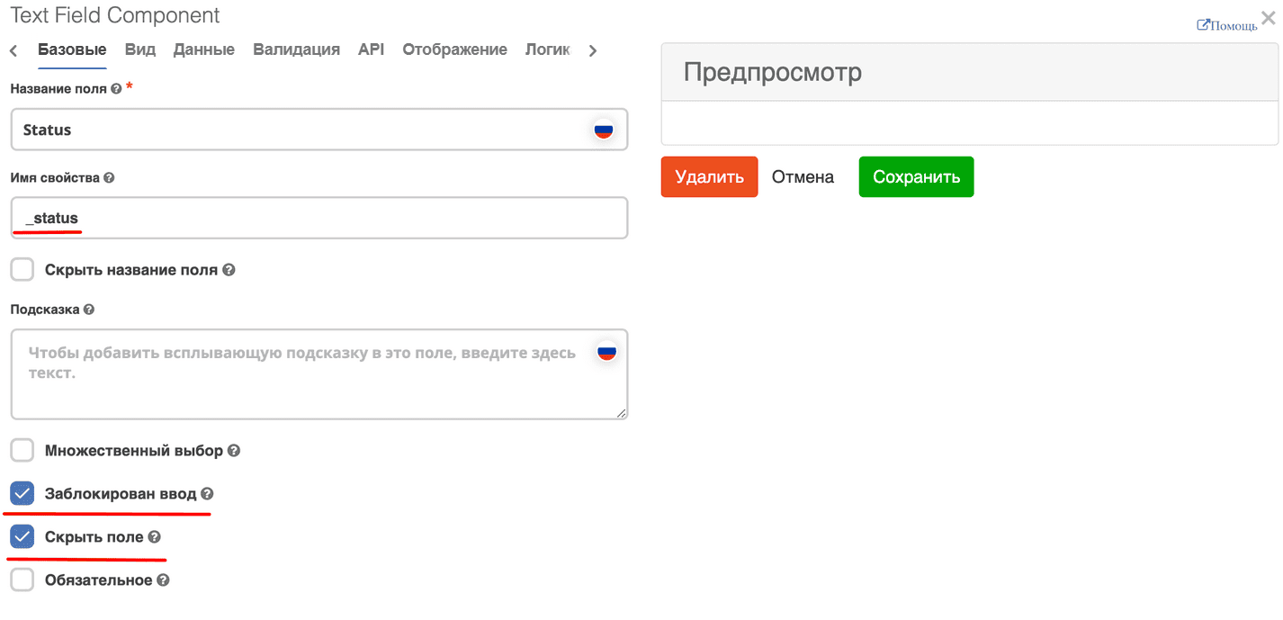
In the Text field component:
field label can be any,
property name - _status,
hide and disable input if it should not be displayed on the form.
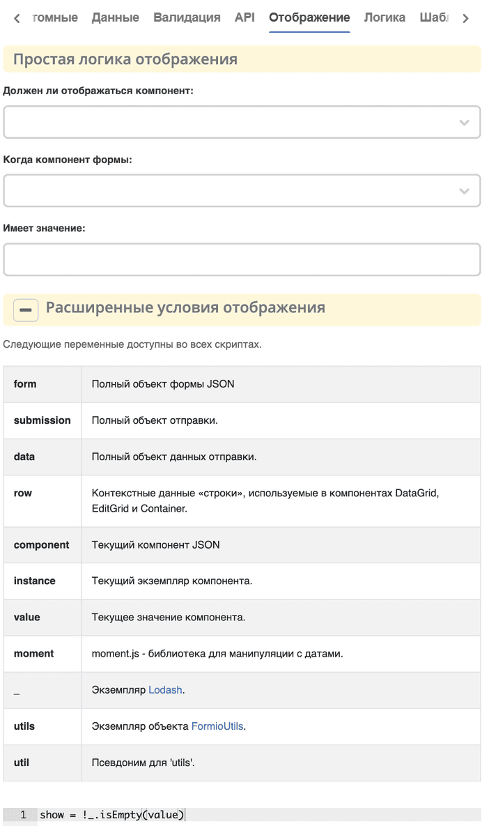
Show field via “logic”
On the «Display» tab, go to Advanced Display Conditions:
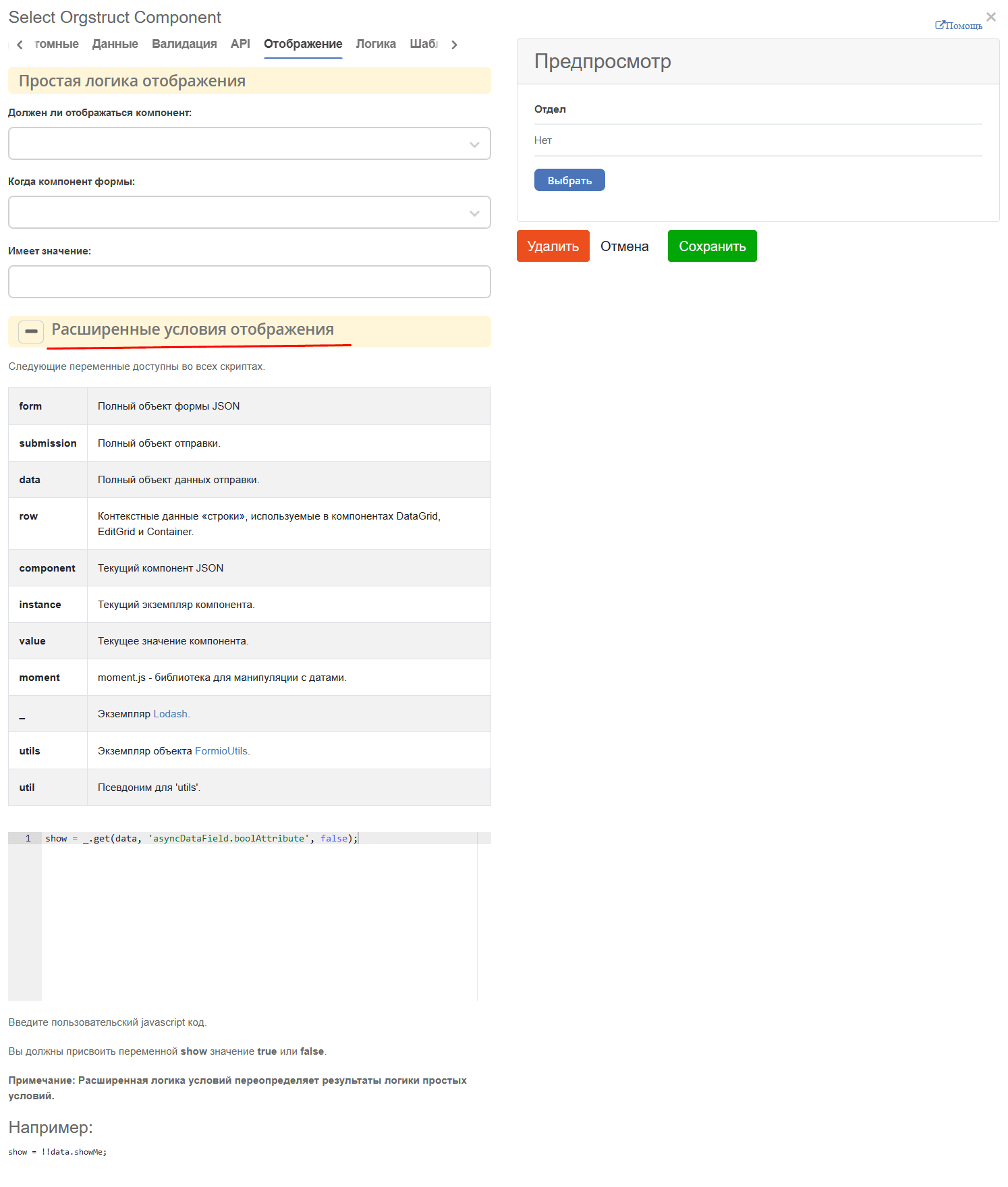
show = _.get(data, 'asyncDataField.boolAttribute', false);
Instead of asyncDataField and boolAttribute, use your data. If needed, the logic in the script can be extended.
If logic for multiple attributes is needed, you can use the Panel component. Place the required attributes inside it. Visually, the panel can be configured so its presence is not displayed.
Show field only in a specific form mode
On the «Display» tab, go to Advanced Display Conditions:
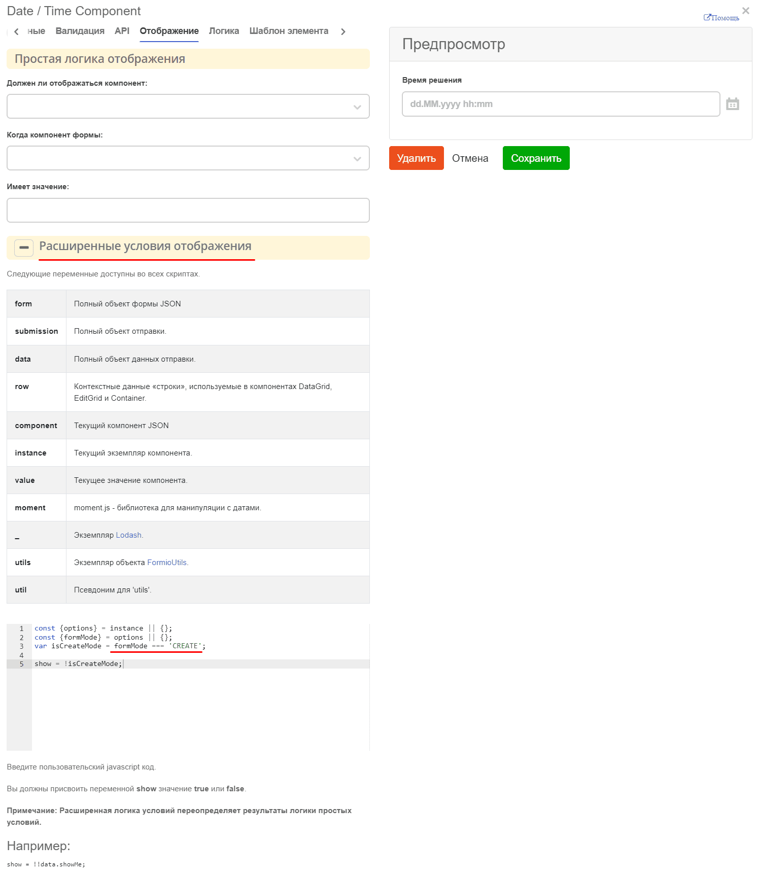
const {options} = instance || {};
const {formMode} = options || {};
var isCreateMode = formMode === 'CREATE';

show = !isCreateMode;
where formMode can be:
CREATE - creation form;
VIEW - view form;
EDIT - edit form
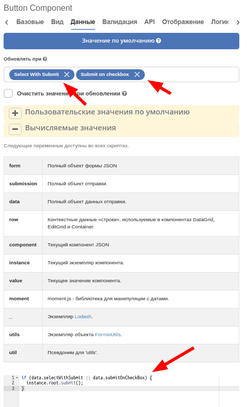
Processing form results for checkbox elements, dropdown lists / submit for dropdown checkbox lists
To make the form submit when selecting an element in a dropdown list or clicking a checkbox, on the submit button in the “Data” tab:
In the “Update On” field, add a dependency on form components whose changes we are interested in.
In the “Calculated Values” field, add logic for auto-submit triggering:
if (data.selectWithSubmit || data.submitOnCheckBox) {
instance.root.submit();
}
where
data - form data;
selectWithSubmit and submitOnCheckbox - keys of components on the form;
instance - current component (button);
instance.root - current form where the button is added.
Configuration example:
How to load an image from external file storage to a form?
For auto-filling form fields, you can add a button and set “Actions” = Custom. With this choice, a field for entering custom javascript code appears at the bottom. In this field, you can load the required data and set it on the form as follows:
const submission = instance.root.submission;
instance.root.submission = {
...submission,
data: {
...(submission.data),
// Заполняем поле с файлом
uploadField: contentData,
// Заполняем текстовое поле
textField: 'Размер файла: ' + contentData[0].size
}
};
where
instance - current component (button);
instance.root - the form containing our button;
instance.root.submission - form data.
With simple text/numeric/boolean fields, you can simply put the required value in data. For content fields, you need to first upload the content to the server as a temporary file.
const formData = new FormData();

formData.append('file', file);
formData.append('ecosType', 'temp-file');
formData.append('mimeType', file.type);
formData.append('name', file.name);

return ecosFetch('/gateway/emodel/api/ecos/webapp/content', {
method: 'POST',
body: formData
}).then(r => r.json()).then(data => data.entityRef);
where
file - File instance - https://developer.mozilla.org/en-US/docs/Web/API/File
As a result of this request, we will get a RecordRef of the temporary file.
Then you need to get a json description from the temporary file, which is needed for the form component:
Records.get(tempFile).load('_as.content-data[]?json').then(it => it.map(element => {
element.data = { 'entityRef': element.recordRef };
}));
The obtained data can be set on the form as shown in the first script.
Configuration example:
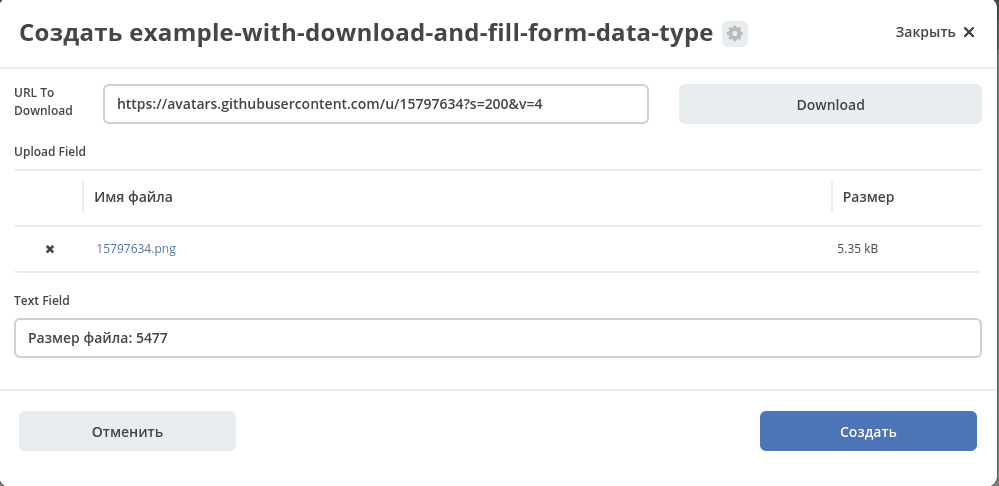
Type and form example:
You can load these artifacts, open the journal http://localhost/v2/journals?journalId=type$example-with-download-and-fill-form-data-type , create a new entity and click the Download button on the form.
How to provide text highlighting based on a flag?
To configure custom styles inside a form, you can
а) Добавить на форму панель (Макет → Panel), в которую добавить все элементы формы и настроить “Пользовательский CSS класс” на вкладке “Вид”, который будет однозначно идентифицировать нашу форму. Это нужно чтобы избежать влияния стилей на другие части системы (назовем этот класс в нашем примере ROOT_PANEL_CLASS).
б) Добавить на форму компонент html (Расширенные → HTML Element), который настраиваем следующим образом:
On the “Basic” tab, check “Hide Field”
On the “Display” tab in the “Content” field, first write arbitrary text (this is needed so the component is visible in the editor and can be edited) and then place opening and closing <style></style> tags, inside which configure custom styles. For styles to work only within our form, they need to be described in the format .ROOT_PANEL_CLASS .inner_class { __styles__ }, where ROOT_PANEL_CLASS is the class we configured in step 1, and inner_class is the class of the element inside the form.
To highlight certain text based on a flag value, you can do the following:
а) Добавить на форму HTML компонент
In the “Display” → “Custom CSS Class” field, enter a class that will uniquely identify our html component (for example, HTML_TO_HIGHLIGHT)
In the “Display” → “Content” field, write arbitrary text that will be displayed to the user and mark up the parts of this text that need to be highlighted depending on conditions using classes.
For example:
Текст до <span class="text-to-select">текст для выделения</span> текст после
б) Добавить на форму “Основные компоненты” → Checkbox и делаем его скрытым в “Базовые” → “Скрыть поле” если пользователю его значение знать и менять не нужно.
в) Добавить еще один html компонент:
Set “Basic” → “Hide Field” → “Yes”
In the “Display” → “Content” field, write arbitrary text so the field is visible in the editor
Data → Update On → Checkbox (from step b)
In the “Logic” tab, add new logic:
Trigger: Simple logic - when the form component Checkbox (from step b) equals true.
Actions: Type - Property, Component Property: Content, In the appeared Content field, enter our styles inside <style></style> tags, not forgetting to specify the class from step (a) to avoid accidentally changing the appearance of other parts of the system. For example:
<style>
.HTML_TO_HIGHLIGHT .text-to-select {
color: red;
font-weight: bold;
}
</style>
Attached is a form with a configuration example: