Panel
The Panel control allows grouping multiple form elements into a visually distinct block with a title. It supports dynamic display of field values in the title and changing the panel style via Bootstrap CSS classes.
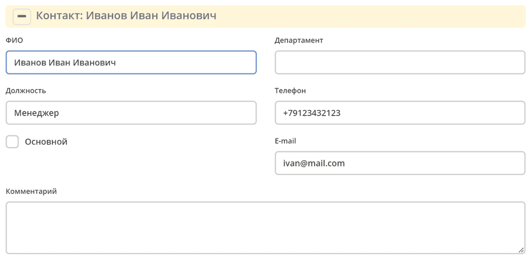
In the View tab, in the Property Name field, you can display the value from any component located inside this panel. Placeholders of the form ${…} are used.
For example: ${someField}
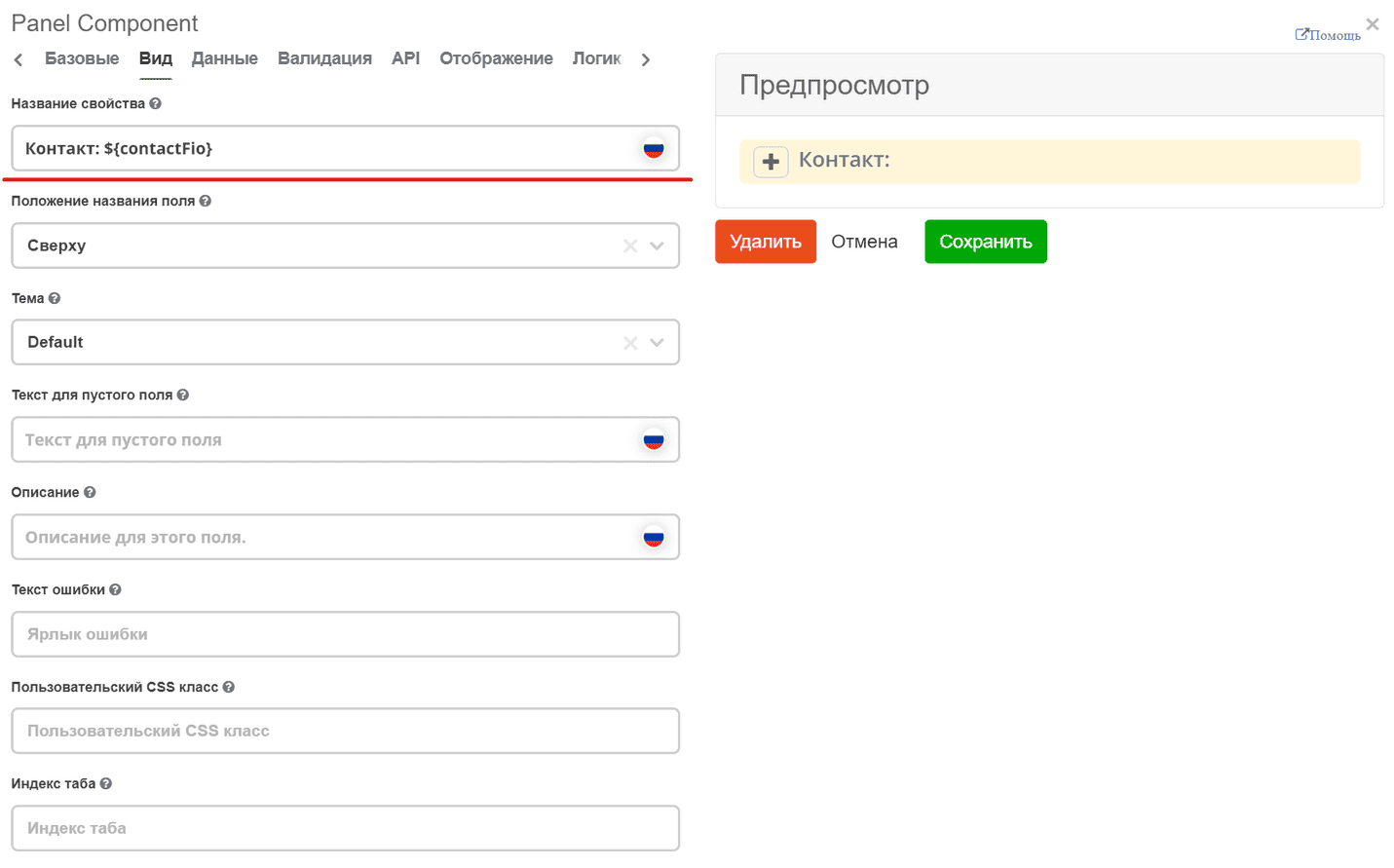
In this example, the full name of the contact person will be displayed in the panel title.
We can also change the color of the panel itself. To do this, you need to add the required Bootstrap class instance.element.classList.add("panel-info");.
For example, add an action based on some logic:
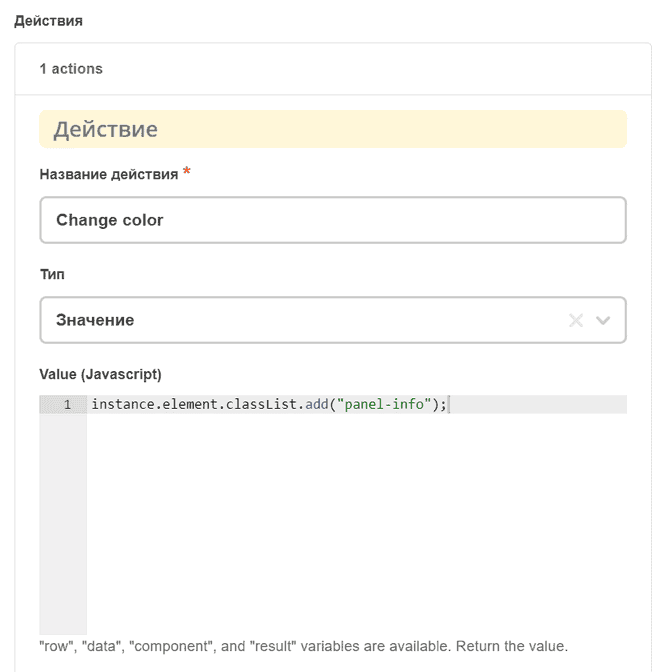
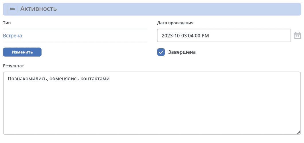
In this example, the panel color will change to panel-info if the Completed checkbox is active: