Workspace Home Page
The Home Page is the main workspace of the Citeck system, where the user begins working after logging in. The page provides centralized access to tasks, journals, documents, and management tools. It is individually configurable: the composition and placement of widgets, the column layout, and journal display parameters are set separately for each user or workspace.
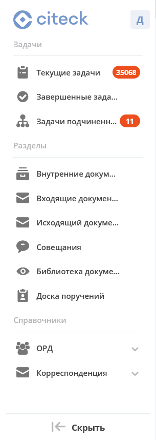
The Citeck workspace home page consists of the main menu (1), control panel (2), tabs (3), and a set of widgets (4).
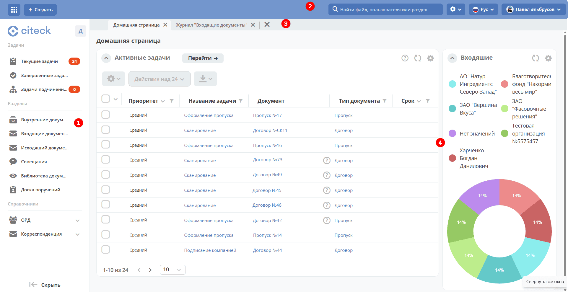
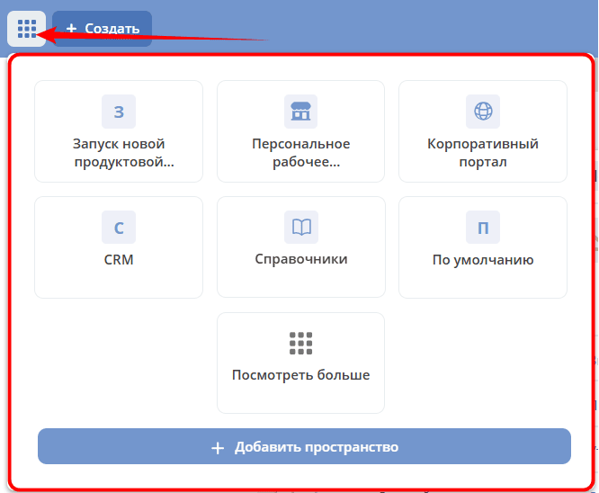
In the upper left corner, there is a button to select available workspaces:
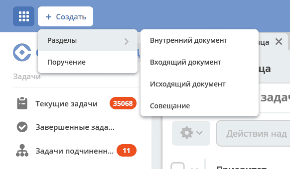
The “Create” button for quickly creating document cards, cases. It is generated based on the items in the left menu. Has additional settings in the menu settings.
Widgets are information blocks that, depending on their purpose and settings, can display Tasks, Task Statuses, Available Actions, Documents, etc. Details about widgets
The user can independently choose the number and layout of widgets to display on the home page.
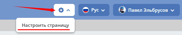
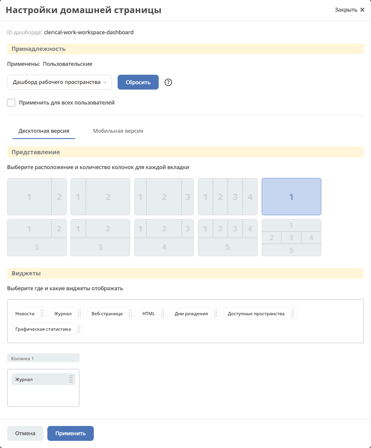
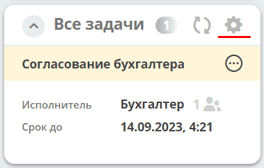
To go to the page settings, click the settings icon in the control panel and select the “Configure Page” item.
The home page settings page will open, where you can change the layout and set of displayed widgets.
In the “Columns” block, you can select the number and arrangement of columns on the home page. To choose, click on the desired layout.
In the “Widgets” block, you can drag the necessary widgets into the home page columns.
To save changes, click “Apply” at the bottom of the page.
Control Panel
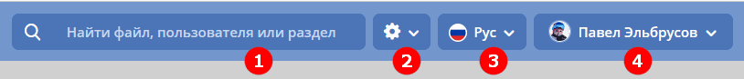
In the upper part of the main page, there is a control panel:
With it, you can:
perform search (1) for documents, people (users), workspaces.
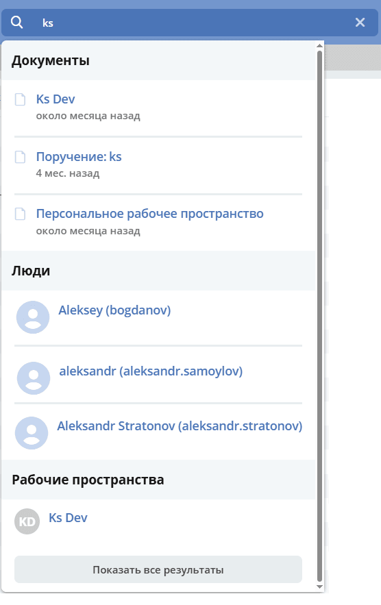
Clicking “Show all results” opens the first page of search results:
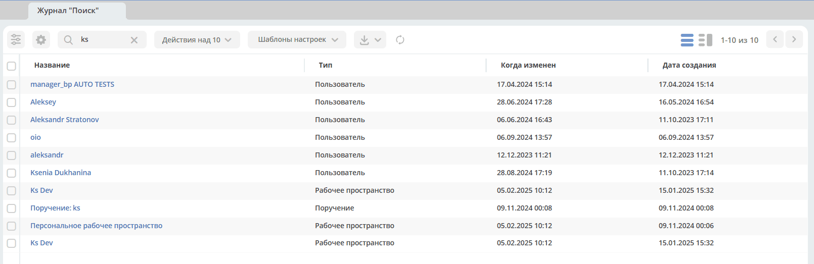
Document types for search are configurable. See details
go to home page settings (2), change the interface language (3), call the user account action menu (4).
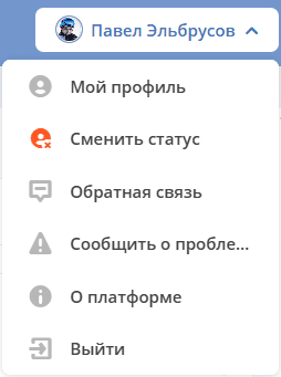
The account menu (4) contains the following actions:
My Profile – opens the user profile, the user can edit personal information;
Change Status - changes the user status to “Away”;
Feedback – opens a form to send feedback about the system’s operation;
Report a Problem – opens a form to send a letter describing a problem found in the system;
About Platform - information about the system version;
Log Out – exit the system.
Main Menu
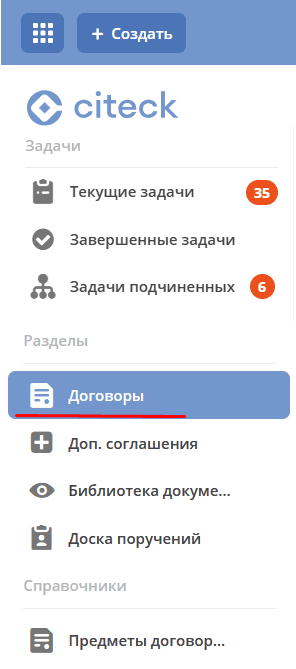
Access to the main system functionality is through the main menu. It contains elements such as:
tasks grouped by various criteria;
a list of available sections;
access to datalists.
Elements displayed in the menu can be flexibly configured.
The main menu can be collapsed/expanded:
|

|
When collapsed, it will be displayed as a panel with icons on the left side of the screen.
Sections can be collapsed and expanded. Sections contain journals. Clicking on a journal name opens a new tab containing the selected journal.
Tasks
The Tasks section contains the following subsections:
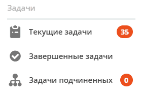
Current Tasks
All tasks that can be performed by the user, either as the sole performer or as part of groups.
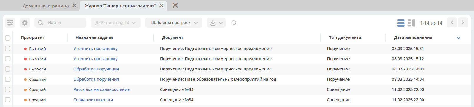
Completed Tasks
Tasks completed by the user.
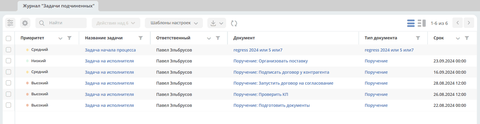
Subordinates’ Tasks
Two categories of tasks are displayed:
tasks of users who have the current user specified as their Line Manager in their profile;
tasks of subordinates whose Line Managers are themselves subordinates of the current user — considering all hierarchy levels.
If a task is assigned to a group and a subordinate is a member of that group, such tasks will not be displayed. The task will only appear when the subordinate clicks I’ll do this.
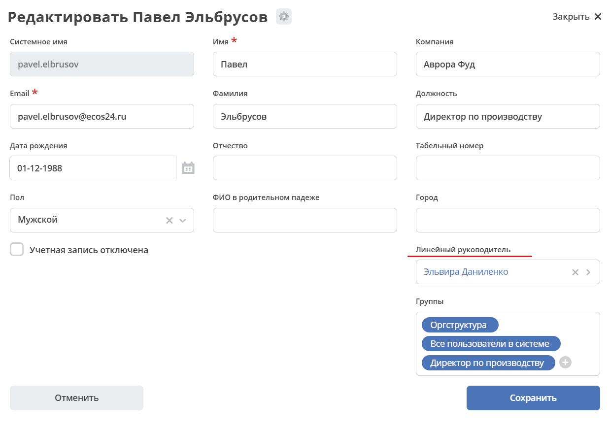
Tasks are reflected if the manager is specified in the subordinates’ profiles in the Line Manager field:
The section supports filtering and sorting similar to regular journals. See below.
Working with Tasks
You can navigate to a document in any status in one of three ways:
by opening the task in the “Current Tasks” Journal;
by opening the card in the corresponding Journal;
by following the link from the received notification.
In the My Tasks widget, the following actions are available for a task:
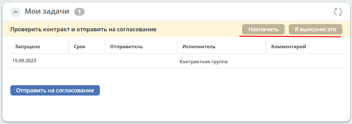
I’ll do this - the action is available if the task is assigned to multiple recipients - a group or several users. When performing the action, the task is taken from the recipients and assigned to the current user.
Assign - the action takes the task from the list of recipients and assigns it to a user selected from the organizational structure.
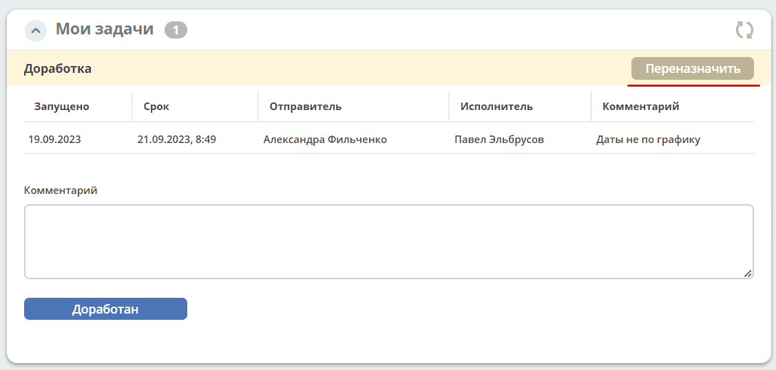
Reassign - the action is available if the task is assigned to one recipient. The task can be reassigned to a user selected from the organizational structure.
In the My Tasks widget, task completion options are available:
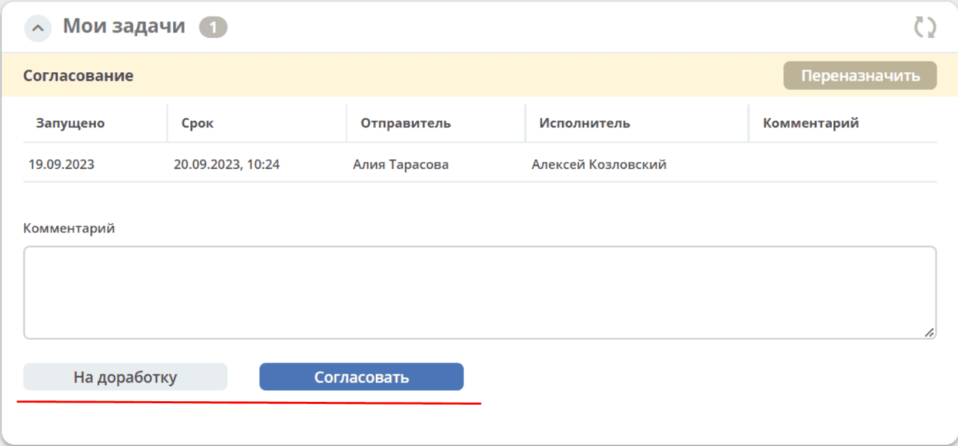
After completion, the task moves to Completed Tasks.
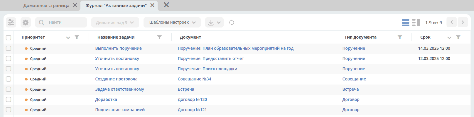
Journals
Note
The updated journal interface adaptively manages data display in the table based on screen height: the table automatically adjusts to the screen size so that all important information is always visible.
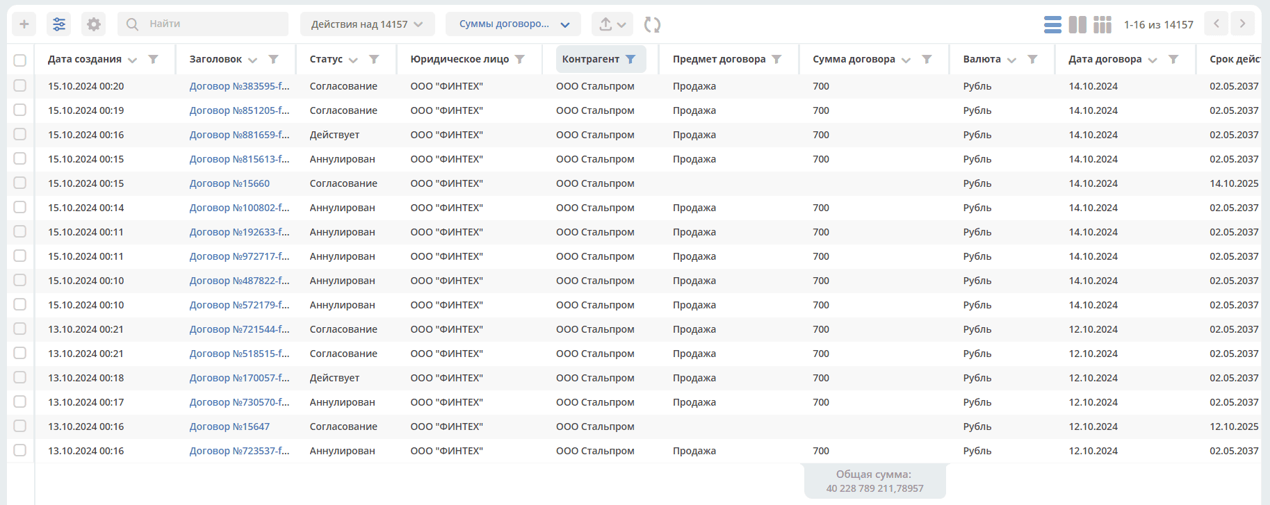
The Journal functionality in the system allows storing and systematizing information created in the system.
Viewing a Journal
In the main menu, click the section name, or expand the menu item and select a journal:
When selected, a new tab with the journal opens. Data is presented in tabular form:
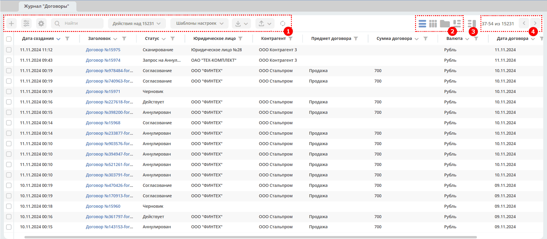
1 – Toolbar
2 – Journal View Switching
3 – Data Preview Mode
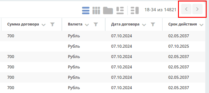
4 - Page Navigation
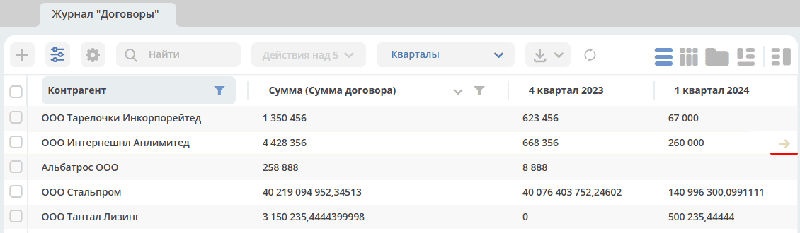
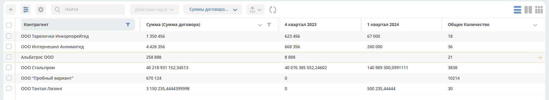
A column can display the total sum of the column values, considering the current workspace:
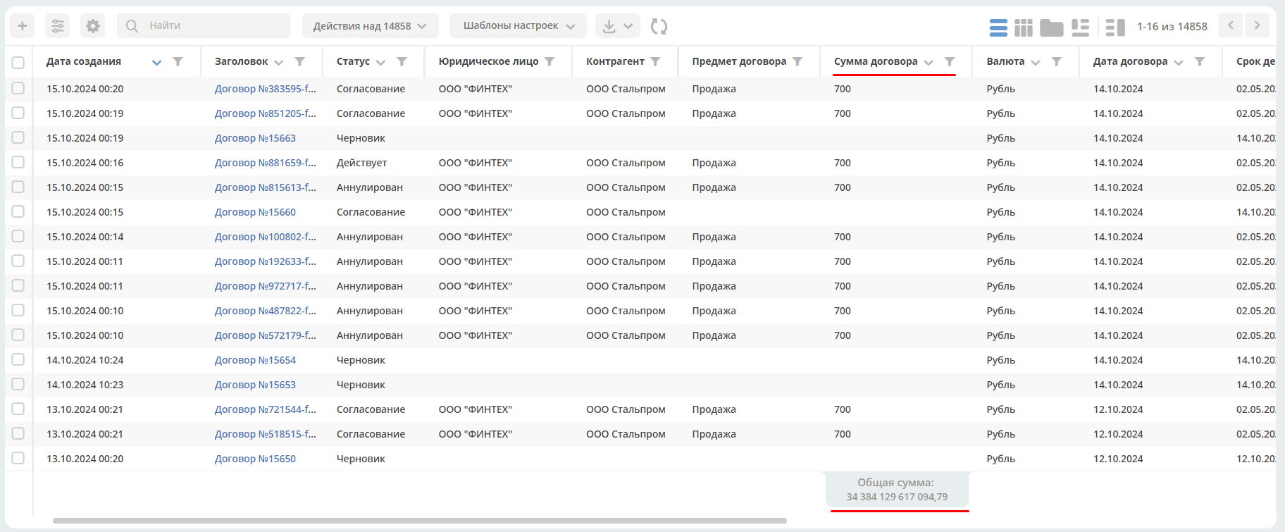
Enabling or disabling the sum display for each column is done separately for each attribute in the journal settings.
The width of table columns can be changed and saved:
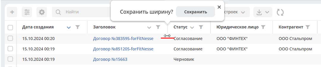
Individual column width settings are saved for each user. When journal data is updated, the saved setting will be applied each time.
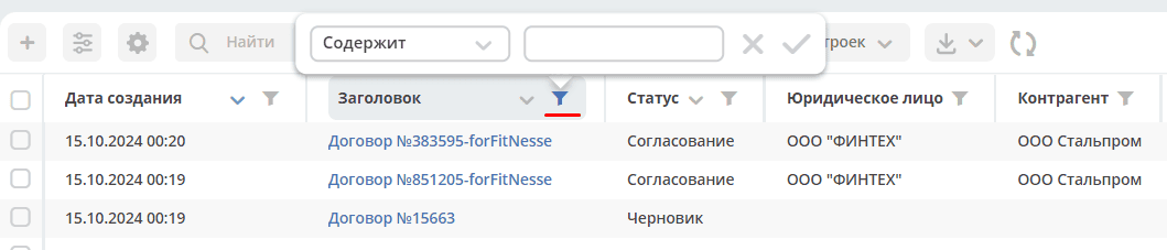
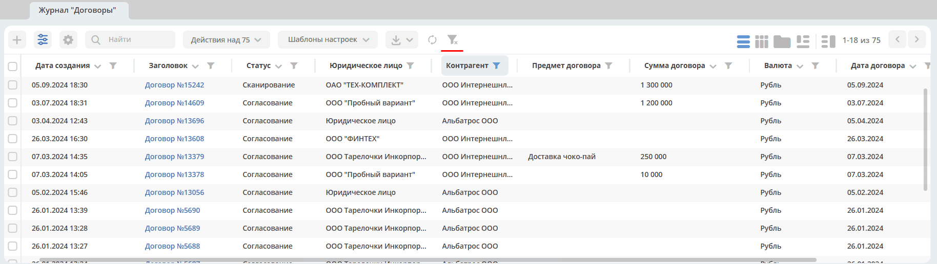
In the journal, for each column, you can configure sorting and/or search:
When hovering the cursor over a journal entry, icons for actions with the document are displayed:


|
open edit form |

|
open document for viewing in a new tab |

|
open a new tab with the selected document |

|
delete document (optional) |
In-line editing is available in the row. The editing option depends on the data type:
Document Journal Toolbar

|
create new object |

|
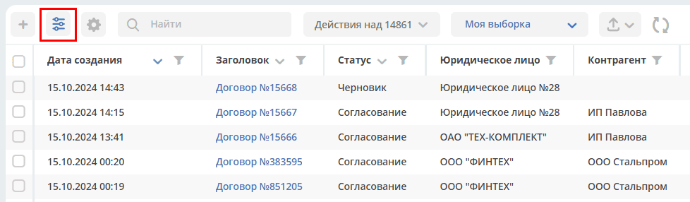
open journal settings |

|
go to editing the journal form. Available only to administrators. |

|
quick journal search |
|
bulk actions on objects |
|
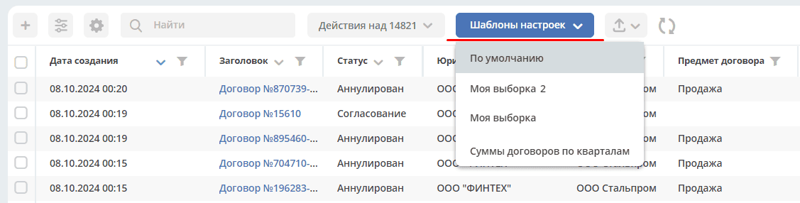
saved templates |

|
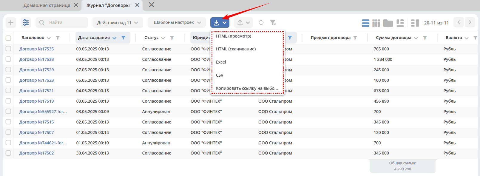
export journal content to specified formats:
- HTML (просмотр),
- HTML (скачивание),
- Excel,
- CSV,
- Копировать ссылку на выборку.
.. note:: Форматы HTML, Excel и CSV доступны только в enterprise-версии.
|

|
import data from a file (Excel) using a template (enterprise version only).
As a result of data processing, cards of the selected type are created in the system.
|

|
refresh data in the journal |

|
reset filters if they were applied |
Journal Navigation
A certain number of rows are visible regardless of screen size. The number adapts to the browser window height upon initialization.
To scroll through pages, click forward/backward in the right corner of the journal:
Changing Journal View
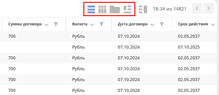
Possible journal view options:


Card Data Preview
To preview card data, click (1), click on a journal row (2) - a preview dashboard (3) will open, consisting of widgets:
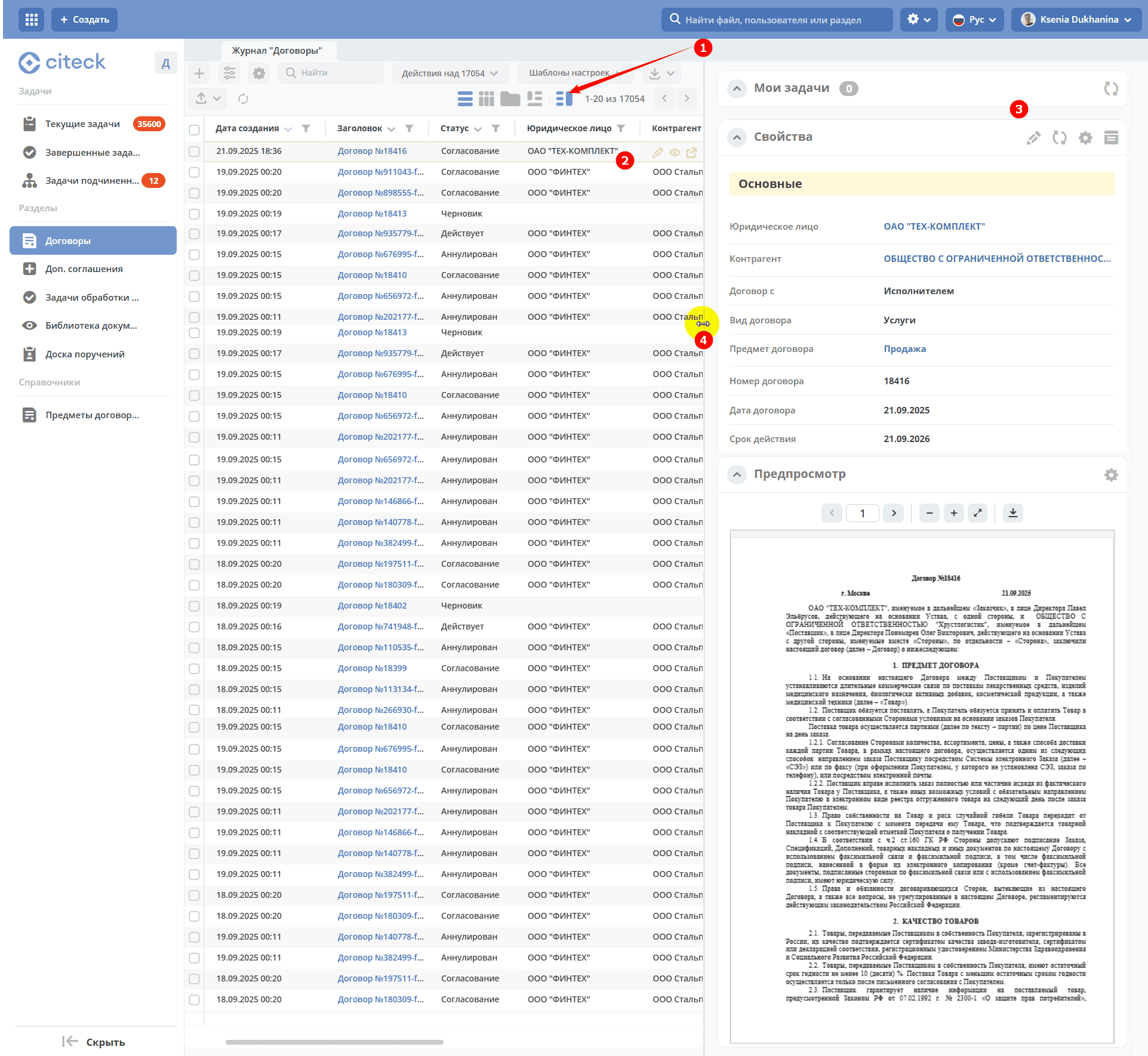
The width of the preview window can be changed by dragging its border (4). To turn off preview mode, click (1) again.
Details on configuring widgets and preview window placement.
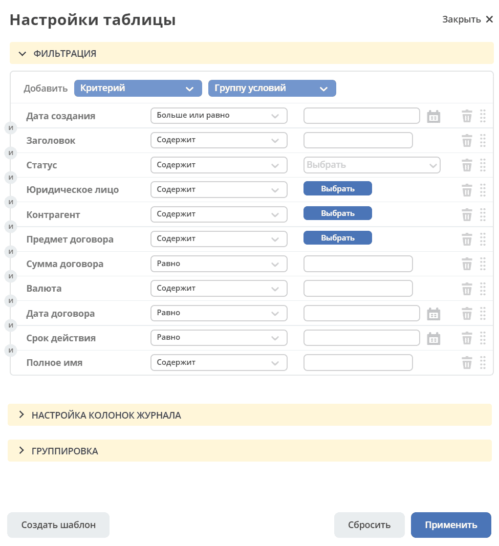
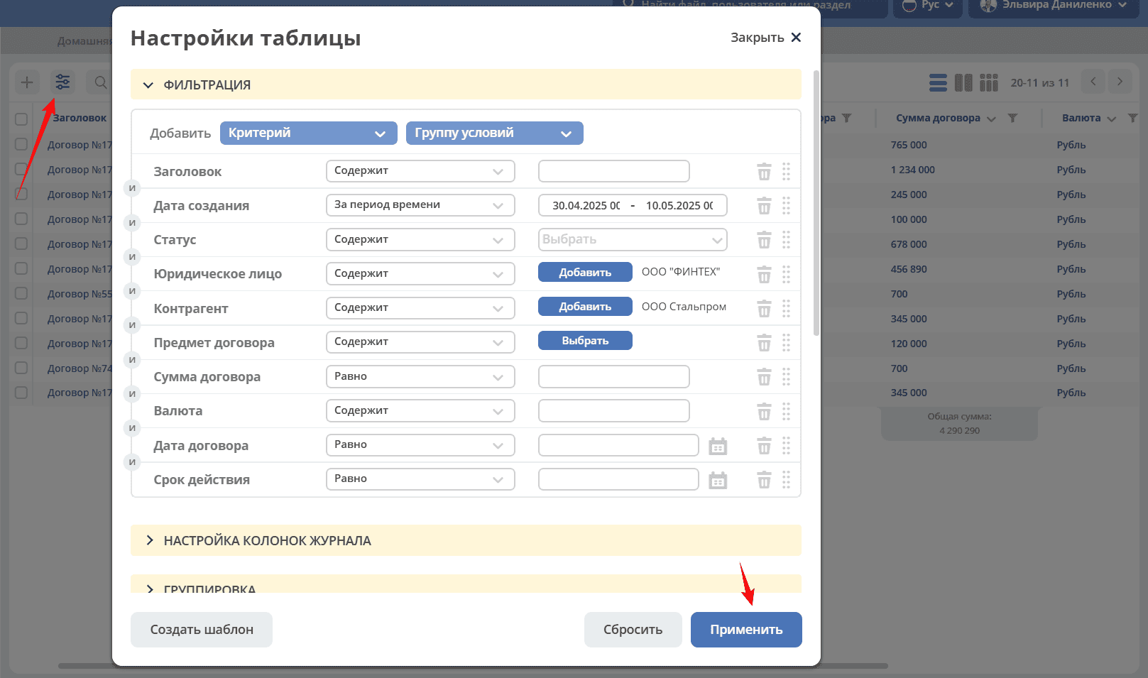
Journal Settings
Journal settings allow applying filters to journal entries, configuring displayed columns in the journal, grouping journal entries, saving selected settings as a template, applying or resetting settings.
If there are no fields for grouping, the panel or values in the panel are hidden.
Filtering
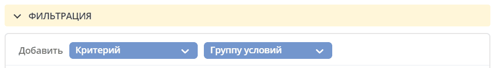
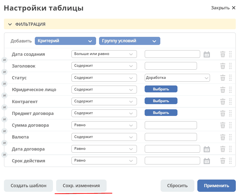
To filter journal entries by specific parameters, you need to fill in the criteria in the Filtering block.
If the default criteria are insufficient, click the “Add Criterion” or “Add Condition Group” button and select additional criteria from the dropdown list:
Fill in the conditions for the necessary criteria (one or several). Criteria that are not filled in will not be considered during filtering.
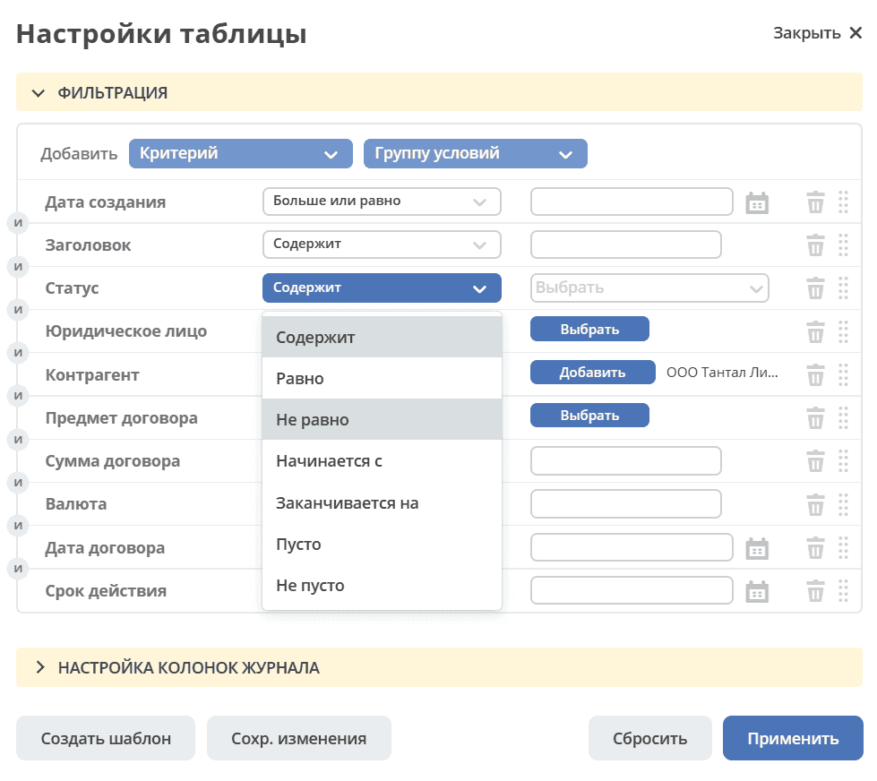
Click the “Apply” button.
If necessary, you can change the order of criteria by dragging.
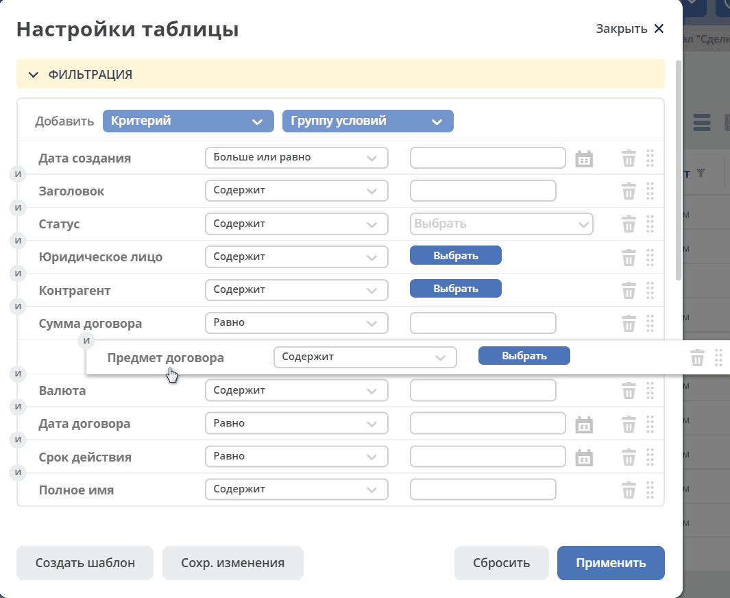
and configure filtering conditions “AND/OR” by clicking on them.
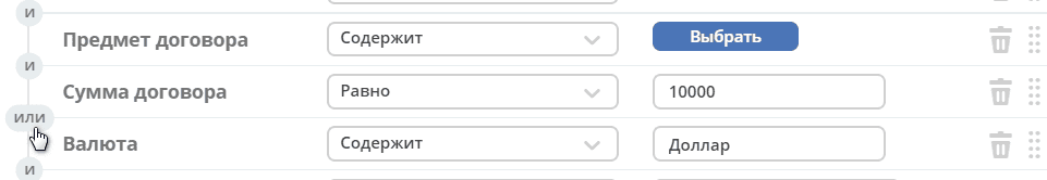
If the “AND” condition is selected between criteria, then the filtering will include records that meet both conditions simultaneously. If the “OR” condition is selected between criteria, then the filtering will include records that meet either the first or the second condition, not necessarily both at once.
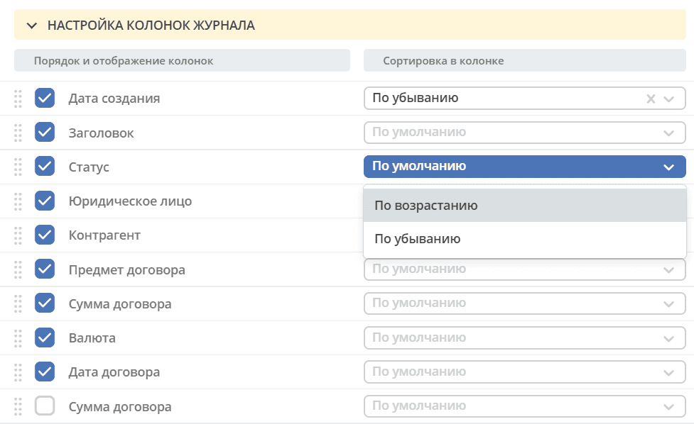
Configuring Journal Columns
To select columns to display in the journal, in the Journal Column Settings block, simply check them with a flag and click “Apply”. In the right part of the Column Settings block, you can choose sorting in columns - ascending or descending.
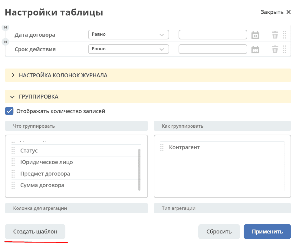
Journal Grouping
To group the journal by values, in the Grouping block, drag the desired value (or several) from the left part (2), by which the journal will be grouped, to the right part (3):
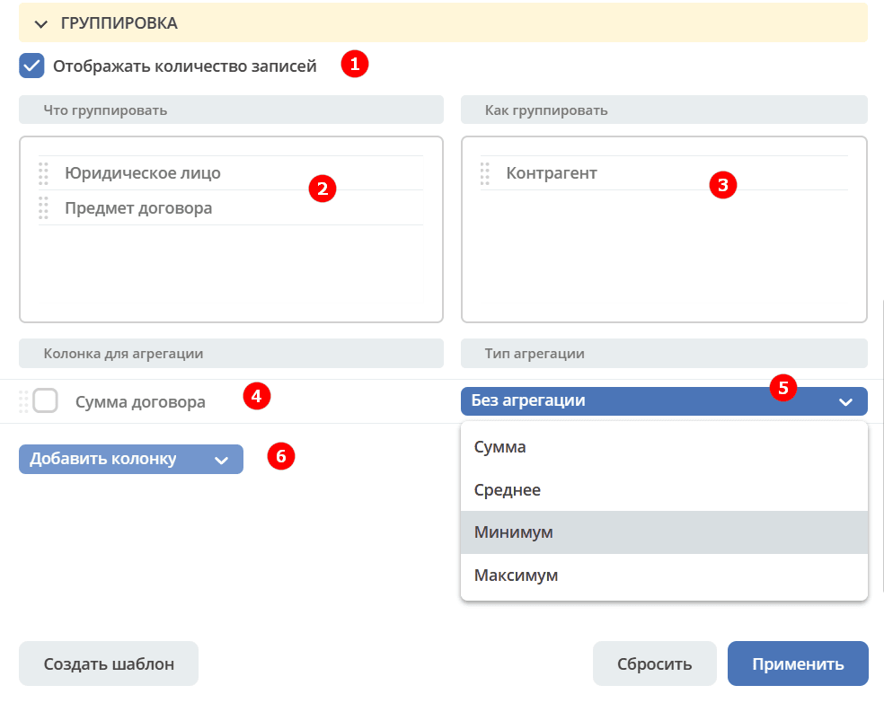
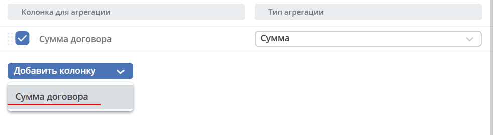
You can select an aggregation column (4) and aggregation type (5), add an additional column for aggregation (6).
If you need to show information about the number of records that fall under a specific aggregation, check the Display Record Count (1) checkbox - the last column Total Count with the calculated value will be added to the journal.
To add a column, click “Add Column”, select a column. The selection is made from the aggregation columns.
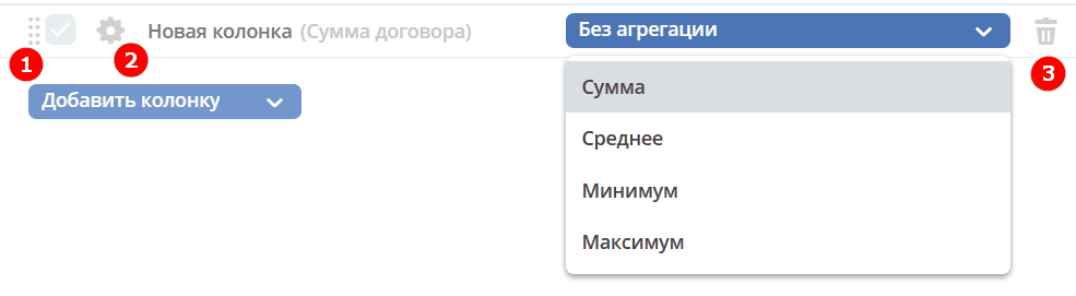
To change the order of additional columns, use (1). To delete, click (3).
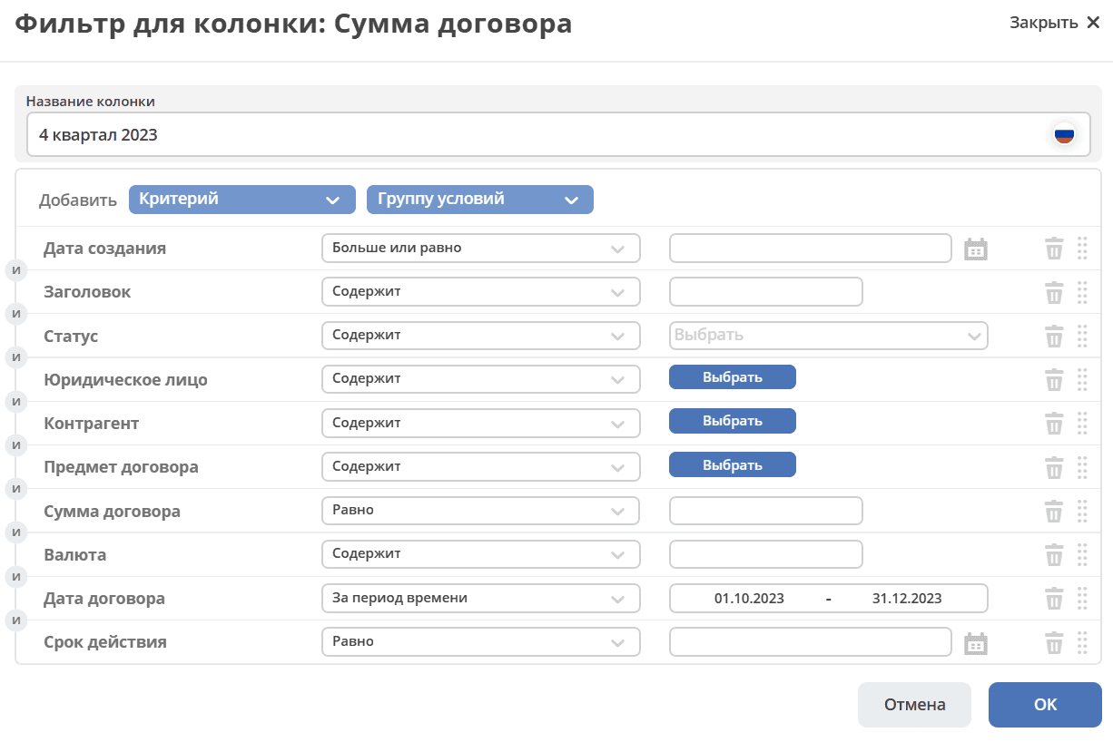
Clicking on (2) provides individual filter configuration, allowing entry of the column name. Filter configuration is similar to that described above.
Multiple columns can be added.
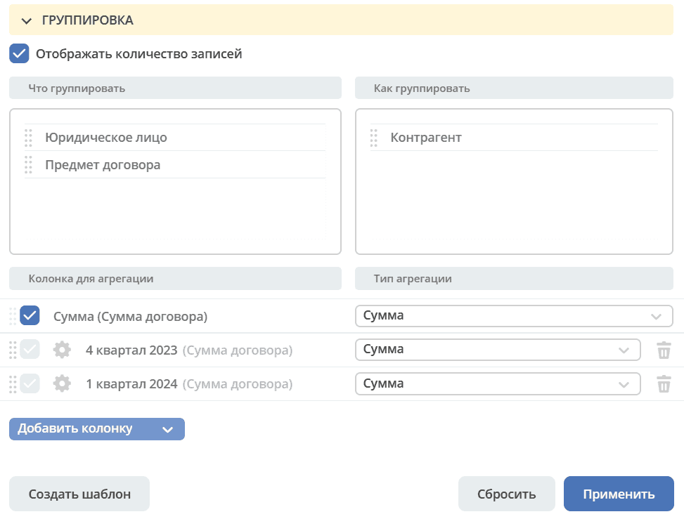
The created data grouping can be saved as a template by clicking “Create Template”.
To view information on the selected grouping, click “Apply”.
Only grouped data is displayed without the column total. The column total will only be displayed when navigating to the grouped data.
To view rows grouped by the selected value, click the arrow in the corresponding row.
To reset applied filters, click:
Saving Settings as a Template
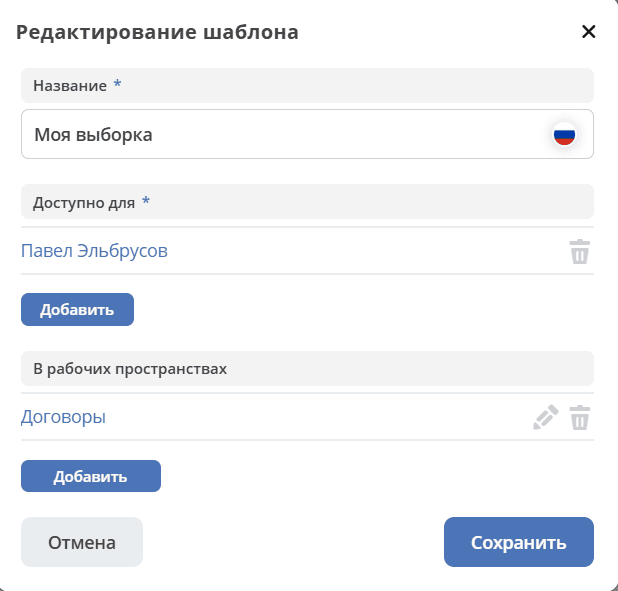
Selected settings can be saved by clicking the “Create Template” button:
In the opened window:
enter the template name,
select users and/or groups for whom it will be available,
the workspace is filled with the current workspace by default, you can also add others from the list of available ones. If the field is cleared, the settings will be applied to all workspaces
click the “Save” button:
The saved template under the specified name will be displayed in “Setting Templates” on the toolbar:
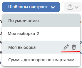
The author can edit the template name, resave the template, or delete it:
Note
Users who are granted access to the template can only use it.
To edit template settings, click:
Make changes to the settings, filtering, grouping, and click “Save Changes”:
When expanding a grouped row from a configured template:
filtering and journal column settings are taken into account:
You can return to the original view of the configured template by clicking on the template again.
Exporting Journal Data
Apply filtering to journal entries, configure displayed columns in the journal, group journal entries, apply selected settings:
Then select export of journal content:
Example of export to Excel:
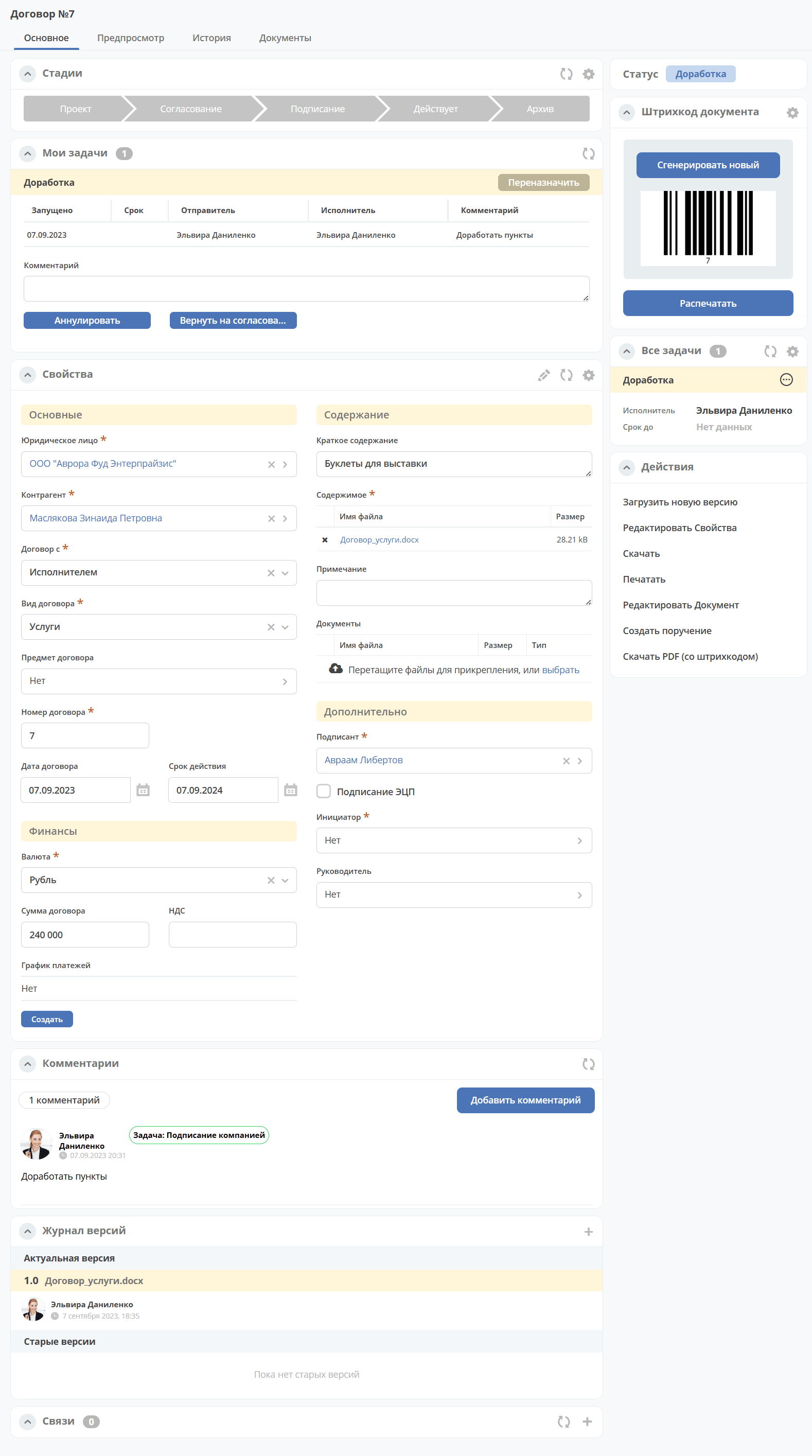
Card
Card - a page of an object (request, document, process, etc.). It is a dashboard with a specific set of widgets for this object.
Working with the “Selection from Organizational Structure” and “Selection from Journal” Components
Selection from Organizational Structure
|
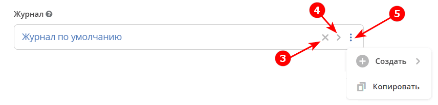
Selection from Journal
|
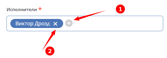
1 - Add user
2 - Delete already selected user
3 - Delete already selected journal
4 - Go to the list of journals for selection
5 - Additional available actions
Main Widgets and Their Purpose
Main card widgets and their purpose:
“My Tasks” to display the current task action for this document by the viewing user and their completion options.
“Properties” to display card attributes and their values.
“Event History” to display events such as creation, update, status change of the document with recording of the date and time of their occurrence, participants, and comments.
“Preview” to display the main document and all related ones. Allows downloading not only the main one but also the currently open document.
“Documents” for uploading related documents.
“Comments” - general comment. Designed for entering and displaying the history of comment input for the task as a whole. It is a feedback tool in the cycle of processing identified deviations.
“Status” displays the current status of the document (determined automatically by the system, not available for editing by the user).
“All Tasks” to display tasks for this document and their performers.
“Actions” contains a list of available actions with the document at this status.
“Document Links” is used to establish links of this document with others in the system and display established links.
“Version Journal” contains the current and previous versions of the document. Serves for uploading a new version of the document, as well as for comparing files.
“Document Barcode” displays the generated document barcode.
“Stages” visualizes the passage of document stages. Stages are grouped statuses.
Some widgets can be configured. To go to the settings in the widget, click:
Details about widgets.
Configuring Card Display
To change existing card display settings, (with the card tab open) go to the settings menu and select the “Configure Page” item.
A page with card settings will open, where you can change the layout and set of displayed widgets for the selected case type.
Contacting Technical Support
If you encounter problems in the system, you can contact technical support. There are several ways to contact technical support:
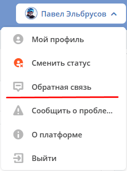
In the upper right corner, click on the user name and select “Report a Problem”:
Open your email and send a letter to support@citeck.ru
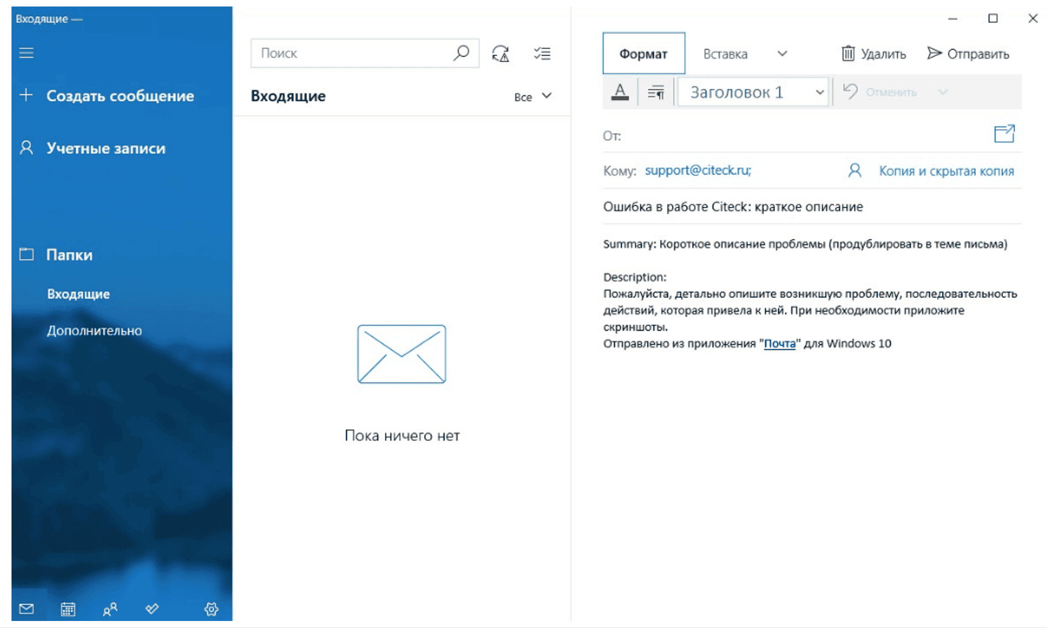
In the subject of the letter, provide a brief description of the problem, and in the body of the letter - a detailed description of the problem, the sequence of actions that led to it, screenshots (if any).