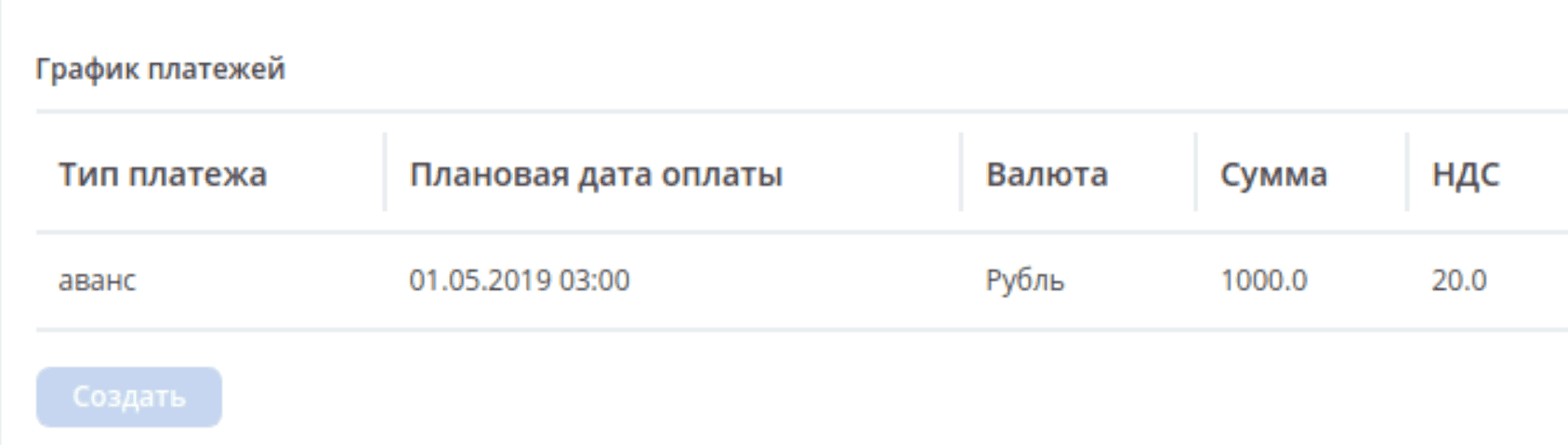
Table form
The Table Form component allows displaying selected values in a table format. Created records are temporary and stored in browser memory. They are sent to the server along with the parent form.
Component creation
The Table Form component allows displaying selected values in a table format.
Created records are temporary and stored in browser memory. They are sent to the server along with the parent form.
To display the Create button and enable calling the creation form, formKey* is used, which can be calculated depending on the Data Type setting on the Data tab:
Journal - creation options are calculated using the Journal ID setting, or based on the type of association specified in the attribute (in this case, Journal ID does not need to be filled). There is an option to select columns for display in the table.
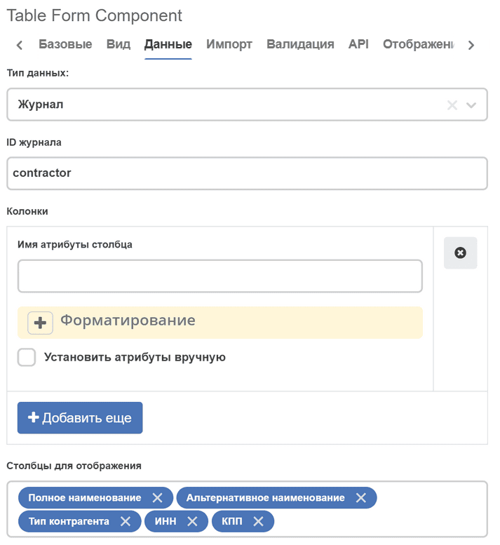

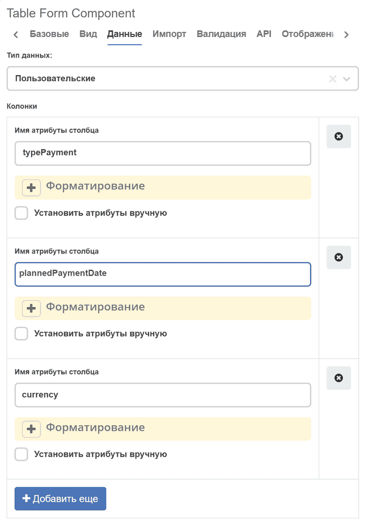
Custom - creation options are calculated based on the type of association specified in the attribute. In this case, columns for display in the table must be added manually (corresponding to field names in the creation form).
Creation options are determined from the specified attribute on the API tab, or from the Custom creation options setting on the Data tab. Column settings are taken from the first creation option in the list. If there are no available creation options, the Create button will be hidden.
For each column, settings can be configured manually. To do this, check the Set attributes manually option:
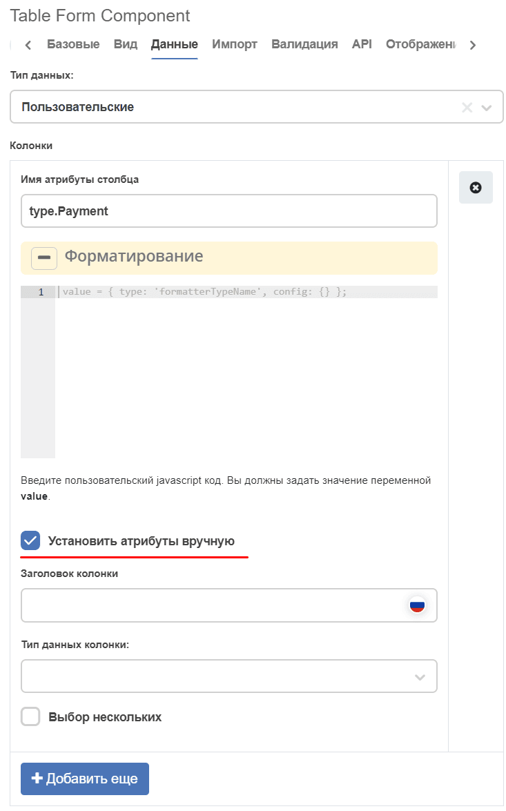
This way you can set the column header (can be specified in two localizations), data type and the Multiple selection flag.
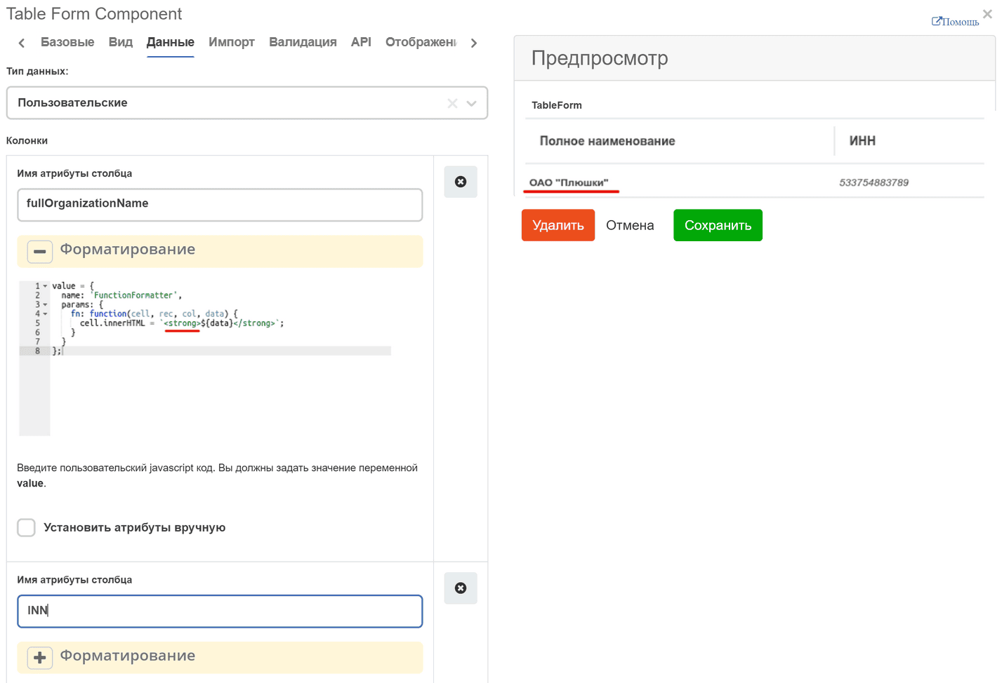
There is an option to manually apply a formatter to a column. The Set attributes manually option does not affect formatter configuration. The formatter setting field accepts values of the form:
 value = {
  type: 'script',
  config: {
    fn: function(...params) {
      const linkHtml = `<a href="${params[0].cell}">${params[0].cell}</a>`
      return {
        type: 'html',
        config: {html: linkHtml}
      }
    }
  }
};
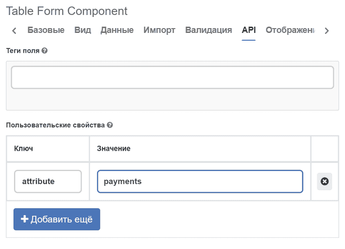
Binding to parent type attribute
For the correct binding of tableForm to the parent record, you need to specify the association attribute on the API tab in the Property Name field, or in the Properties block set the attribute key with the value — the attribute name on the parent type.
For example, if the following attribute is defined on the parent type:
- id: risks
  type: ASSOC
  config:
    typeRef: emodel/type@project-risk-item
    child: true
  multiple: true
Then in the tableForm settings:
component key =
risks(matches the attribute id), orspecify
attribute=risksin the Properties block
Without this binding, tableForm will not be able to save child records when the parent form is submitted.
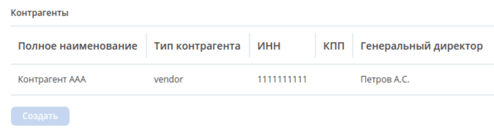
“Create” and “Select” buttons
The Table Form component supports two ways to add records:
Create — opens a blank form for creating a new record. The record is created from scratch as a child element of the parent entity. Creation options are determined from the journal specified in source.journal.journalId, or from the attribute’s association type.
Select — opens a reference journal from which you can select an existing record. The selected record is used as a template: it is copied (cloned) into the table as a new child record. The original in the reference is not modified.
The “Select” button is displayed only when the “Select” button flag is set and selectJournalId (the journal identifier for selecting templates) is specified.
Note
The journal for the “Create” button (source.journal.journalId) and the journal for the “Select” button (selectJournalId) are typically different journals. The first displays child elements in the table, the second is the reference of templates for copying.
Select value from reference
To display the “Select” button on the form for copying existing objects, set the “Select” button flag:
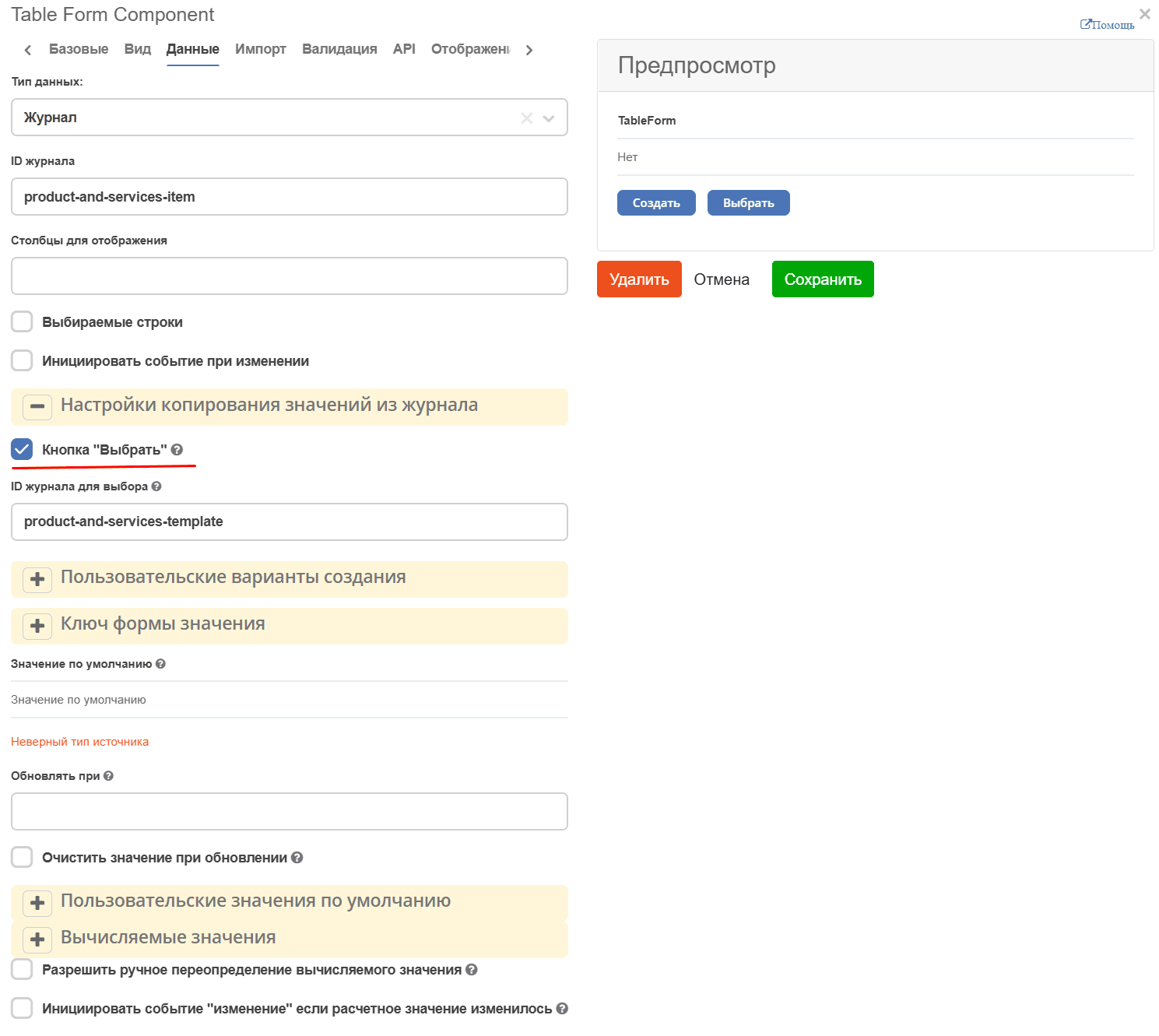
Specify the journal identifier for object selection. If no identifier is specified, the journal corresponding to the type of the first creation option will be used.
On the form, click the “Select” button.
Select the required object for copying. The selected value is used as a template for the copied object.
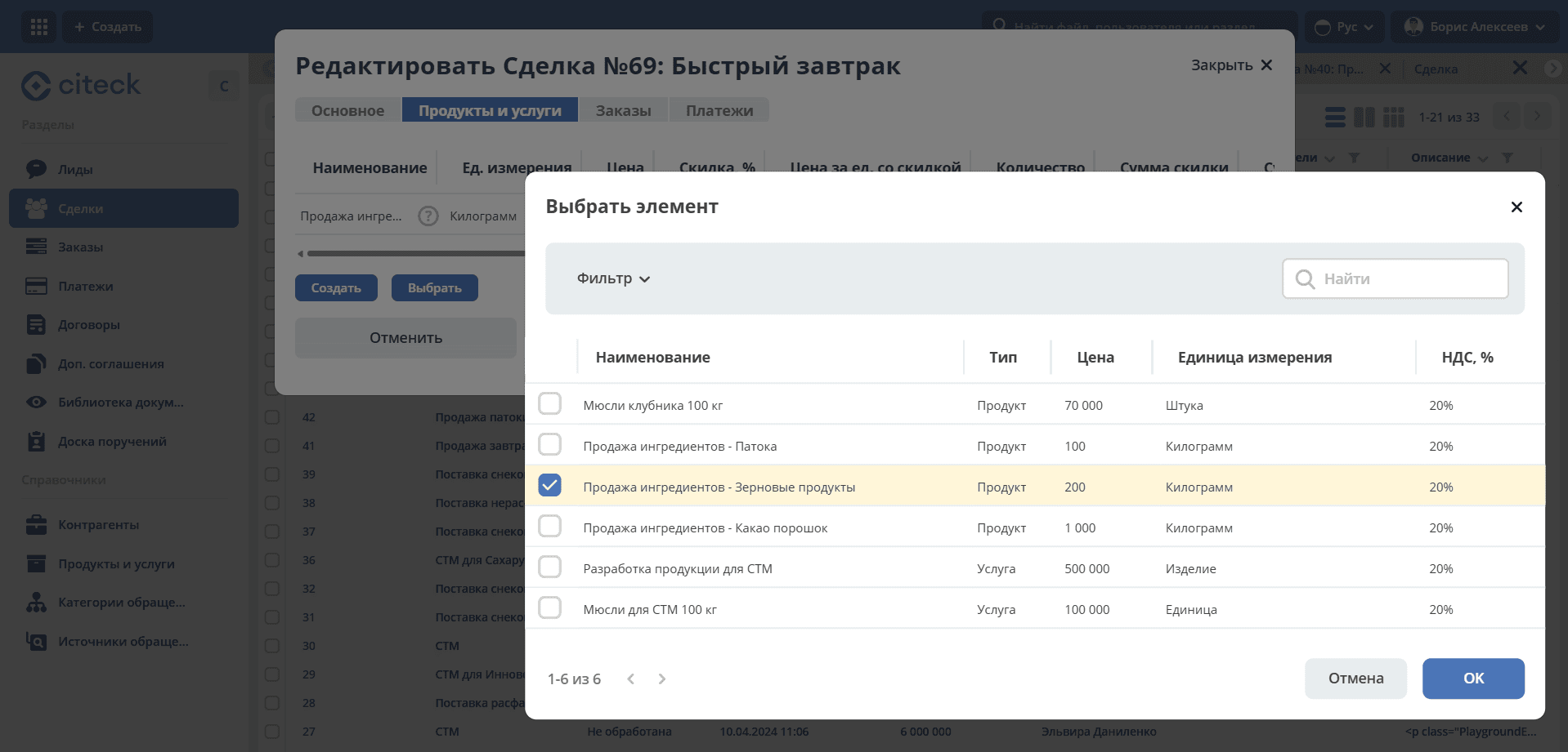
The object editing form opens, where values can be modified if necessary.
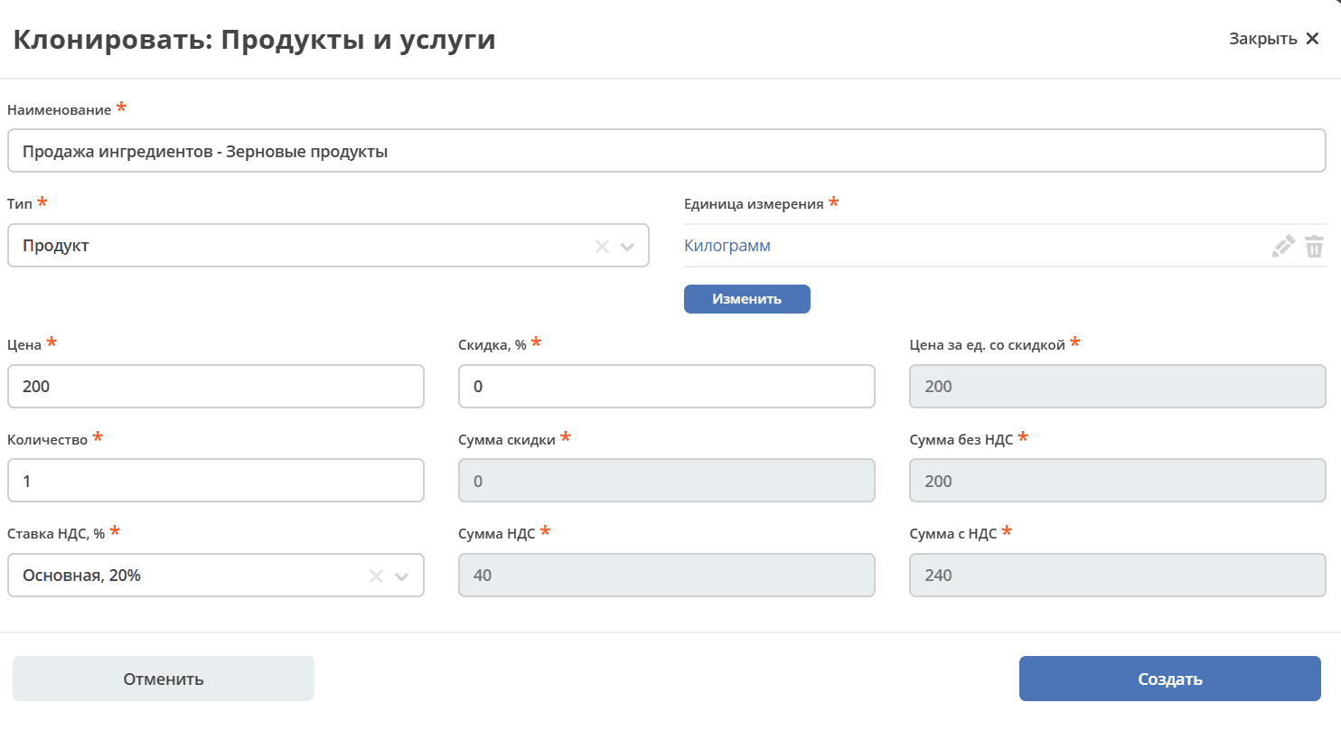
Confirm the selection, the object will be copied to the table form.
Type structure for correct copy operation
For copying from a reference to work correctly (records are created as child elements of the parent entity and do not end up in the global reference), a two-level type hierarchy is required:
data-list
  └── <тип-справочник>            ← справочник (шаблоны для выбора)
        └── <тип-элемент>         ← дочерний тип (создаётся при копировании)
Example from CRM (products and services):
# Тип-справочник (глобальный каталог шаблонов)
id: product-and-services
parentRef: emodel/type@data-list

# Тип-элемент (дочерняя запись сделки/заказа)
id: product-and-services-item
parentRef: emodel/type@product-and-services
Association configuration on the parent type (deal/order):
- id: product-and-services
  type: ASSOC
  config:
    typeRef: emodel/type@product-and-services-item  # ← тип-элемент, не справочник
    child: true
  multiple: true
Table Form component configuration on the form:
{
  "key": "has-pas:product-and-services",
  "type": "tableForm",
  "source": {
    "type": "journal",
    "journal": {
      "journalId": "product-and-services-item"
    }
  },
  "enableSelectButton": true,
  "selectJournalId": "product-and-services-template",
  "properties": {
    "attribute": "has-pas:product-and-services"
  }
}
Where:
source.journal.journalId— the journal of the element type (for displaying rows in the table)selectJournalId— the journal of the reference type (for selecting templates when the “Select” button is clicked)properties.attribute— the association attribute on the parent type
Important
If the element type inherits directly from data-list, created records will end up in the global reference. The element type must inherit from the reference type (or another non-reference type) so that records exist only as child elements of the parent entity.
Data population in the table
Using Records Array
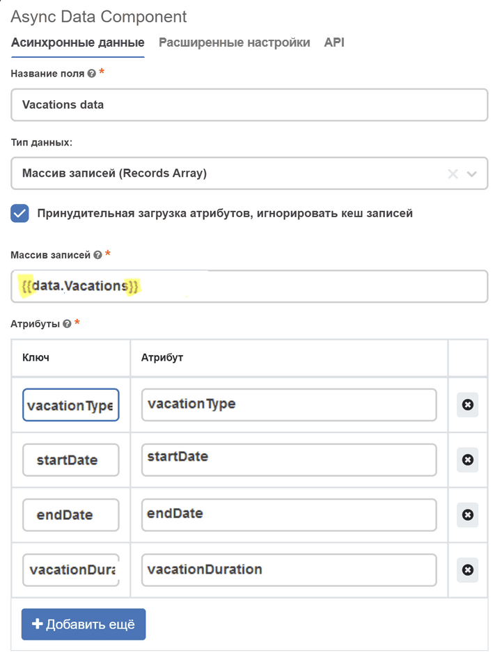
For this, you can use the Async Data component (add link) with the data type Records Array.
In the Records Array field, specify the table name enclosed in double curly braces, in the attributes - the fields of this table and the keys by which they will be accessible.
Manual population
Table form expects that its value will be an array of recordRef. Record data will be loaded automatically.
Thus, we can obtain some data in async data, for example, through recordsQuery, and in table form (Data tab -> Calculated values) convert them into a recordRef array and assign to value:
const uncompletedIssues = _.get(data, 'uncompletedIssues.records') || [];
const issueIds = uncompletedIssues.map(issue => issue.id);

value = issueIds;
How to access the parent form?
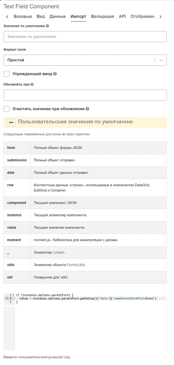
To access the parent form from the record creation/editing form, you can use the instance.options.parentForm object. For example, if you need to set a default value for a child form field based on a value from a parent form field, you can set the Custom default values setting for this field:
  if (instance.options.parentForm) {
value = instance.options.parentForm.getValue()['data']['someParentFormFieldName']
  }
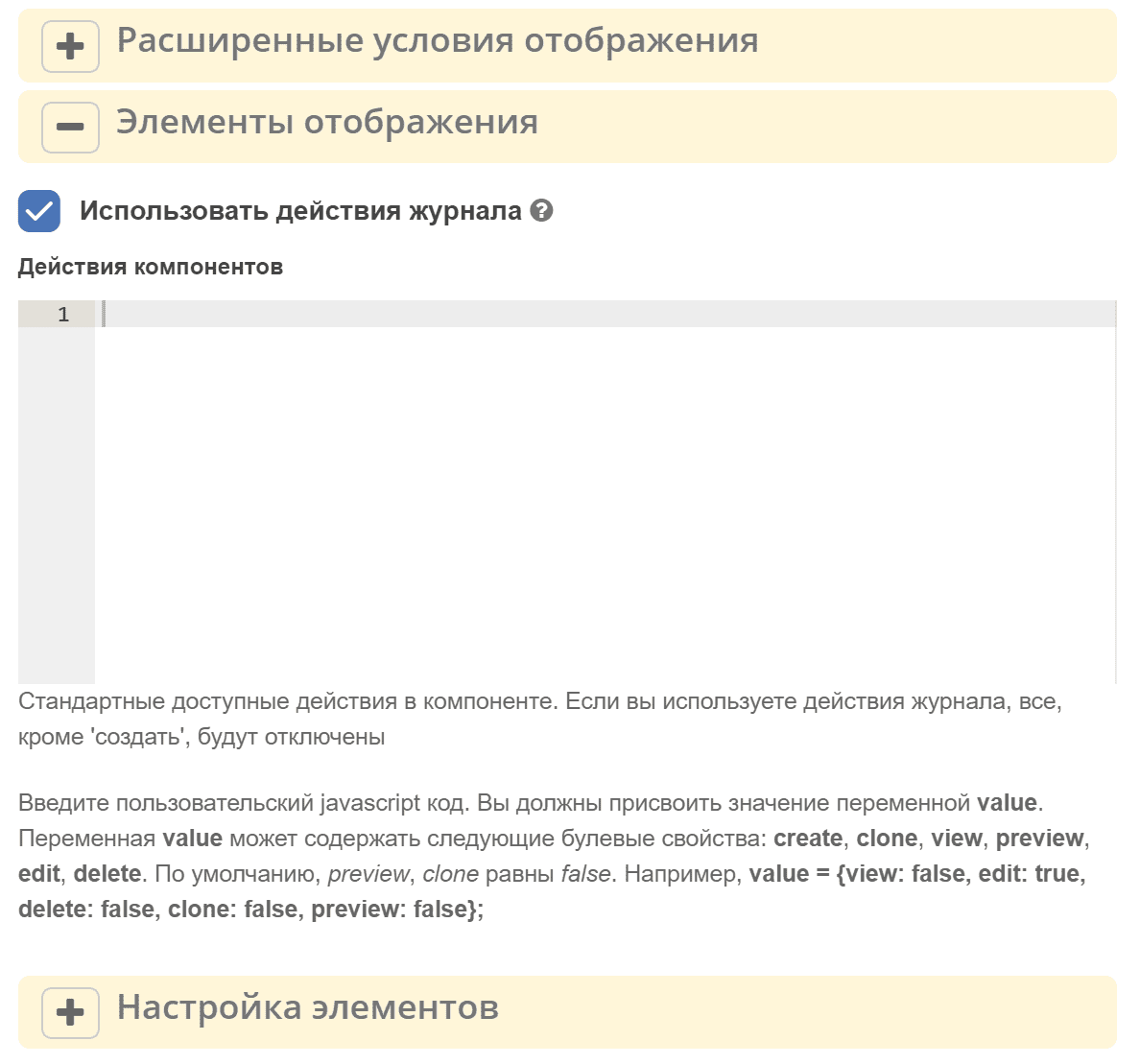
Displaying actions
The Display tab, Display elements setting allows configuring action display conditions.
There are two ways to set up actions:
Use journal actions — a flag on the Display tab. When enabled, the table rows display the actions defined in the journal configuration (the
actionssection in the journal YAML). For example, ifuiserv/action@editanduiserv/action@deleteare specified in the journal, edit and delete buttons will be available in each table row. Recommended when the data source is Journal.If the source is not a journal or journal actions are not needed, and the Component actions field is filled, available standard actions described below will be displayed.
If the Use journal actions flag is set, only the Create action from the Component actions field will be processed.
Action name |
Key |
Default |
disabled / view mode |
|---|---|---|---|
Create |
create |
true |
unavailable or hidden |
Edit |
edit |
true |
unavailable |
Delete |
delete |
true |
unavailable |
View |
view |
true |
|
Document preview |
preview |
false |
|
Clone |
clone |
false |
The field accepts a JavaScript expression where you need to assign an object with optional properties create, view, preview, edit, and delete (keys in the table above) to the value variable.
If any property is not specified, the component itself will decide whether to display or hide the element, depending on the situation (*).
Если компонент Table Form в состоянии disabled или форма в режиме просмотра, элементы “редактировать“, “удалить“ в любом случае будут недоступны.
value = {
  create: false,
  view: false,
  edit: false,
  delete: true,
  preview: true
}
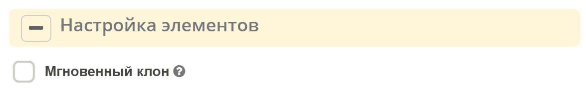
Element settings
The Display tab, Display elements setting configures some properties for actions.
Copy without confirmation
If the flag is set, when selecting from the reference the record is immediately copied to the table without opening the editing form. If the flag is not set, the editing form opens first, where values can be modified before adding.
Row selection in table and performing actions with selected rows
To enable row selection in the table, check the Selectable rows option on the Data tab.
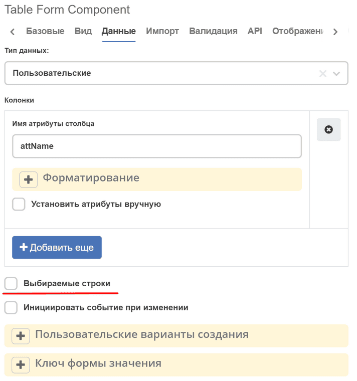
The component has a getSelectedRows() method for obtaining a list of selected rows in the table.
For example, to perform some action with selected rows in the table when a button is clicked, in the Button component select Actions: Custom and specify Button Custom Logic:
const tableFormComponent = utils.getComponent(form.components, 'tableFormComponentKey');
if (!tableFormComponent) {
    return;
}

const selectedRows = tableFormComponent.getSelectedRows();

// some actions with selectedRows
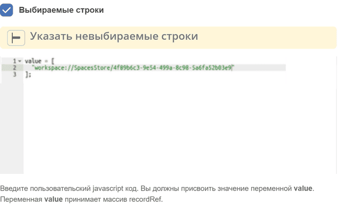
Prohibiting selection of certain rows in the table
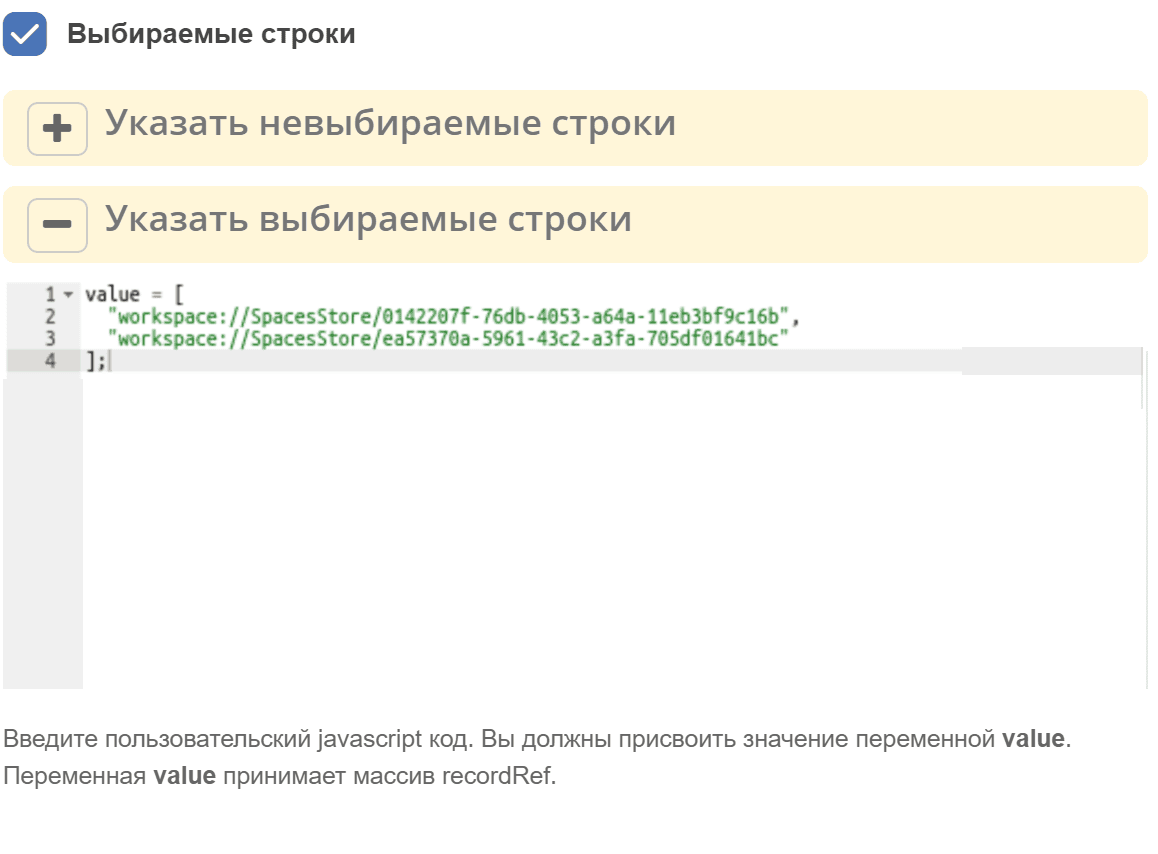
On the Data tab, in the Specify non-selectable rows field, you can prohibit the selection of certain rows in the table:
Setting default selected rows
On the Data tab, in the Specify selectable rows field, you can specify which rows should be selected by default:
Flag “Allow manual override of calculated value”/ “Allow Manual Override of Calculated Value”
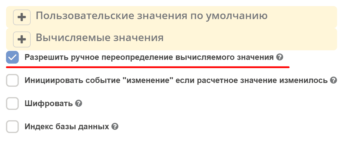
On the Data tab, the set flag allows the user to forcibly overwrite a field where a calculated value has already been entered.
See details
Static headers
To enable a static header, in the parent form, check the Hide record name in modal title checkbox. In this case, the node name will be hidden.
Additionally, there is an option to set your own localized static header. To do this:
Create a bundle with the required localization in Localization
Insert the localization key in the field Enter custom static label for concat with basic. If this key is not found, the text from the field Enter custom static label for concat with basic will be added to the header
Import from file
The ability to import data into the table from a file (e.g., xslx) has been added. For this, an Import section has been added to the component settings:
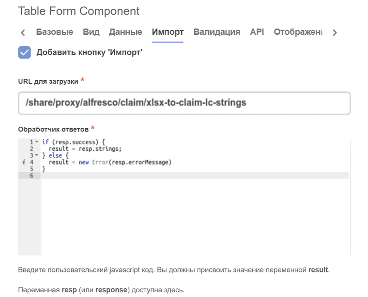
The Upload URL field is for specifying the URL where a POST request with an attached file (or multiple files) will be sent for processing. Mandatory to fill.
The Response handler field is for processing the server response result after file upload. Mandatory to fill. Accepts a JavaScript expression where you need to assign to the result variable a string (recordRef), array of strings (array of recordRef), or error (result = new Error(‘error text’)).
In the JavaScript expression, in addition to standard objects formio (data, instance, _, moment, etc.), the response (or resp) variable is available, which contains the server response result after file upload.
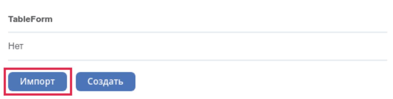
After filling in the settings, the component should have an Import button:
Examples
Data import
File handling is usually delegated to the backend.
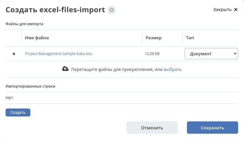
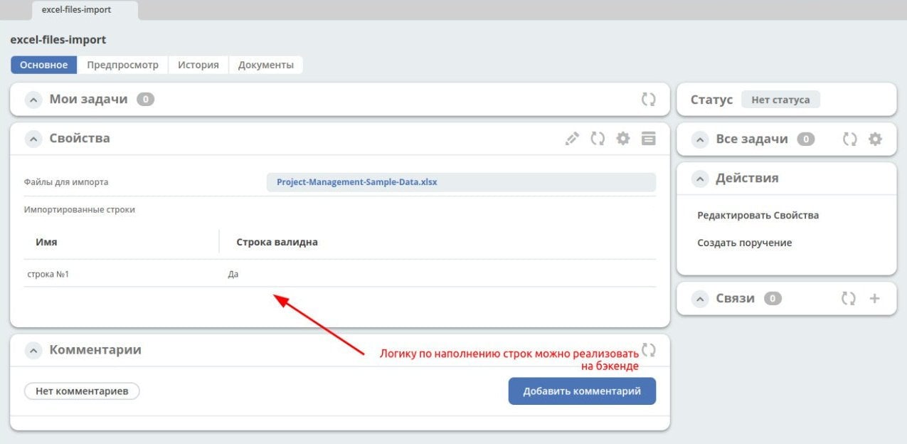
Let’s create a new type for data import excel-files-import.yml and a form excel-files-inport-form.json
For displaying rows, use the child type excel-files-import-line.yml
ecos-app archive with all artifacts, which can be fully loaded at v2/admin?journalId=ecos-apps&type=JOURNAL
Next, you need to add the main type to the menu, open the journal, click “Create”, add files for import, and click “Create”. On the backend, the creation event is caught, files are processed, and rows are populated.
Approximate view of how it will look:
For custom backend logic in Citeck, there is an option to create additional microservices. A demo microservice that can be viewed as an example - https://github.com/Citeck/ecos-demo-app
Changing row style
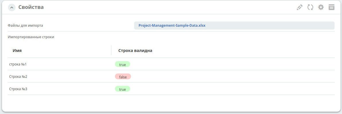
For each row, you can fill the “match” flag and attach a formatter to this attribute
Example form excel-files-inport-form.json
Adding rows
Tables on forms are a way to represent child entities.
To add new rows on the backend, specify the correct attributes _parent (reference to the parent) and _parentAtt (parent association for linking with the child entity).
recordsService.create("type@excel-files-import-line", ObjectData.create()
    .set("name", "custom-name")
    .set("validLine", true)
    .set(RecordConstants.ATT_PARENT, "emodel/excel-files-import@0fd3353c-8a9f-47bc-b3f9-26ec92b1245c")
    .set(RecordConstants.ATT_PARENT_ATT, "importedLines")
);