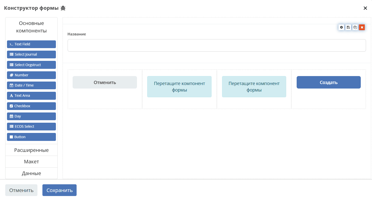
General description
The Citeck platform form editor includes a set of components grouped by purpose:
Basic — for data input and selection,
Advanced — specialized platform components,
Layout — for structuring the form,
Data — for working with data without displaying it to the user.
Some components are based on standard Form.io components and enhanced with Citeck functionality. For such components, links to the original Form.io documentation and enhancement descriptions are provided.
Basic components
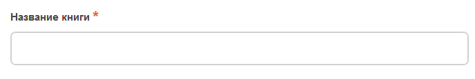
Text Field
Single-line text field.
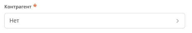
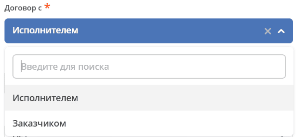
Select Journal
Component responsible for selection from a journal. Only works if a journal exists for the reference type.
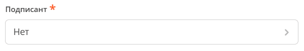
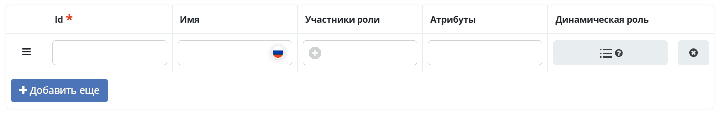
Select Orgstruct
Component responsible for selection from organizational structure users/groups. What exactly will be selected (users with groups together, or something single) is regulated within the component.
Number
Numeric field. Can accept both integer values and floating point values. This is regulated within the component.
By default, number digits are separated by space. For example, 1 000 000
Date/Time
Field responsible for displaying date and time.

Display is regulated within the component, RU/Eng localization is available

Text Area
Analog of Text Field. Multi-line text field.

To display entered data in multiple lines, you need to add an editor on the View tab:

Checkbox
Field for selecting multiple values from a list of parameters.

Day
Field for entering values “Day”, “Month” and “Year” using number or field type selection.
ECOS Select
Field responsible for selection from a list. Based on the standard formio Select component, has been modified.
Button
Adding buttons to perform various actions in the form.

Advanced
ML Text
Single-line text field. Language selection is provided by a Russia/USA flag switch. After selecting the language, text is entered in the field.
Both entered values are saved. If the field contains the ML postfix and is an object (contains EN/RU key), the element is rendered.
ML text support is implemented for the “Field name”, “Hint” fields of all form editor components, as well as for the “Content” field of the Html Component, “Property name” field of the Panel Component.
Table Form
Component allows displaying selected values in table format.
Task Outcome
Component is used to add task verdict buttons to the form. The component automatically forms verdict buttons based on Task Outcomes settings.
Select Hierarchical
Component implements a hierarchical select for Citeck forms — selection of records organized in a tree via self-association (parent–child).
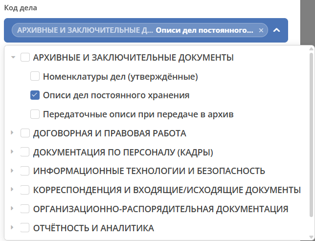
Component features:
dropdown list with a tree;
lazy loading of child nodes: root is loaded on open, nested nodes — on node expansion;
display of full path (Parent › Child) via the
_parentchain up the tree (up to 20 levels);automatic expansion on open: if a value is selected — ancestors expand automatically;
single or multiple value selection;
protection against Formio «echo-updates» via
lastEmittedRef.
Email
Component is a string field that performs special input validation, ensuring that entered data is in a valid email format.
A valid email address consists of an email prefix and email domain in acceptable formats.
URL
Component has a customizable validation parameter that, if configured correctly, can ensure that the entered value is a valid URL.
Phone Number
Component can be used to enter phone numbers into the form. Number input mask can be set.
Address Field
Special component that performs search of entered addresses.
ML Textarea
Multi-line text field for input in Russian/English languages. Language selection is provided by a Russia/USA flag switch. After selecting the language, text is entered in the field.
Both entered values are saved. If the field contains the ML postfix and is an object (contains EN/RU key), the element is rendered.

HTML Element
Component can be added to a form to display a single HTML element.
Content can be changed dynamically via a script. For example:
instance.component.content = {en: '<p>Hello World</p>', ru: '<p>Привет, мир</p>'};
instance.setHTML();
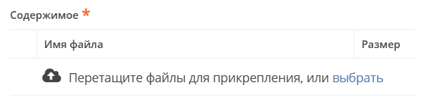
File
Component for file upload.
Select Action
Component for displaying a list of values in a dropdown. Users can select one of the values.
Layout
Horizontal Line
Component for displaying block separator.
Columns
Component responsible for dividing the form into columns. Based on the standard formio Columns component, has been modified.

See detailed description of Columns on Form.io
Panel
Panel where a property can be placed. Needed for zoning. Components that are similar in meaning are placed in it and assigned a title.

See detailed description of Panel on Form.io
Table
Component allows creating a table with columns and rows.
Tabs
Component responsible for tabs on the form. A tab is hidden when all components on it are hidden, or there are no components at all.
Data
Hidden field
Component can be added to a form to create a resource property that can be configured in the form. There is no external widget for hidden components. They are not displayed in visualized forms.
Async Data
Invisible component for loading asynchronous data.

Include Form
Component for including one form into others.
In properties, one field - formRef with selection from forms journal (ecos-forms).
External appearance in builder (like Hidden component, but name is formed by pattern “Form: form_name”).
English variant: Form: form_name
where form_name and имя_формы is the “?disp” attribute of the selected form. If no form is selected, it writes No form (Нет формы)
When rendering a form not in the builder, the component should not be drawn (on the server it will be automatically replaced with all components that are in the selected form).

Container
Wrapper for a set of fields, similar to Field Set.

Data display management component based on Bootstrap Grid usage.
The Bootstrap Grid system is needed for page layout, particularly for creating responsive layouts.
The framework defines 5 responsiveness levels (breakpoints) that are based on viewport width:
xs — extra small, super small — width < 576px (this is the default level);
sm — small, small — width ≥ 576px;
md — medium, medium — width ≥ 768px;
lg — large, large — width ≥ 992px;
xl — extra large, super large — width ≥ 1200px.
The grid consists of groups of rows and columns located within one or more containers.
Basic grid rules in Bootstrap:
columns are strictly inside a row at the first nesting level;
rows are only needed for placing columns;
rows must be located inside a container.
Rows and columns always work together, they cannot be separated.
An element with the .container class is the root block of the grid in Bootstrap, meaning it is located at the outer level. The container is suitable for storing any elements, not just rows and columns.
Only columns should be inside a row, and content should be inside them.
Columns are needed for dividing the viewport horizontally, while in one row there can be columns of different widths.
The classic Bootstrap grid consists of 12 columns.
In most cases, using all of them is not required; they can be combined as needed. Imagine that the entire viewport is divided into 12 equal parts - width units. One column can contain from 1 to 12 such units.
Data Grid
Data display management component that extracts information from a collection of objects and visualizes it in a grid with rows and cells. Each row corresponds to a separate object, and each column corresponds to a property in that object.
Data Grid Assoc
Data display management component.
Data Map
Component allows users to create key/value pairs.