Widget “Process Statistics”
Note
Available in the enterprise version only.
Viewing widget data is available to users with the “View reports” permission.
Key process-statistics
The widget visualizes business process statistics with a heatmap display.
A heat map is a tool that visualizes data using different colors. Data is displayed as colored spots.
Available view modes
The widget has 3 possible views:
KPI mode:
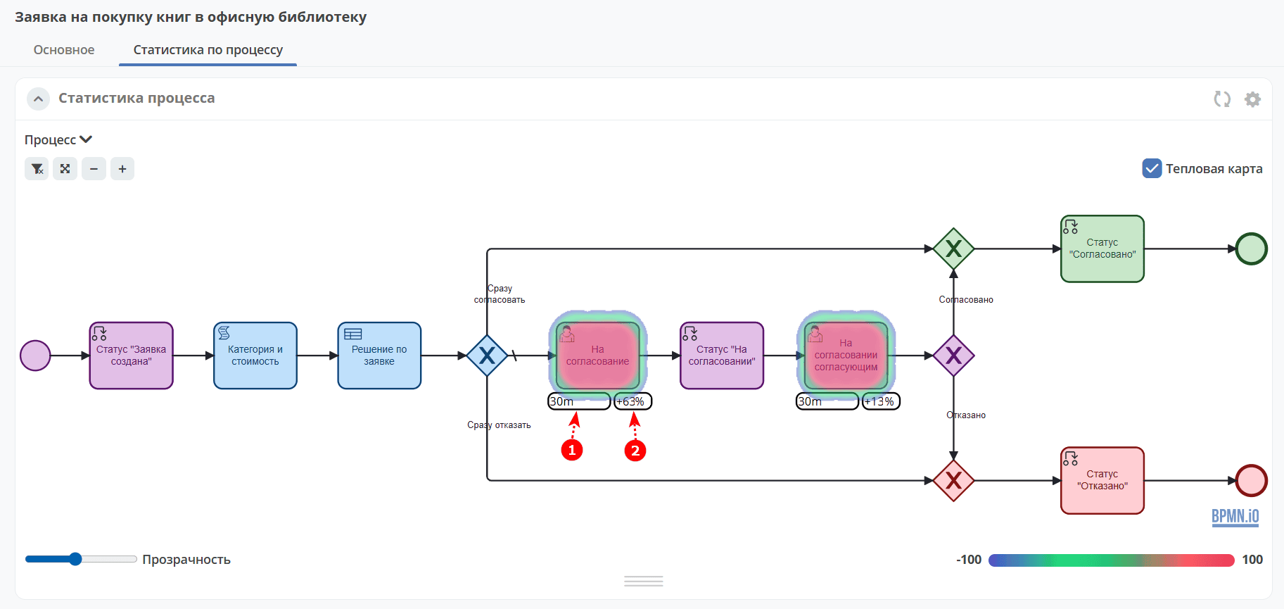
The business process, KPI target values (1), and KPI deviations from the target (2) are displayed:
See details on KPI.
Simplified mode:
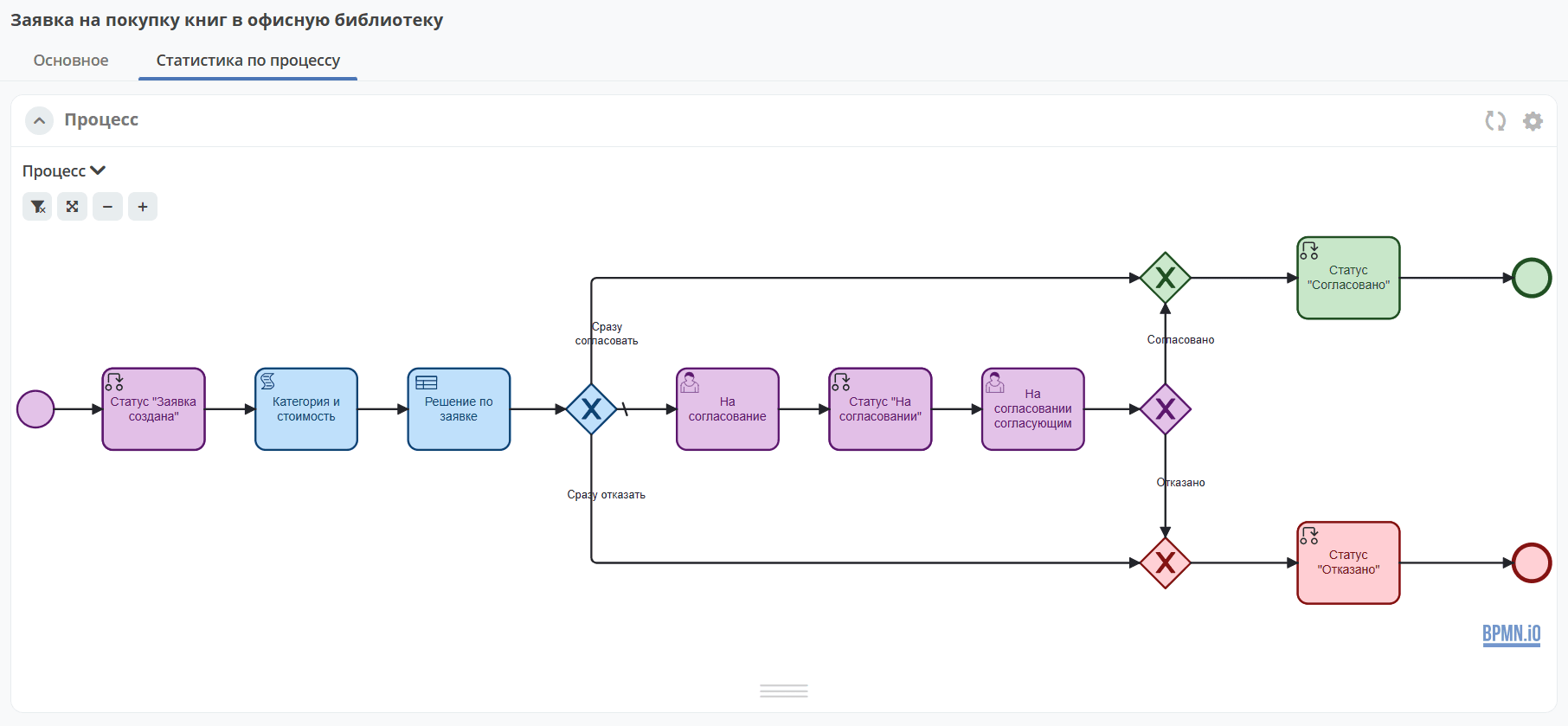
Only the business process is displayed.
Extended mode:
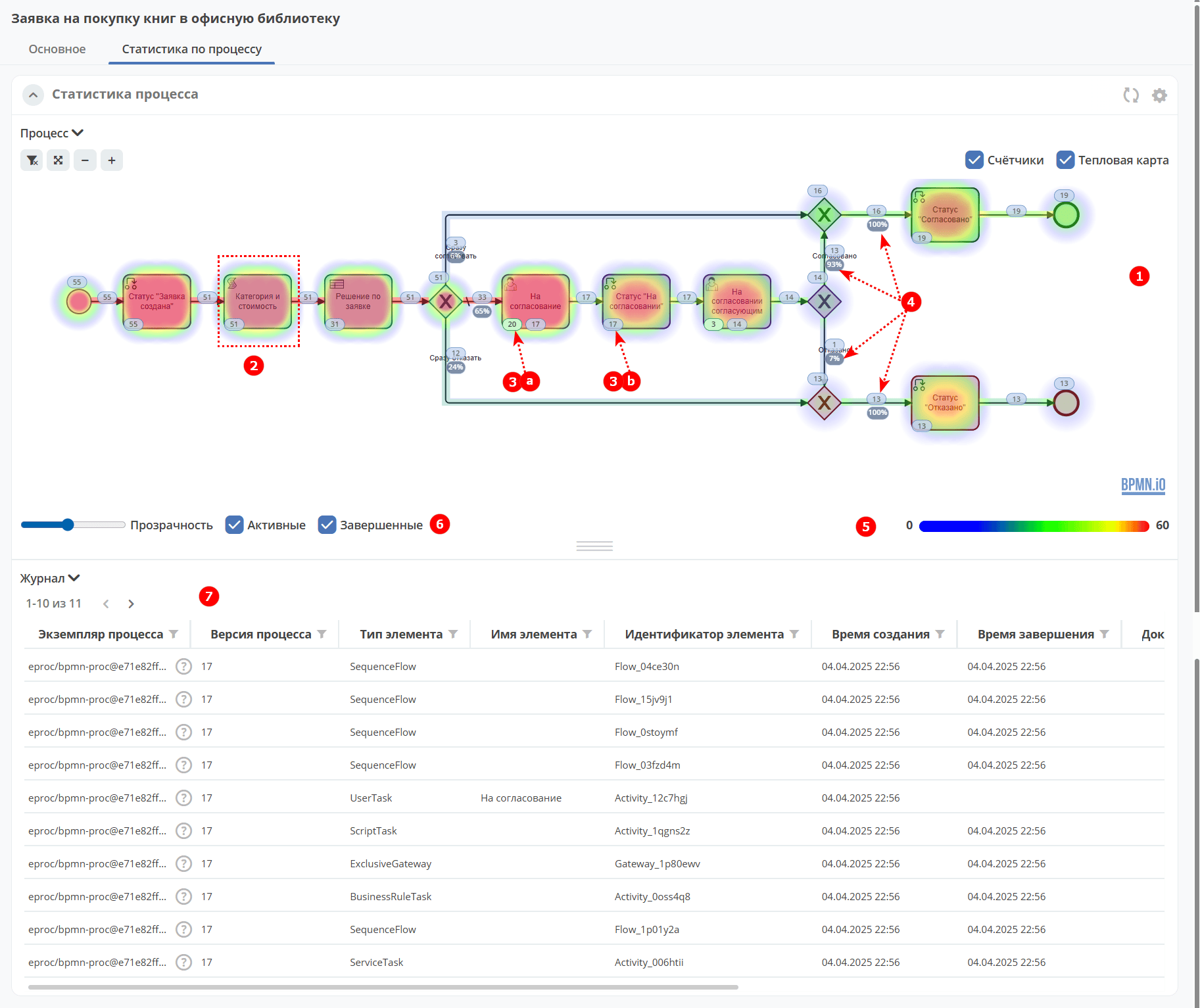
With maximum default settings, the extended mode provides:
Business process (1)
Heat map (2) — more active elements are shown in warmer colors; the lower the value, the cooler the color.
Counters (3) — shows the number of process instances at each process step. Counters can be toggled on/off; the business process itself will remain visible.
A — active instances.
B — completed instances.
% of instances that followed each branch after a gateway (4). The percentage is calculated from the total number of instances that passed through the gateway.
Heat map panel (5) — opacity control, displaying the minimum and maximum values of active and completed instances.
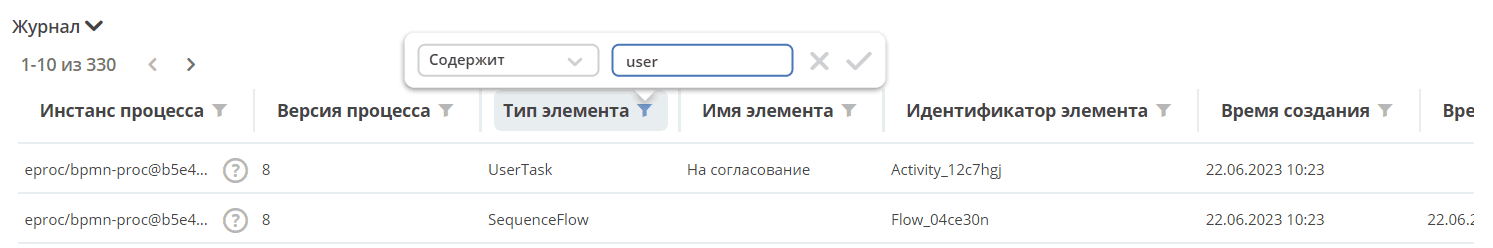
Journal (6) — filtering and event search can be configured for each column. The visualization will be redrawn according to the selected filters.
Zooming and panning
To zoom, use the Ctrl + mouse scroll shortcut.
To pan the heatmap left or right, use Shift + mouse scroll.
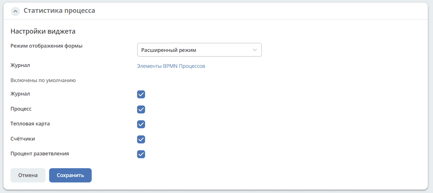
Widget settings
Widget configuration is available only to users in the ECOS Administrators group.
The KPI and Simplified modes have no additional settings:


For the Extended mode, the widget elements displayed by default are selected here: